One of the painful realities of software is that as it becomes increasingly rich with features, it becomes increasingly difficult to use.
Despite the best intentions of software companies to design usable software, there is often a large conceptual gap between what users know and what software designers expect users to know. For a simple application, the gap may be small. For complex applications, the conceptual gap can be huge. As this conceptual gap widens, users are more likely to rely on software documentation and support services, resulting in decreased user productivity.
“The two most important tools an architect has are the eraser in the drawing room andthe sledge hammer on the construction site.” -Frank Lloyd Wright
Using software does not have to be this painful. There is a large and growing body of research in user-centered design that can help you create truly usable software and Web applications. In this article, I will focus on one element of user-centered design called user assistance. I will first explain the environment within which unusable software is born. Then I will define user assistance and show how it can lead your users to a more positive user experience.
The Environment
Despite a strong belief by some, unusable software is not the intended goal of software companies. The software industry is remarkably competitive. Oftentimes, the success of a software product, and sometimes a company itself, is directly related to how quickly the company can design, develop, and bring a particular software product to market. It is within this reality that unusable software is born.
Add to this the unfortunate truth that software companies have adopted what some have called a “good enough” mentality. That is, they have found that users are very forgiving of bad software design because, despite usability problems and even numerous defects (which developers have euphemistically termed “bugs”), the software provides a function or service that users depend on to do their jobs. Besides, software companies have a unique way of quelling user unrest with promises to address problems in a newer version or even service packs or patches.
At a lower level, the tools necessary for a developer to create usable software either are absent or ignored. Typically, interface design is left to a developer's “best judgment,” and aggressive project schedules leave little time, if any, for prototyping and iterative design. For the most part, the problem does not rest with the developer, but with the environment within which the software development takes place.
So, the obvious question is: will incorporating user assistance into your software take more time? The answer is probably. Now a more important question: will incorporating user assistance into your software benefit your users? The answer is definitely.
Defining User Assistance
User assistance is any interface element that helps the user to use the software correctly. Certainly, Wizards and online Assistants fall into this category. However, interface text, button text, screen titles, and option text also fall into this category. Even “non-visible” interface elements that require user interaction to access, such as rollover text, fall into the category of user assistance. Application warning and error messages are another important element that I believe should be categorized as user assistance. The development of user-friendly warning and error messages usually falls off the radar screen during software development and testing.
Evolving Interface Guidelines
As noted earlier, there is a considerable amount of information available regarding usability. One of the companies effectively leveraging their large customer base to obtain valuable usability data is Microsoft. Their very active usability labs have resulted in more usable software for users, as well as ever-evolving interface guidelines for developers.
Currently, Microsoft's Inductive User Interface (IUI) guidelines are getting the most attention (see References sidebar). The basic idea of the IUI model is to create software screens that explain their purpose (inductive) rather than screens that offer multiple purposes and behaviors that users must establish on their own (deductive). Microsoft followed the IUI model in developing many of their recent Microsoft Money products. In addition, limited IUI features appear in Microsoft's newest releases of two of their flagship products: Office XP and Windows XP.
So, with the Microsoft IUI model as a yardstick, let's look at user assistance in more detail.
User Assistance
The IUI model broadly categorizes user assistance into two categories: primary assistance and secondary assistance. Let's look at each of these categories in detail.
Primary Assistance
Primary assistance refers to all of the visible text on the screen. Its purpose is to provide concise information specific to the current task the user is trying to perform. This text attempts to answer the “What should I do?” question. Specific examples of primary assistance are:
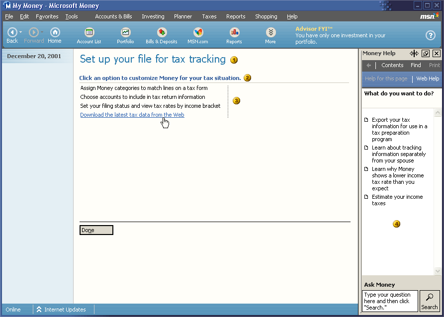
- Screen titles: As the first and most important item that appears on the screen, the title should describe the core task to complete on a page. To put it more simply: every screen should explain itself. You should try to avoid using screen titles that describe how to complete the task. The simpler and shorter the description of the task, the better defined the task is likely to be. Refer to bullet 1 in Figure 1.

Screen subtitles: Subtitles help to elaborate a screen's purpose when the screen title may not be sufficient to explain a complex task. Subtitles help to clarify the purpose of the page, provide additional task description, or help establish expectations. Users should still be able to use the page successfully without reading the subtitle. Just as with the title, you should avoid describing task details in the subtitle. Refer to bullet 2 in Figure 1.
Tasks" You can present tasks as text links, graphical images, or both. When you use text links, commands should be verb-based and written as clear and concise tasks. Refer to bullet 3 in Figure 1.
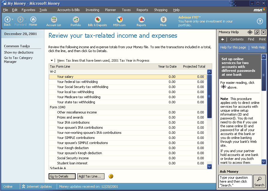
Labels for Command buttons: The three types of command buttons are Cancel, Done, and Commit. The Cancel and Done buttons typically use that text as their labels. Commit buttons should use active text labels instead of generic OK text. For example, Save Personal Information and Create New Password. Refer to bullet 4 in Figure 2.

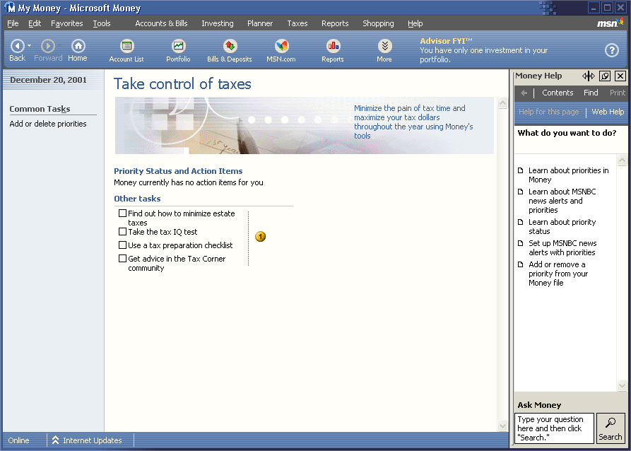
- Labels for other controls: Labels associated with radio buttons, check boxes, and text boxes should be clear and concise so that users immediately know their purpose. Refer to bullet 1 in Figure 3.

Related tasks links: “Related tasks” links provide explicit entry points to tasks related to the current task. Write these as task-based links. Refer to bullet 1 in Figure 4.
See Also tasks links: “See also” links provide secondary tasks, which are related to the primary task, but take the user out of the current context. Write these as regular task links. Refer to bullet in Figure 4.
Secondary Assistance
Secondary assistance consists of all of the non-visible text that requires user or programmatic interaction to access. Examples include the text that displays when user a clicks or hovers over an interface element. The content of this text is not required to complete the task, but is directly related to the current task. Specific examples of secondary assistance are:
InfoTips: InfoTips, also known as ToolTips, ScreenTips, and hover text, provide the user additional information about an interface element. An InfoTip displays when the user hovers the mouse pointer over an object. You should create InfoTips for each clickable user interface element. Refer to bullet 3 in Figure 4.
“Learn about” help topics: These links open Help topics such as feature overviews, conceptual information, supporting information, and procedural information. You should strive to keep the number of “Learn about” links to a minimum. Refer to bullet 4 in Figure 1.
Error Messages: How often have you seen cryptic error messages that provide no hint whatsoever to the problem and its resolution? I believe that developers need to start thinking of error messages as part of user assistance. Ideally, error messages should clearly and concisely describe the problem and provide suggestions for problem resolution. Refer to Figure 5 and Figure 6.


As you can see, designing user assistance in to your software takes thought and planning. Ideally, it also requires the help of actual users. Perhaps the best way to test out your attempts at designing user assistance is to give a prototype to a group of users for review. User feedback can help you to sharpen your design and make the product more usable for everyone. To make this process work, you will have to force yourself not to fall in love with your interface design. You have to abandon the traditional programmer mindset that says you know better than your users what they need, and that developing multiple prototypes is a sign of weakness. Remember the sobering reality that it is only the opinion of your users that matters. Even after release, keep in mind that your software is still a “work in process.”
Conclusion
It is becoming evident in today's competitive software industry that the companies offering an enhanced user experience?companies like Microsoft, Lotus, and IBM?are the companies winning and retaining customers. Feature-packed software has elevated the need for usable software to a requirement instead of merely a bonus. Developers who are able to understand this reality and take ownership of user-centered design principles, such as user assistance, may find themselves a hot commodity in the software industry. So, do your users and yourself a favor: hop on the user assistance bandwagon.


