Extender classes do just that; they allow you to extend the functionality of a .NET control class.
The Error Provider and Tooltip classes are two examples of extender classes in the .NET Framework. The Tooltip class represents a significant departure from how tooltips were implemented in earlier versions of Visual Studio. The Error Provider class provides a new way to inform users about invalid input. Although each class serves a different purpose, their implementation is quite similar. This article introduces these two classes and gives a brief, yet comprehensive primer on how to use them.
Tooltip Class
Implementing tooltips in Visual Basic 6 was easy. You simply set the Form's ShowTips property to True and set the ToolTipText property of each control on the form to the desired string setting. Visual Studio .NET has taken this procedure and turned it on its ear. Is it a better design? I don't know. I will reserve judgment on the issue and I will instead help you intelligently add tooltips to your .NET controls.
If you're like me you'll instinctively look for properties like ToolTip Text and ShowTips. However, those properties don't exist in .NET.
If you are like me you will instinctively look for properties like ToolTipText and ShowTips. However, these properties don't exist in .NET. Instead, there is a class devoted to this singular task called the Tooltip class. Instead of setting properties on the control you implement the Tooltip class and through various property settings, you inform the Tooltip class of the control's existence. The basic steps are:
- From the toolbox, select the Tooltip class.
- Drag the Tooltip class to the form.
- Drop the Tooltip class onto the form.
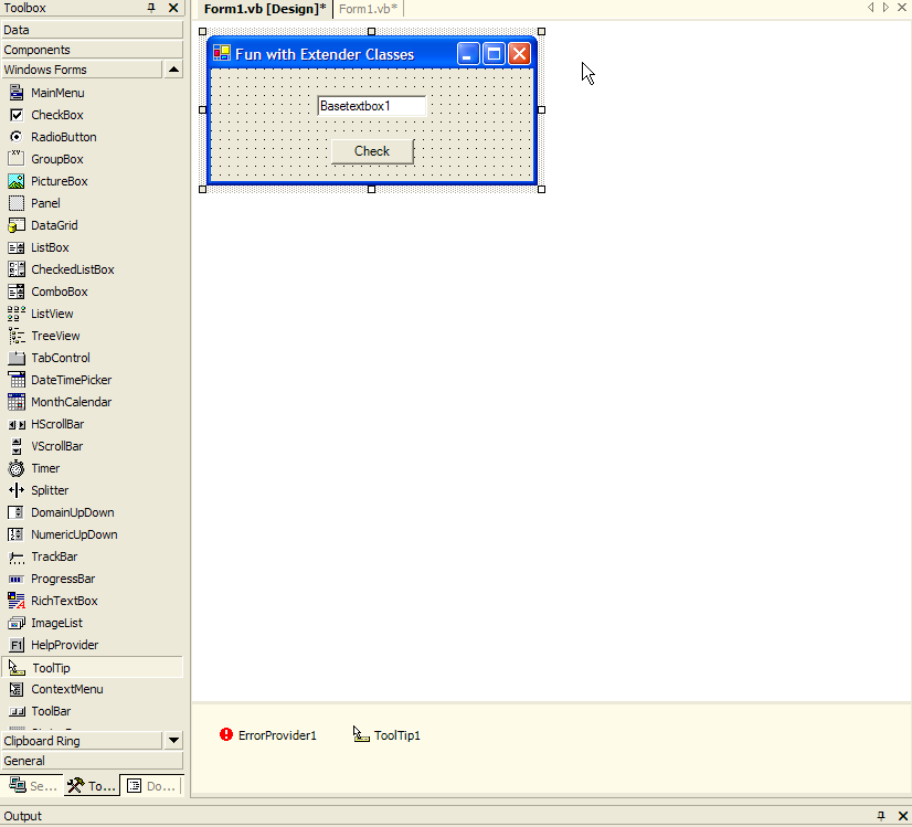
Figure 1 shows you how to implement the Tooltip class in an application.

#1: Once you've added the Tooltip class you can put it to work. Tooltips get displayed whenever you position the mouse pointer over a control for a few moments. In Visual Basic 6 you didn't need to worry about trapping events since VB 6 handled everything automatically. In Visual Studio .NET this is not the case. The following snippet illustrates the code you might add to the Command Button's MouseHover event:
Private Sub Button1_MouseHover(_
 ByVal sender As Object,_
 ByVal e As System.EventArgs)_
 Handles Button1.MouseHover
        Me.ToolTip1.SetToolTip(_
 Me.Button1, "This button will validate"+_
   the controls and check for errors")
  End Sub
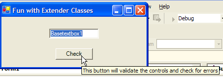
The code is straightforward. When the user positions the mouse pointer over the control, the control sends a SetToolTip message to the ToolTip object; sending a reference to itself as well as the text that it should display. Figure 2 illustrates how the tooltip appears at runtime.

While adding tooltips are simple, it does seem as through developers are taking a step backward. Setting properties in Visual Basic 6, in this author's opinion, is more straightforward and simple. .NET's way of implementing tooltips appears to add more work with little benefit in return. In preparing this article I wondered if there was a simple way to achieve the ease of the past. Then it dawned on me?what about OOP? Specifically, why not subclass the .NET textbox and outfit it with the tooltip functionality? Then, when I want tooltips I can simply add the textbox and set a property; just like in the good old days!
#2: Classing Things Up
The first order of business is to create a textbox subclass that has the tooltip functionality I require. This involves creating a class library project. Figure 3 illustrates my BaseTextBox class definition.

Once you define the class, the next step involves compiling the project into a DLL. Once you create the DLL you can customize the ToolBox in your ExtenderClass project to include the new BaseTextBox class. The steps to customize the ToolBox are as follows:
Right-click the toolbox and select Customize Toolbox.
In the dialog, select the .NET Framework Classes tab.
Click the Browse button and navigate to your class library DLL.
Figure 4 shows you the BaseTextBox class definition in the ToolBox. You can now implement the class like any other Framework control, including the ability to drag and drop the control onto any form.

In the Form Load event, this code sets the BaseTextBox's ToolTipText property:
Me.Basetextbox1.tooltiptext =
"This textbox cannot be empty"
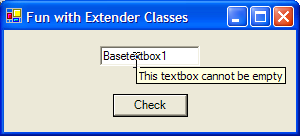
Look at Figure 5 to see how the BaseTextBox class works.

#3: Error Provider Class
The Error Provider class provides a user friendly method to give feedback on input errors. Not only does it tell the user that an error has occurred, but it shows the user which data fields they have to correct.
Referring back to Figure 1 at the beginning of this article, you can see the Error Provider class next to the Tooltip class. Error Provider is a non-visual class; it only becomes active when invoked in the context of a specific control. The Error Provider is located in the ToolBox and is added to the form via the same drag and drop operation used to add a tooltip or any other Windows control.
Like the Tooltip class, you need to tell the Error Provider which control to extend. You could place the following in the Click event of the Check button:
If Basetextbox1.Text = "" Then
 ErrorProvider1.SetError(Basetextbox1,_
    "Like I said, you cannot leave this"+_
    textbox  empty!!")
Else
 ErrorProvider1.Dispose()
End If
The rule is simple. If the textbox is empty, set the error by passing a reference to the control that contains the invalid condition and text for the tooltip. If no error condition exists, it invokes the error provider's Dispose method, which releases any resources consumed by the error provider. This clears the errors. Figure 6 illustrates how the Error Provider class works.

Because you're passing a reference to the control to the Error Provider, you don't need to worry about location. In other words, no matter where you put the control on the form, the Error Provider will always place the icon next to the offending control.
You can also use the Error Provider to work with bound data. Instead of working with the name of the control itself, you can validate data elements and raise errors through a dataset. Because Windows controls are bound to data elements, the Error Provider will locate the appropriate Windows control. To illustrate, consider the following code snippet:
Dim row As DataRow
Dim iRow as Integer
iRow = _
   BindingContext(objAuthors, "authors").Position

With ErrorProvider1
   .DataSource = objAuthors
   .DataMember = "authors"
   .ContainerControl = Me
End With

If editphone.Text = "" Then
   row = objAuthors.authors.Rows(iRow)
   row.SetColumnError("phone", _
      "Phone Number cannot be empty!")
End If
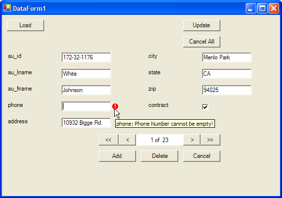
The Error Provider is given a specific dataset to act upon. Once that information is in place, invoking the SetColumnError method will trigger the Error Provider to place an icon next to the appropriate user control. You may wonder how the Error Provider could know which user control is the correct one. Since the controls are bound to specific data elements and since you need to provide which column has the error, the Error Provider can determine which user control is bound to that column. Figure 7 illustrates the Error Provider at work in the data context.

Summary
Extender classes provide a way to extend the functionality of a Windows control. The Tooltip class allows you to add tooltip functionality that was previously native to Windows controls. While .NET has significantly changed how tooltips are implemented, the ability to subclass Windows controls in .NET allows you to encapsulate and reduce the amount of code required to implement tooltips.
The Error Provider class presents an interesting alternative to alerting users to input problems. Instead of displaying a generic message box, developers can easily implement functionality that not only alerts users to problems, but you can indicate to users where the problems exist.


