Catering to the strength of the third-party .NET component market and the power of the .NET Framework itself, Microsoft includes several powerful new WinForm controls in the Base Class Libraries for Windows application development.
The WinForm controls provided by the .NET Framework 1.1 are extremely useful, and the framework for developing new custom controls provided in 1.1 is very strong, but sometimes the development community expects more out-of-the box. Many needs of the development community are satisfied by the basic collection of WinForm controls while some developers have voiced their need for more functionality. Microsoft appears ready to rise to the occasion with the inclusion of many new WinForm controls.
The set of user controls that are an integral part of Microsoft's development environments provide the baseline for rapid application development (RAD). Every release of the IDE brings new controls to accelerate the development of user-friendly GUIs. Microsoft has seemed content with providing a strong set of base controls, and a framework allowing the development community and third-party Independent Software Vendors (ISVs) to tackle the really heavy lifting in developing complex controls.
Microsoft is starting to break with that strategy with Visual Studio .NET and really follows through with the new controls that appear in the Toolbox of the alpha build of Whidbey. The new controls include everything from data-centric, to layout-oriented containers, to significantly improved versions of existing controls. A few new controls plug up holes in the existing user control line-up.
Both the ListView and TreeView classes acquire the long overdue owner-drawn capability, opening the door to highly customized variations of these two classes.
It is probable that many new or improved WinForm controls covered in this article will change, perhaps dramatically, as Whidbey progresses from alpha through beta to the final release, and new controls could surface. What you can expect for sure is that the quality, ease-of-use, and RAD characteristics of the new WinForm controls will continue to increase beyond the already impressive alpha.
Simplifying Common Tasks
Microsoft designed the .NET Framework to allow the developer to easily create either custom controls or extend existing controls to provide custom features. Although developers can easily create their own custom functionality, some tasks are so common that it is better to have a standard control that facilitates performing that task.
Enhanced Menu Options
The current MainMenu control is very useful and powerful; the in-place editing feature makes it very easy to design complex collections of menu items. One glaring omission is the left-hand image stripe that can be seen on all the menu items in the IDE, but was not available on the standard MainMenu control. The MainMenu class has been updated in Whidbey with three properties used to implement the image margin visual element: ImageList, IsImageMarginPresent, and ImageMarginColor. The new ImageList property can be set to make the desired images available for menu items, the IsImageMarginPresent property controls the visibility of the image region down the left side of any drop-down menu, and ImageMarginColor controls the color to be used for the image margin.
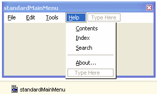
You will often use the same set of common menu items in many applications as a part of standard Windows application design. Common menu items include the File, Edit, and Help menus. If you often use many of these common elements, you will save time by using the standardMainMenu component. The standardMainMenu component on the Toolbox creates a MainMenu control shown in Figure 1 and will auto-populate all the standard Window menu items. From this starting point, you should delete or disable the items you do no need.
A Better Toolbar
The ToolBar class available in 1.1 leaves much to be desired when compared to the highly appealing toolbar styles found in many Microsoft products, such as Office. The WinBar class fills this need by acting as a container for numerous classes inheriting from WinBarItem. These classes include:
- WinBarButton
- WinBarDropDownButton
- WinBarSplitButton
- WinBarOverflowButton
- WinBarComboBox
- WinBarTextBox
- WinBarLabel
- WinBarSeparator
- WinBarDropDownItem
- WinBarMenuItem
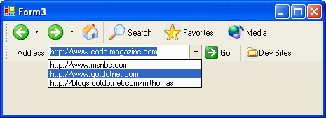
An example of using the WinBar control is shown in Figure 2, where portions of Microsoft Internet Explorer toolbars are emulated.
Using Sound with Ease
Playing sounds as a feature of your application just became as simple as possible. Drag a Sound component from the Toolbox to a form and it provides you with a very simple interface for loading and playing .wav files. The Sound class can load a .wav file from a file path, a URL, or into a Stream object by preloading the .wav file prior to playback.
You can enable auto-completion features for ComboBox or TextBox instances, even specifying a custom collection of strings to serve as the source.
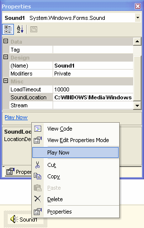
The Sound class supports both synchronous and asynchronous loading of .wav files. The LoadCompleted event is raised when the .wav file has been completely loaded. The context menu for the Sound component, shown in Figure 3, supports the playing of the selected .wav file during design-time to facilitate testing.
A More Powerful ListView
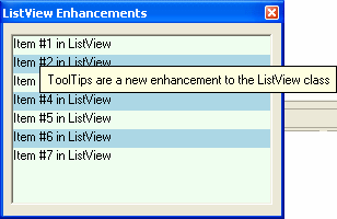
The ListView control is already very flexible. It supports multiple views, including LargeIcon and SmallIcon, and the ability to automatically add checkboxes to items in the Items collection. Several missing features are being added to both the ListView and TreeView classes. You can control how each individual item within the ListView is drawn by setting the OwnerDraw property to True and then handle the DrawItem event of the ListView.
If you want to specify item-specific tooltips, you can set the ShowItemToolTips property to True and set individual ToolTipText values for each instance of a ListViewItem that you add to the Items collection. Both techniques are shown in Figure 4.
There is a new grouping feature using the ListViewGroup class to allow ListViewItems within a ListView class to be grouped according to custom settings and visually associated with each other when the View property of the ListView class is set to any value other than List. ListView groups are only available on Windows XP and Windows Server 2003.
Active Document Editing
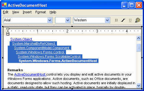
You'll use the new ActiveDocumentHost class to display and edit in-place assorted active documents directly from your Windows application. Examples of active documents include rich text-format files and Office documents. You will use the ActiveDocumentHost class to load documents initially in static read-only mode.
The ActiveDocumentHost class provides some very powerful features. You can set the DrawMode property to Normal, Stretch, or Zoom to control the display mode when the document is inactive. You can set the ActivationGesture property to Click, DoubleClick, Focus, or Never to control which action switches the document to edit mode. You can use the ShowMenus and ShowToolbars properties to modify the look of the document when active and you can set the Tooltarget property to the object that houses the toolbars when the document is active.
As shown in Figure 5, all the toolbars, menu bars, and appropriate editing elements of the original application are hosted in the Windows application, and the document itself becomes editable. The originating application must be installed on the local computer in order to host a document within an instance of the ActiveDocumentHost class
Finally, a Managed WebBrowser
The strength of the COM interoperability services in the .NET Framework is excellent. Despite the strength of the APIs and the flexibility of Visual Studio .NET for hiding how complex it can be to use the System.Runtime.InteropServices namespace, you most likely found that using complex COM objects or ActiveX controls can produce less than perfect results in some cases. The WebBrowser object found in Shdocvw.dll is a fair example. This ActiveX component provides the Web page and HTML visual rendering services of Internet Explorer. Through COM interop, it was trivial to use this browser component on a WinForm application, but a few desirable features did not exist, or were complicated to implement.
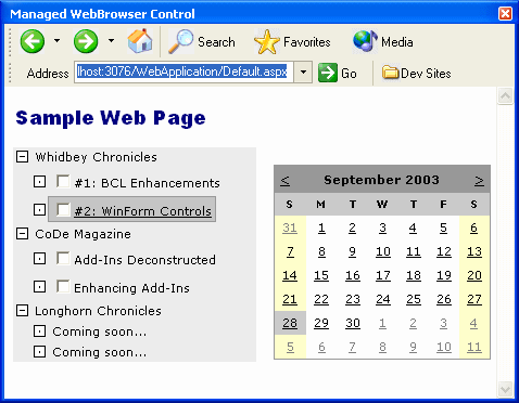
The new managed WebBrowser class is found in the System.Windows.Forms namespace and extends the functionality provided by the underlying ActiveX control. The rendering behavior did not change, but events have been cleaned up and reorganized, and additional information is available in certain events. Many new properties provide functionality not easily accessible through the underlying browser component.
The WebBrowser class exposes several core navigation events you can handle to process the loading of a document. The primary navigation-related events, in chronological order, are:
- Navigating
- Navigated
- DocumentCompleted
The Navigating event can be cancelled if desired conditions do not exist. The Navigating event wraps and replaces the BeforeNavigate2 event of the underlying component, which was not handled correctly when using a generic COM-interop assembly wrapper. You can use the Stop method to cancel any active loading operation and the Refresh method to force the WebBrowser class to load the desired document.
Navigation is initiated by the WebBrowser object whenever one of the following methods is executed:
- Navigate
- GoBack
- GoForward
- GoHome
- GoSearch
- A more complete list of methods provided by the WebBrowser class is provided in Table 1.
- Navigation is also initiated when one of the following properties is changed:
- Url
- DocumentText
- DocumentStream
The DocumentCompleted event is your primary mechanism for processing a loaded Web page. When handling this event, you access the Web page contents through the Document, DocumentText, or DocumentStream properties. Manually setting the DocumentText or DocumentStream properties causes the WebBrowser class to first navigate to about:blank. This provides a fully instantiated document object to hold the page contents.
By using the same icons found on the Internet Explorer toolbars, I approximated the look of Internet Explorer. This is a simple example of leveraging the WebBrowser control to create a custom browser application. An example of combining a couple of WinBar controls and a WebBrowser control onto a form is shown in Figure 6.
The FileDownload event should be handled to execute code before the Internet Explorer File Download dialog box is displayed. You should handle this event if you want to cancel a file download operation. If you want to cancel the loading of a new browser window, handle the NewWindow event that is raised before a new browser window is opened. Additional events provided by the WebBrowser class are listed in Table 2.
The WebBrowser class provides several properties used to leverage extended functionality that is enhanced beyond the behavior directly exposed by the underlying browser component through generic COM-interop wrappers. The AllowWebBrowserDrop property is set to True to allow the WebBrowser object to automatically navigate to and load a document dragged and dropped onto the control. Set this property to False to disable it. Set the ScriptErrorsSuppressed property to True to disable the display of the scripting error dialog box in response to errors raised within script embedded in a Web page being loaded.
If you want to disable user interaction with the WebBrowser control and the loaded document, use the IsWebBrowserContextMenuEnabled and WebBrowserShortcutsEnabled properties. Set these properties to False to disable the most common methods of user/Web page interaction. Additional properties of the WebBrowser class are listed in Table 3.
If you want to enable two-way communication between managed code and client-side script contained within a Web page, use the ObjectForScripting property. Set this property to the object you want referenced by any Web page scripting code when a reference to window.external is made in the script. The window.external object is a built-in DOM object that provides access to the host application of the Web page. Specifically, this provides the page script with a late-bound reference to a managed object and enables communication from the Web page to a managed object.
To make the communication channel two-way, you use the Document property of the WebBrowser instance. This property is an HtmlDocument object instance and provides a managed wrapper around the COM-based MSHTML library. This library is also known as the Microsoft HTML Object Library and it provides you with access to elements within the Web page through the document object model, completing the two-way programmatic communication channel. Use the System.Windows.Forms.InvokeScript method to directly script methods provided by the Web page.
New Container Controls
Whidbey includes several new controls that provide advanced layout services. Three new container controls are provided to you to simplify three different control layout scenarios: SplitContainer, FlowLayoutPanel, and TableLayoutPanel.
Simplifying Form Design
The SplitContainer control, shown in Figure 7, combines several controls and docking settings commonly used in a single composite control, saving many steps in the development of complex forms. A common task in designing forms is to use controls that could share a vertical or horizontal space. The existing Splitter control allows an application user to adjust the division of space separating sections of a container control, such as a Panel class. Use the SplitContainer control to eliminate the need to perform these combined steps multiple times.
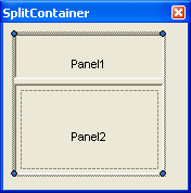
The SplitContainer class provides several properties to modify the behavior of an instance of the control. Use the FixedPanel property to select which panel in the control should not resize as the SplitContainer instance resizes. Set the SplitterDistance and Orientation properties to control the direction and starting location of the splitter bar. The Panel1MinSize and Panel2MinSize properties are used to specify the minimum size of the SplitterPanel instances in the SplitContainer, effectively controlling how close the splitter bar can be placed to either edge of the control.
Reducing Control Layout Code
Two closely related controls, the FlowLayoutPanel and TableLayoutPanel classes, extend the Panel class by adding specific child control positioning logic. Use either of these controls to implement a very specific set of child control layout scenarios. In simple scenarios, as shown in Figure 8, the result of using either control may not be uniquely distinguishable from the other.
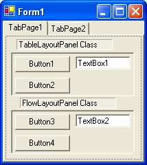
The FlowLayoutPanel class, mentioned in the Whidbey documentation as the FlowPanel class, is used as a container control when the child controls added are dynamically repositioned to flow in a particular direction. The FlowLayoutPanel automatically positions all child controls in the direction indicated by the value of the FlowDirection property. You can leave the WrapContents property set to the default value of True to force the controls to stay within the boundaries of the SplitContainer class by starting a new row or column, depending on the value of the FlowDirection property. In Figure 9, a FlowLayoutPanel control with a FlowDirection value of Horizontal moves the controls when one of the child controls is increased in size.
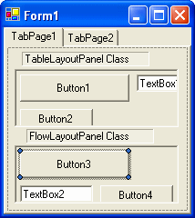
The TableLayoutPanel class, mentioned in the Whidbey documentation as the GridPanel class, implements different positioning logic than the FlowLayoutPanel class. The FlowDirection and WrapContents property of the FlowLayoutPanel are replaced with integer-based Columns and Rows properties. The TableLayoutPanel class implicitly positions child controls in a table format, which, assuming default values of 0 for both Columns and Rows, mimics a FlowLayoutPanel instance with FlowDirection set to Horizontal and WrapContents set to True. You set either Columns or Rows to a non-zero positive value to limit the cells in either dimension of the table. Increasing the size of a child control shifts the cell size in the table containing the child control to accommodate the larger child control, as shown in Figure 9. This pushes other child controls away from the growing control.
An exception is raised if you set values for Columns and Rows that combine to produce too few cells in the table to hold all the child controls. The TableLayoutPanel class provides ColumnStyles and RowStyles properties. Use these collection-based properties to modify sizing properties at the individual row and column level.
Miscellaneous New Features
Of all the enhancements introduced to WinForm controls in Whidbey, the most useful are sometimes the least obvious. Many enhancements are not as obvious as the SplitContainer or the addition of owner-drawn functionality to the ListView and TreeView classes.
Enhancing Button
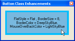
The single most common class, Button, has received a couple of new properties. Set the new BorderColor and BorderSize properties to modify the appearance of a Button when the FlatStyle property is set to Flat. Set the new MouseOverBackColor property to control the button color while the cursor is positioned over the Button. The impact of these properties on appearance is shown in Figure 10. These three properties only impact Button appearance when the FlatStyle is set to Flat, although the documentation may indicate that a value of Popup for FlatStyle also takes these values into account. If Windows XP styles are enabled, these properties have no impact.
Enhancing ComboBox and TextBox
The ComboBox and TextBox classes acquired built-in auto-complete functionality. To enable it, change the new AutoCompleteMode property from the default of None. Possible values are:
- AutoAppend
- AutoSuggest
- AutoSuggestAppend
Once enabled, configure the source used by changing the new AutoCompleteSource property from the default of None. Possible values are:
- AllSystemSources
- AllUrl
- FileSystem
- HistoryList
- RecentlyUsedList
- CustomSource
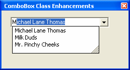
If configured to use a custom source, provide the collection of strings to use by setting the new AutoCompleteCustomSource property to an array of strings. Set AutoCompleteMode to AutoSuggestAppend and use a custom source, and your ComboBox will look something like Figure 11.
Flashing Your Form
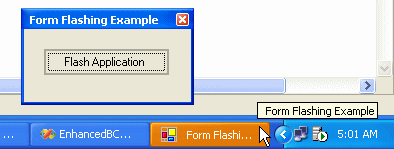
A nice little addition to the base Form class has been added, giving you ability to provide a visual notification to users that something has occurred. The Flash method, shown in use in Figure 12, causes the Form to visually switch between the active and inactive appearance and if the application is visible on the taskbar, to flash on and off. Use the StopFlash method to terminate the flashing behavior.
Summary
There was a time when the following statement, or something close to it, was overheard all too often, “If I'm not doing Web development, then why should I care about .NET?” It seemed like the message about the .NET Framework Base Class Libraries including something called WinForms was lost in the heavy push for cementing the phrase “Web services” in the minds of every developer on the planet. This is not a complaint, but merely an observation. I will have to admit that most of the really cool WinForm controls, or at least anything much above a managed version of an existing common control was left to the 3rd party ISV market.
After taking my own “alpha” look at some of the new WinForm controls that Whidbey will be bringing to the developer's out-of-the-box experience, I firmly believe that more than a few developers will be very impressed. Considering this is an alpha release of the technology, having such complex additions at this stage of the product development process is a very positive sign.
Several of the additions, such as adding long overdue owner-draw functionality to the ListView and TreeView classes, fit into the “it's about time” bucket. Other enhancements like the new SplitContainer class make you wonder why Microsoft didn't think of adding this sooner. In response to my own rhetorical question, I would like to offer up the phrase “reliability and stability before functionality.”
When you dig in and you find enhancements like the auto-complete functionality added to the ComboBox and TextBox classes and the new, managed and greatly extended WebBrowser class, it makes me think “now that's the kind of new stuff I want to see!” All things considered in proper context of working with an alpha build of the product, I believe we all should be eagerly awaiting the next stage.
Table 1: The WebBrowser methods provide core navigation and dialog box display features expected in a browsing control.
| Method name | Description |
|---|---|
| GoBack | Navigates to the previous document in the navigation list if one exists. The return value indicates whether a previous entry is available. |
| GoForward | Navigates to the subsequent document in the navigation list if one exists. The return value indicates whether a subsequent entry is available. |
| GoHome | Navigates to the Home page configured by Internet Explorer. |
| GoSearch | Navigates to the Search page configured by Internet Explorer. |
| Navigate | Basic navigation method used to initiate navigation to a document found at the specified URL |
| Sends the currently loaded document to the printer as specified by the current default printer settings | |
| Refresh | Reloads the document currently displayed in the WebBrowser control by checking the server for an updated version |
| ShowPageSetupDialog | Opens the Internet Explorer Page Setup dialog box |
| ShowPrintDialog | Opens the Internet Explorer Print dialog box |
| ShowPrintPreviewDialog | Opens the Internet Explorer Print Preview dialog box |
| ShowPropertiesDialog | Opens the Internet Explorer Page Properties dialog box |
| ShowSaveAsDialog | Opens the Internet Explorer Save As dialog box |
| Stop | Cancels any pending navigation and stops any dynamic page elements, such as background sounds and animations. |
Table 2: WebBrowser events provide critical feedback on the navigation process to allow the implementation of all the standard visual indicators to the application user.
| Event name | Description |
|---|---|
| CanGoBackChanged | Changing the CanGoBack property raises this event. |
| CanGoForwardChanged | Changing the CanGoForward property raises this event. |
| DocumentCompleted | Raised when the WebBrowser control finishes loading a document. This is the primary event used to process Web pages after loading. |
| DocumentTitleChanged | Changing the DocumentTitle property raises this event. |
| EncryptionLevelChanged | Navigating to or away from a Web site that uses encryption raises this event. |
| FileDownload | Raised before the WebBrowser control begins downloading |
| Navigated | Raised after the WebBrowser control has navigated to a new document but before it has begun loading |
| Navigating | Raised before the WebBrowser control navigates to a new document |
| NewWindow | Raised before a new browser window is opened |
| ProgressChangedEvent | Raised when the WebBrowser control has updated information on the download progress of a document it is navigating to. Typically used to modify a progress bar. |
Table 3: The WebBrowser class exposes many useful properties, including many extended properties beyond the core set provided by the underlying Internet Explorer component.
| Property name | Description |
|---|---|
| AllowWebBrowserDrop | Controls whether the WebBrowser control automatically loads and renders a document dropped onto it. Set to False to assist in concealing the use of the WebBrowser control. Default value is True. |
| CanGoBack | Indicates whether a previous entry in the navigation list exists. If True, the WebBrowser control can successfully navigate to a previous location. |
| CanGoForward | Indicates whether a subsequent entry exists in the navigation list. If True, the WebBrowser control can navigate to the next location in the list. |
| Document | An HtmlDocument object representing the document currently loaded. The HtmlDocument provides an HTML document object model view of the page and allows programmatic manipulation of the HTML items contained in the Web page. |
| DocumentStream | A Stream object used to get or set the contents of the page currently loaded in the WebBrowser control |
| DocumentText | Represents the HTML contents of the page displayed in the WebBrowser control. A value of "" is returned or used when no document is loaded. |
| DocumentTitle | Read-only value representing the title of the Web page, as defined by the HTML <title> element. Often used to set the text value in the title bar of a form. |
| DocumentType | The Multipurpose Internet Mail Extensions (MIME) type of the document loaded in the WebBrowser control. |
| IsBusy | Indicates whether a new document is currently loading |
| IsOffline | Indicates whether the WebBrowser control is in offline mode. In offline mode, pages are loaded from the local cache. |
| IsWebBrowserContextMenuEnabled | Determines whether the standard context menu normally displayed when right-clicking on a Web page is shown by the WebBrowser control. Set to False to control user interactions with the loaded document. |
| ObjectForScripting | Determines the object accessible by scripting code contained within a Web page loaded in the WebBrowser control. |
| ReadyState | Indicates the current state of the WebBrowser control. Used to provide more information than the IsBusy property. |
| ScriptErrorsSuppressed | Indicates whether the WebBrowser control should display scripting error dialog boxes or suppressed them. |
| Url | Location of the currently loaded document |
| Version | Retrieves the version of Internet Explorer installed |
| WebBrowserShortcutsEnabled | Retrieves or sets whether keyboard shortcuts are enabled within the WebBrowser control |


