The next version of Silverlight should be available by the time you read this article. The Silverlight team has followed a fast pace during the last few years, producing four versions of their framework in only thirty months. Each new version of Silverlight has been full of surprises and useful features. Version 5 is no different. Let’s look as some of the best features available in SL 5.
XAML Debugging
Gather a crowd of developers together and they’ll soon be grumbling about their daily code battles. Markup languages like HTML and XML often become a target for developer angst during these gripe-fests due to their lack of debugging support.
Silverlight suffers from this problem and it’s particularly aggravating when using data binding in your XAML. I’ve seen the angry glint in my teammates’ eyes when they’re wrestling with a nasty data-binding problem.
My favorite new feature in Silverlight 5 has to be the XAML debugging supported added to Visual Studio. Finally, it’s possible to place breakpoints in my XAML, press F5 to step through the binding markup and see binding details in the Visual Studio Locals window.
To demonstrate this satisfying new feature, I’ll bind a ListBox and TextBlock to a simple data source and then add a breakpoint. First, let’s look at the data source classes.
public class Food {
    public string FoodName { get; set; }
    public Int32 Calories { get; set; }
    public Int32 StockCount { get; set; }}
public class Foods {
  private List<Food> foods;
  // ... constructor creates the list of Food
 public List<Food>FoodByCategory(
string category){
 var q = from f in foods
       where String.Equals(f.Category, category,
       StringComparison.OrdinalIgnoreCase)
       select f;
   return q.ToList();}
Next, I’ll create the UI and bind the controls. Note the typo on the TextBlock binding.
<ListBox Height='163'
         ItemsSource='{Binding}'
         DisplayMemberPath='FoodName'
         Grid.Row='1' />

    <TextBlock Grid.Row='2'
               Text='{Binding FodName}' />
Finally, I’ll set the data context in the code behind.
 var foods = new Foods();
 this.DataContext=
  foods.FoodListByCategory("Dairy");
Because of the typo in the data-binding XAML, the bound data will not show up at runtime. This is the perfect scenario for XAML debugging.
Setting a Breakpoint in XAML
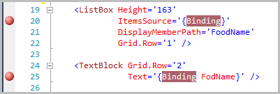
Setting a breakpoint in XAML is identical to the way you set one in the Visual Studio code editor. First, move the selection point to the line of XAML that you want to debug. Then either press F9 or click in the code selection margin on the left side of the code window. Note you cannot add a breakpoint to a line of XAML unless it has a Binding Markup Extension within that line of text. Figure 1 shows two breakpoints set in the XAML editor.
With the breakpoints in place, all you need to do is run a debug session for the application. After the debugger is attached, you will see the joyful sight shown in Figure 2.
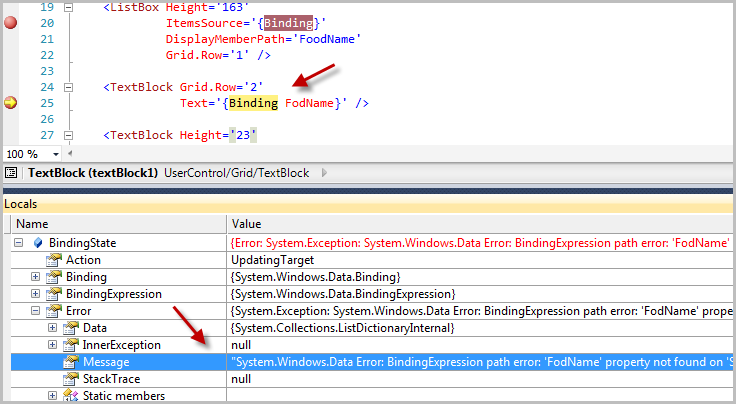
Once you are at the breakpoint, you can view the Locals and other debugging windows in Visual Studio. You can also step through the code files while doing XAML debugging.
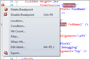
You can customize the breakpoints as Microsoft ported all the normal breakpoint options to the XAML version. Just right-click the red breakpoint circle and set breakpoint conditions, filters and hit counts as shown in Figure 3.
Data-binding Improvements
Silverlight 4 often gets jeers from the Windows Presentation Foundation crowd because it is missing some key data binding features. These WPF devs will have to find other problems to criticize as most of the missing data-binding features are now part of Silverlight 5.
Ancestor Relative Source Binding
Occasionally you need to bind an element property to a parent element in the element tree. If the element has a name just use the ElementName binding property like this.
<Grid x:Name="LayoutRoot"
        Background="Gold">
    <Grid Margin='20'
          Background="Black">

        <TextBlock Foreground='{Binding
           ElementName=LayoutRoot,
           Path=Background}'
           Text='Binding by ElementName/>

    </Grid> </Grid>
It’s not always advantageous to name elements in your XAML. With RelativeSource binding the dependency system will walk the element tree looking for a parent element matching the type you’ve specified. This works even when the desired parent is nameless. Use the AncesterType property to indicate the type of element to find and the AncestorLevel property to skip over more immediate parents.
<Grid  Background="Gold"
       Margin='20'>
    <Grid Background="Black">

        <TextBlock
           Text='Binding to Ancestor property'
           Margin='{Binding
           RelativeSource={RelativeSource
                AncestorType=Grid,
                AncestorLevel=1},
           Path=Margin}' />

    </Grid></Grid>
Implicit Data Templates
With implicit data templates you have the ability to produce a DataTemplate that will be associated with a particular data type. This powerful technique is popular in the WPF world and is finally available for the Silverlight developer to use in their code.
For this example I will create a data template for the three classes shown here.
  public class Dairy : Food { }
  public class Produce : Food { }
  public class Bakery : Food { }
The data is loaded into an observable collection and assigned to the UserControls datacontext.
  var foods = new ObservableCollection<Food>();

  foods.Add(new Dairy{FoodName="Hartly Cheese" });
  foods.Add(new Produce{FoodName = "Tomatoes" });
  foods.Add(new Produce{ FoodName = "Cucumber" });
  foods.Add(new Bakery{ FoodName = "Bread" });
  foods.Add(new Dairy{ FoodName = "Cream" });
  foods.Add(new Bakery{ FoodName = "Cupcake" });

  this.DataContext = foods;
If you know how to create data templates in prior versions of Silverlight, you should be comfortable with the XAML syntax shown here. Implicit data templates are identical to explicit data templates with one minor difference. You can specify a typename via the DataType property. This tells the binding engine to apply the template to any instance of that typename.
WPF developers should note that the Silverlight implementation uses a looser syntax; you don’t need to use the traditional markup extension syntax.
<DataTemplate DataType="model:Bakery">
In the XAML for the Listbox, set the ItemsSource property to bind to the underlying DataContext.
  <ListBox ItemsSource='{Binding}'
             Grid.Row='1'
           />
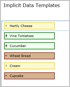
As you recall from the observable collection code there are instances of three classes (Dairy, Produce and Bakery) within the data. When the binding engine sees a bound item, it checks whether there is a template specified for that type and applies the appropriate data template.
Listing 1 shows the XAML for the three data templates used to create the list shown in Figure 4.
Other Data-binding Highlights
In two-way binding you indicate when the changed data is pushed back to the source with the UpdateSourceTrigger.PropertyChanged enumeration. When using a TextBox, the default UpdateSourceTrigger occurs when the TextBox loses focus. Silverlight 5 adds the PropertyChanged enum value, which causes the source to update upon each keystroke.
You can now receive notification when a binding data context changes via the new DataContextChanged event.
Finally, let’s take a quick look at style data binding.
Custom Markup Extensions
Successful Silverlight developers know when to use Markup Extensions in their XAML. Here’s an example of the StaticResource extension in action.
<TextBlock Foreground =
   '{StaticResource AccentBrush}'
           Text='Message' />
I’m constantly surprised how few XAML developers understand what happens when they use a markup extension like StaticResource in their XAML. So let’s do a little review. At runtime, an instance of the StaticResourceExtension class is created and the value AccentBrush is passed to its constructor. Then Silverlight calls the StaticResource.ProvideValue method and assigns the return result to the TextBlock.Foreground property. So what a markup extension really does is provide is a way to inject runtime code into your XAML.
I'm constantly surprised how few XAML developers understand what happens when they use a markup extension like StaticResource in their XAML.
With Silverlight 5, you can create your own MarkupExtension class. The code to accomplish this couldn’t be simpler. Just derive from MarkupExtension class and override the ProvideValue method. Silverlight also includes the IMarkupExtension<T> interface for implementing Markup extensions. Naturally, you can create property members on the extension. This is the way to pass information into your custom extension. This snippet shows a simple markup extension that returns a string of “Lorum Ipsum” text.
public class LatinGeneratorExtension :
              IMarkupExtension<string> {
public int WordCount { get; set; }
private string sourceString="Lorem ipsum and more;
private string[] words;
public string ProvideValue
         (IServiceProvider serviceProvider) {
  // no bounds checking in the demo code.
 words = sourceString.Split(' ');
  var builder = new StringBuilder();

  for (int i = 0; i < this.WordCount; i++) {
    builder.Append(words[i] + " ");
  }
  return builder.ToString(); }}
Here’s how to use the LatinGenerator extension in the XAML.
<UserControl  xmlns="http://schemas..."
              xmlns:x="http://schemas..."
              xmlns:mark='clr-namespace:Article '>

<Grid x:Name="LayoutRoot" Background="White">
  <TextBlock
     Text='{mark:LatinGenerator WordCount=6}' />
  </Grid>
</UserControl>
Vector Printing
Silverlight 4 supports printing but it has some limitations pertaining to output speed and clarity. Silverlight 5 adds an additional true vector (Postscript) printing mode to the existing bitmap model, providing a faster and higher resolution printing in a familiar .NET manner.
Printer Workflow
Here is what happens during a print request. You specify the XAML for the job. This can be an existing XAML tree or one you create via code. Silverlight creates a bitmap or vector representation of the printer data. In Silverlight 4, the output is always sent to the printer as an uncompressed bitmap. In Silverlight 5, the printing output can be sent as either a vector or bitmap. Vectors are usually faster and Silverlight will choose this format provided the printer has PostScript drivers and the content is vector friendly. If your XAML contains perspective transforms, 3D or semi-opaque elements then Silverlight falls back to bitmap mode. Silverlight still tries to optimize the print job in this situation by sending a compressed bitmap to the PostScript printer. Non-Postscript printers always receive an uncompressed bitmap.
Printer 101
The central class for anything print related in Silverlight 5 is the PrintDocument class. You setup your print job in the BeginPrint event procedure, tear it down in the EndPrint event procedure and do the actual print work in the PrintPage event procedure.
Here’s an example of how to wire up handlers and start a print job.
private void PrintBasics_Click(object sender,
                               RoutedEventArgs e){
  var doc = new PrintDocument();
  doc.PrintPage += Doc_Print;
  doc.EndPrint += Doc_EndPrint;

 // start the job
  doc.Print("PrintDocName");}
Here is the code that does the print work.
public void Doc_Print(object s,
PrintPageEventArgs e){
string xaml = @"<Canvas
xmlns='<a href="http://schemas.microsoft.com/">http://schemas.microsoft.com/</a>..." >
<Polyline Stroke='Orange' StrokeThickness ='10'
Points='330,100 160,150 ... '>
</Polyline></Canvas>";
var c = new Canvas();
c.Children.Add((UIElement)XamlReader.Load(xaml));
e.PageVisual = c;
e.HasMorePages = false;}
Add this simple event handler to show a message at the end of the print job.
void Doc_EndPrint(object sender,
          EndPrintEventArgs e){
MessageBox.Show("Printing finished."); }
If you know that your print job is destined for a non-Postscript printer you can force a bitmap output by calling the PrintBitmap method.
doc.PrintBitmap("PrintDocName2");
You can also force vector printing on ineligible documents with the ForceVector class. Let me explain. Say you have a document with a few elements that are semi-transparent. Under normal conditions, those semi-transparent elements cause the print output to fall back to the bitmap representation. You can override this behavior and set a minimum threshold for transparency. Any element with opacity set higher than your threshold is converted to fully opaque and treated as vector output.
  var fallback = new PrinterFallbackSettings();
  fallback.OpacityThreshold = .6;
  fallback.ForceVector = true;
  doc.Print("PrintDocName3", fallback);
Printer Caveats
You only get the vector speed improvements if you’re sending the print job to a Postscript printer. In the office that shouldn’t be an issue, but most consumer printers don’t have Postscript drivers. To be clear, printing will work whether or not the printer is PostScript, but you’ll get clearer output and faster results when PostScript is available.
Threading Changes
Silverlight for Windows Phone uses a different threading model from WPF and traditional Silverlight. Silverlight 5 borrows from the lessons learned on the Windows Phone and introduces the idea of a composition thread.
The composition thread works closely with the GPU and helps speed up certain types of rendering calls. This frees up the UI thread to do other UI work. When the UI thread is blocked, the composition thread under certain conditions can continue to update the screen. This keeps the users happy and they have a more satisfying end user experience. The two areas that gain from this change are 3D rendering and Silverlight animations.
Silverlight 5 borrows from the lessons learned on the Windows Phone and introduces the idea of a composition thread.
To take advantage of these animation improvements you must add your animated element to the GPU cache with CacheMode=“BitmapCache”. You must also toggle on GPU acceleration for the subsection of your visual tree. The initial rasterization of the element is processed on the UI thread. The composition thread then handles subsequent UI refreshes. If any of the cached items visual properties change, the UI thread will process the initial rasterization again.
Be sure and use common sense regarding thread workload. Loading up the UI thread with work or long running tasks is still a bad idea. The composition thread helps smooth your animations but a blocked UI thread can cause the rest of your UI to stutter miserably.
Listing 2 shows a how to animate a perspective transform and apply it to a grid. The simple act of setting the CacheMode property to BitmapCache is what activates the composition thread.
Due to a bug in the current Silverlight RC the BitmapCache property cannot be set directly on the image control. The workaround is to wrap the image control in a grid or other container element.
<Grid Name='ImageGrid'
          Grid.Row='1'
          CacheMode='BitmapCache'>
In the sample code included with this article are two versions of the animation UI. Experiment with both to see how the new threading model helps keep animations running smooth.
Text Improvements
Text is an integral part of any user interface. The Microsoft crew has made a few improvements to text output in this version. For example, both the TextBlock and TextBox controls now support customizable spacing between characters with the CharacterSpacing property.
<TextBlock
    Text="Expanded spacing"
    CharacterSpacing="200"/>
<!-- measured in 1000ths of the font size -->
<TextBox
    Text="Condensed spacing"
    CharacterSpacing="-60"/>
The LineHeight and LineStackingStrategy change the vertical spacing for text.
<TextBlock
    Text="Normal"
    FontSize ="20"
    LineHeight="0"/>
<!-- measured in pixels -->
<TextBox
    Text="Additional vertical spacing"
    FontSize ="20"
    LineHeight ="110"/>
Silverlight offers two new rich text controls in this release. The RichTextBlock control provides a read-only view of your text content. You can link the RichTextBlock to one or more RichTextBlockOverflow controls to provide smooth flowing of text content throughout your application. This makes it easy to create multiple columns of content. For example, you could place your RichTextBlock in the first column of a grid panel and a RichTextBlockOverflow in the second column of the same grid. When the user resizes the page the content will smoothly flow between the “columns”.
<RichTextBlock x:Name="MainTextBlock"
  OverflowContentTarget=
  "{Binding ElementName=OverflowTextBox}"
   HorizontalAlignment="Left"
   Grid.Column='0'>
  <Paragraph>Text is loaded in code.</Paragraph>
    </RichTextBlock>
 <RichTextBlockOverflow x:Name="OverflowTextBox"
                       HorizontalAlignment="Right"
                       Grid.Column='1' />
OpenType Support
I’m surprised it has taken Microsoft so long to get OpenType support in their tools and applications. The OpenType specification has been around for a long time, first adopted by Adobe and Microsoft back in 1996. It provides a fantastic system for defining scalable computer typefaces.
Type foundries benefit from OpenType because they can express the beauty and rich history of typefaces with this specification. UI designers benefit because they get better typefaces that contain a rich set of features. Silverlight developers can rejoice because they can use OpenType features by using the Typography attached property.
Fractions
Displaying a fraction such as 15/16 in most text controls results in a feeble rendition of the fractional value. That’s because the author of the document uses the / character when writing the value. Most common typefaces render the fraction literally as a number followed by the / followed by another number. Real fractions, as represented in math books, should have the numerator placed directly over the denominator (like this ¼).
If you are using an OpenType typeface it’s easy to add fraction support. Just use the Typography.Fraction attached property as shown here.
<!      -- use a typeface that contains
     fractional features-->
  <TextBlock Text='5/6, 14/15'
     Margin='8,0,0,0' FontSize='22'
     Typography.Fraction='Normal'
     FontFamily='candara'  />

  <TextBlock Text='5/6, 14/15'
     Margin='8,0,0,0'
     FontSize='28'
     Typography.Fraction='Slashed'
     FontFamily='candara' />
In Figure 5: you can see the results. The first two lines show the fraction as rendered in a standard font. Using the Typography property has no effect, as the font doesn’t do anything special to fractions. The last two lines in the figure show the subtly improved results when using the OpenType Candara font.

Numbers
It’s confession time. It vexes me every time I hear someone say “oh” when they should say zero. It is a widespread habit here in the U.S. Give me a naught or zero, any of these is better than the lazy way out. Of course, that’s just me with my grumpy developer hat on my head.
It vexes me every time I hear someone say “oh” when they should say zero.
I’m just as fussy with it comes zeros in my documents. I prefer to use a typeface that uses a slashed zero. As you might have guessed, Silverlight has a SlashedZero attached property that helps in this situation.
Typography.SlashedZero ='False'
You can control the alignment of numbers with the Typography.NumeralAlignment property. Use the Tabular alignment when you want each letter to occupy the same width in the layout. It’s like making the numbers of the typeface monospaced even though the rest of the typeface is proportional. Understandably, setting the NumberAlignment property to proportional causes each digit to occupy different widths.
Superscripts and Subscripts
A superscript is a character that appears smaller than the normal line of type and is set slightly above it (example: 2nd) - while a subscript is set slightly below the line of type (example: C6H12O6). Place the superscript or subscript characters in a Run element as shown here.
<TextBlock
  Margin='8,0,0,0'
  FontFamily='candara'
  FontSize='24'
  Typography.Fraction='Normal'>
 <Run Text="C" Typography.Variants="Normal" />
 <Run Text="6" Typography.Variants="Subscript" />
 <Run Text="H" Typography.Variants="Normal" />
 <Run Text="12" Typography.Variants="Subscript" />
 <Run Text="O"  Typography.Variants="Normal" />
 <Run Text="6" Typography.Variants="Subscript"/>
</TextBlock>
Ligatures
The Typography class contains other useful settings worth investigating like capital spacing, small caps and historical lettering. I’ll end this section by showing my favorite two features in OpenType: Ligatures and ContextualAlternates.
A ligature takes two or more characters and combines them into a single unit. In the olden days of printing when the typesetter set up a page using metal letters they would pick one metal die (called a sort) for each letter in the word. Over the years, typesetters learned that certain letter combinations (like ff, , fi) looked better when stamped onto a single sort. Take for example the word coffee. Using ligatures, a typesetter could compose the word with five sorts instead of six.
Here’s an example of how to add Ligatures in XAML.
<TextBlock
 FontFamily='candara'
 FontSize='24'
 Typography.StandardLigatures="True"
 Text='Coffee'/>
Figure 6 shows what the ff ligature looks like.

Contextual Alternates
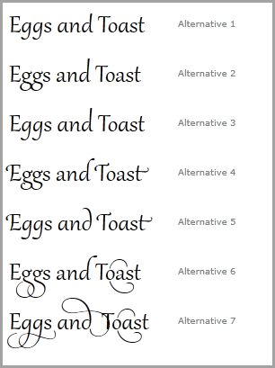
Type designers like to create fancy ligatures for capital letters, especially if the letter appears as the first letter of the starting word of a magazine article. It is not uncommon to find dozens of alternate letter versions within a professional, ?Artsy” typeface. In Silverlight, these are called contextual alternates. Each character is fine-tuned based on the characters on either side of its position in the document. In this example, there are two properties set. First, the ContextualAlternates property is set to true. Then you specify which alternate set of fonts to use.
<TextBlock Text='Eggs and Toast'
           Typography.ContextualAlternates='True'
           Typography.StylisticSet6="True"
           FontFamily='Gabriola'
           FontSize='32'
           MinWidth='180' />
Feast your eyes on the extravagant alternates available in the Gabriola font in Figure 7.
PivotViewer
PivotViewer is a powerful tool for visualizing data collections in a rich graphical way. I like watching PivotViewer users interacting with large datasets in a natural way, quickly exploring patterns in the data. It has an impressive UI with lots of flash and transition magic, which makes sorting and categorizing the data an entertaining experience. See for yourself at http://netflixpivot.cloudapp.net/
The trouble I have with the Silverlight 4 version is that you must convert your data to the special Pivot collection format and generate a corresponding DeepZoom image collection. The generated data is stored in a static XML file, which means when the underlying data changes you need to regenerate both the image collection and the XML data. Microsoft provides a set of tools to simplify the conversion process but I would be happier if I could use my existing collections without resorting to the extra fuss.
The Silverlight 5 PivotViewer does away with the DeepZoom image collection. Now you define a data template for each data item. These data templates are flexible and definable for each zoom level. For example, you could create a summary template for general level zoom and detail templates for closer zoom levels.
Another plus is that you can bind to any collection; using the old CXML format from the prior version is no longer required. If you have a bindable source in your code-base, you can use it in the PivotViewer.
Using Standard Collections in PivotViewer
The first step to using the new PivotViewer is to add a reference to the System.Windows.Controls.Pivot.dll. Then add the following xmlns to your XAML.
xmlns:pivot="clr-namespace:
 System.Windows.Controls.Pivot;
 assembly=System.Windows.Controls.Pivot"
Add the PivotViewer to the XAML. To allow the user to sort and filter the data, add a Pivot for each property.
 <pivot:PivotViewer  Name='pivotViewer1'>
 <pivot:PivotViewer.PivotProperties>
  <pivot:PivotViewerStringProperty Id="FoodName"
   Options="CanFilter"
   DisplayName="Food Name"
   Binding="{Binding FoodName}" />
  <pivot:PivotViewerStringProperty Id="Department"
   Options="CanFilter"
   DisplayName="Department"
   Binding="{Binding Department}" />
  <pivot:PivotViewerStringProperty Id="Organic"
   Options="CanFilter"
   DisplayName="Organic"
   Binding="{Binding Organic}" />
 </pivot:PivotViewer.PivotProperties>
In the code behind, bind the PivotViewers.ItemsSource property.
  var foods = new Foods();
  pivotViewer1.ItemsSource = foods.GetAll();
Finally, define a custom data template for the bound data in the PivotViewer.
 <pivot:PivotViewer.ItemTemplates>
  <pivot:PivotViewerItemTemplate>

  <Border Background='Orange'
  Width='180'
  Height='140'>
 <StackPanel Orientation="Vertical">
 <TextBlock Text="{Binding FoodName}"
  Foreground='Red' />
  <!-- the other datatemplate XAML removed... -->
  </StackPanel>
 </Border
  </pivot:PivotViewer.ItemTemplates>
</pivot:PivotViewerItemTemplate>
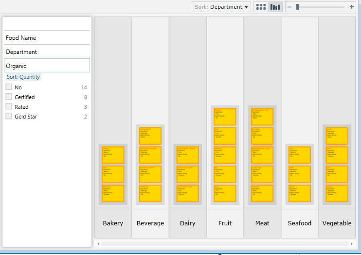
Figure 8 shows an example of what the PivotViewer looks like at runtime. Trust me, if you haven’t played with PivotViewer, you need to run the sample code and see it in action to understand the appeal of this control.
Media Improvements
Silverlight 5 exposes a few changes in the media stack.
Variable Speed Playback
Trickplay is the name for this handy “Training” features. You can speed up or slow down the video playback without changing the pitch of the audio track. To use Trickplay, just set the PlaybackValue property on the MediaElement. Silverlight handles the speed adjustments and normalizing the audio pitch for you.
 <!-- In XAML -->
<MediaElement  PlaybackRate='1.5'
   Stretch="Fill"
   AutoPlay='True'
   Source="Boots.mp4"
   x:Name="media1" />

  // or in code behind
  media1.PlaybackRate = .5;
Improved Video Decoding
Graphics cards and the Graphics Processing Unit (GPU) revolutionized motion and image rendering on the PC. The Silverlight engineers bring the power of the GPU to video decoding in Silverlight 5. Using the GPU to carry out this task on the client is clever and results in faster decoding and lower energy consumption.
Speaking of decoding, let’s take a minute and talk about the new H.264 codec added to Silverlight 5. H.264 continues to gain popularity as the primary codec for encoding TV and other video for device playback. It’s only natural that Microsoft would add H.264 support because it is a popular codec and content providers won’t have to re-encode their material to use in Silverlight.
Improved Power Smarts
Here’s an exasperating scenario you’ve probably encountered. You’re streaming a full-length movie and just getting to a riveting action scene when the screen saver kicks in destroying the ambience. Silverlight 5 uses the same power modes as Windows Media player. That means that Silverlight suppresses the screensaver when a Silverlight application is playing a video and the application is in full screen mode.
SoundEffects
In prior versions of Silverlight the MediaElement was the principal way to add audio to your application. It’s the obvious choice for playing songs and videos but it has some shortcomings when playing sound effects. Effects, like playing a beep sound when the user successfully touches a UI element, provide immediate audio feedback for the user. Because the MediaElement suffers from latency problems it’s it difficult to play a sound effect with it in a timely manner. Luckily for us the XNA library provides an alternate class which solves the problem. This XNA feature also allows the use of raw WAV files within your application.
The first step in adding sound effects is to add a reference to the Microsoft.Xna.Framework.dll. Then add the following to the top of your code file.
using Microsoft.Xna.Framework.Audio;
Add a WAV file to your project and set its build action to Content. There are a few restrictions on the type of WAVs that can utilized in Silverlight.
WAV file restrictions
- PCM format
- Mono or stereo content
- 48 kHz, 44.1 kHz or 22.5 kHz sample rates
- 8 bit or 16 bit data only
To play the WAV file requires only a few lines of code.
var resource =
  Application.GetResourceStream(
  new Uri("media/bleep.wav",
   UriKind.Relative));
 var effect =
  SoundEffect.FromStream(resource.Stream);
 effect.Play();
The SoundEffectInstance class provides a more efficient way of loading an effect especially when you use the effect in multiple places. SoundEffectInstance also provides extra features (like looping) that are not available in SoundEffect.
This code snippet builds on the previous one. I create two loopable SoundEffectInstances and give each instance a different pitch and volume.
  var instance = effect.CreateInstance();
  instance.IsLooped = true;
  instance.Pitch = 1.0f;

  instance.Volume = 0.8f;
  instance.Play();

  var instance2 = effect.CreateInstance();
  instance2.IsLooped = true;
  instance2.Pitch = -1.5f;

  instance2.Volume = 0.9f;
  instance2.Play();
Audio and Silverlight are interesting topics and worthy of appearing in a separate article. As it happens, I wrote about music, sound and media for Silverlight and Windows Phone in the Sept/Oct 2011 issue of CODE Magazine.
True 3D Rendering
The multitudes asked for real 3D modeling and rendering for Silverlight, their voices singing out loud and clear. Microsoft heard the chorus and produced a new 3D engine for Silverlight 5. They accomplished this by porting a version of the XNA graphics engine to Silverlight. If you are an experienced XNA developer, you should have no problem adapting to the Silverlight version. If you are just starting 3D development, you have some brain twisting discoveries in your future.
You’ll need to reference the System.Windows.Xna.dll to add 3D support to your project. That gives you access to a number of graphic primitives. You’ll also find some basic shader effects like AlphaTestEffect, BasicEffect, DualTexture, EnvironmentMapEffect and SkinnedEffect in the dll. Microsoft also ported the 3D math library (Microsoft.Xna.Framework.Math.dll) which contains the matrix, vector and other essential 3D classes. You still need to know a lot about XNA development to work with these libraries. Don’t worry much about it though because the Silverlight Toolkit team is shipping additional tools to simplify your 3D development tasks.
If you are an experienced XNA developer, you should have no problem adapting to the Silverlight version. If you are just starting 3D development, you have some brain twisting discoveries in your future.
The Silverlight 5 Toolkit - September 2011 version contains many new XNA features. Among the more interesting of these are 3D models, custom effects, Spritebatch, ContentManager and mouse/keyboard input handlers. The toolkit also contains a ton of interesting 3D samples for you to investigate. I suggest you download a copy and see what it contains before doing much 3D development.
http://silverlight.codeplex.com/releases/view/74436
To explore the new 3D capabilities in any depth would require another full article, so I’ll just cover some of the highlights here. Because Silverlight use the GPU to render the 3D items, you need to enable GPU acceleration on the Silverlight plugin.
<!-The Silverlight plugin in HTML -->
<object data="data:application/x-silverlight-2,"
  type="application/x-silverlight-2"
  width="100%"
  height="100%">
<param name="EnableGPUAcceleration"
 value="true" />
</object>
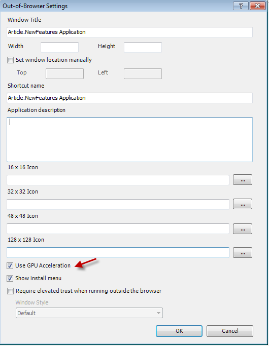
You can also enable acceleration with the Out of Browser dialog in Visual Studio as shown in Figure 9.
The DrawingSurface is the element for rendering 3D content to your visual tree.
<Grid x:Name ="ThreeDSection"
  Background ="#004400">
  <DrawingSurface Draw ="OnDraw"
    Loaded="OnLoaded"
    Width ="500"
    Height ="650" />
</Grid>
Whenever Silverlight is ready to draw the next frame, it raises the DrawingSurface Draw event. You compose and render your 3D world within this event procedure.
Listing 3 contains an example taken from the Silverlight Toolkit showing the basic code needed to animate a 3D model. Figure 10 shows the mercenary soldier as rendered in the Silverlight application. Be sure and check out the Skinning project in the Silverlight Toolkit to see all the XNA code and assets.

Ending Too Soon
In this article, I showed eight areas where Silverlight has improved. The list of changes has grown dramatically since the early betas. I spent a good deal of my time these last three months keeping up with the added features. There’s more I’d like to write about but this article is overdue for a conclusion.
Pete Brown has a good list of the changes in the Silverlight platform on his site. See the sidebar for a link to his site and other useful resources.
Listing 1: Implicit Data Templates
<UserControl.Resources>
    <DataTemplate DataType='model:Produce'>
      <Border BorderBrush="Green"
              BorderThickness='2'
              Margin='5,2'
              Padding='2' Background='Honeydew'
              >
        <StackPanel Orientation='Horizontal'>
          <TextBlock Text='+' Margin='0,0,8,0'/>
          <TextBlock Text="{Binding Path=FoodName}"
                   MinWidth='150'>

          </TextBlock>
        </StackPanel>
      </Border>
    </DataTemplate>

    <DataTemplate DataType='model:Bakery'>
      <Border BorderBrush="Brown"
              BorderThickness='2'
              Margin='5,2'
              Padding='2'
              Background='Tan'>
        <StackPanel Orientation='Horizontal'>
          <TextBlock Text='?'
                     Margin='0,0,8,0' />
          <TextBlock Text="{Binding Path=FoodName}"
                     MinWidth='150'>

          </TextBlock>
        </StackPanel>
      </Border>
    </DataTemplate>

    <DataTemplate DataType='model:Dairy'>
      <Border BorderBrush="Gold"
              BorderThickness='2'
              Margin='5,2'
              Padding='2'
              Background='LightGoldenrodYellow'>
        <StackPanel Orientation='Horizontal'>
          <TextBlock Text='?'
                     Margin='0,0,8,0' />
          <TextBlock Text="{Binding Path=FoodName}"
                     MinWidth='150'>

          </TextBlock>
        </StackPanel>
      </Border>
    </DataTemplate>

  </UserControl.Resources>

    <Grid x:Name="LayoutRoot" Background="White">
    <Grid.RowDefinitions>
      <RowDefinition Height='43*' />
      <RowDefinition Height='257*' />
    </Grid.RowDefinitions>
    <ListBox ItemsSource='{Binding}' Grid.Row='1'
             Grid.RowSpan='2'></ListBox>
    <TextBlock FontSize='16'

               Margin='8'
               Name='textBlock1'
               Text='Implicit Data Templates'
              />
  </Grid>
Listing 2: Composition Thread for Animation
<Grid Name='ImageGrid'
      Grid.Row='1'
      CacheMode='BitmapCache'>
  <Grid.Resources>
    <Storyboard x:Name="RotateImageStoryboard">

      <DoubleAnimation BeginTime="00:00:00"
                  Duration='00:00:05'
                  Storyboard.TargetName="ImageGrid"
                  Storyboard.TargetProperty=
                     "(UIElement.Projection).(RotationY)"
                   RepeatBehavior="Forever"
                   AutoReverse="True"
                   From="80"
                   To="-80">

      </DoubleAnimation>

    </Storyboard>
  </Grid.Resources>
  <Image
    Source='/Article.NewFeatures;component/Images/DudeHead.png'
    Width='120'
    Name='imageDude'
    Margin='140,0' />

  <Grid.Projection>
    <PlaneProjection RotationY="0"></PlaneProjection>
  </Grid.Projection>
</Grid>
Listing 3: Silverlight code that renders a XNA model
// Code from the Silverlight Toolkit 3D samples
  ContentManager contentManager;

   Model currentModel;
   AnimationPlayer animationPlayer;

   float cameraArc = 0;
   float cameraRotation = 0;
   float cameraDistance = 100;


   private void OnLoaded(object sender, RoutedEventArgs e)
   {
  contentManager = new ContentManager(null) {
 RootDirectory = "Content"
  };

  // Load the model.
  currentModel = contentManager.Load<Model>("dude");

  // Look up the custom skinning information.
  SkinningData skinningData = currentModel.Tag as SkinningData;

  if (skinningData == null)
      throw new InvalidOperationException
     ("This model does not contain a SkinningData tag.");
  // Create an animation player,
  // and start decoding an animation clip.
  animationPlayer = new AnimationPlayer(skinningData);

  AnimationClip clip = skinningData.AnimationClips["Take 001"];

  animationPlayer.StartClip(clip);
   }


   private void OnDraw(object sender, DrawEventArgs e)
   {
  GraphicsDevice graphicsDevice =
          GraphicsDeviceManager.Current.GraphicsDevice;

  // Update the skinned animation player.
  animationPlayer.Update(e.DeltaTime, true, Matrix.Identity);

  Matrix[] bones = animationPlayer.GetSkinTransforms();

  // Compute camera matrices.
  cameraRotation += (float)e.DeltaTime.TotalSeconds * 10;

  Matrix view = Matrix.CreateTranslation(0, -40, 0) *
    Matrix.CreateRotationY(MathHelper.ToRadians(cameraRotation)) *
    Matrix.CreateRotationX(MathHelper.ToRadians(cameraArc)) *
    Matrix.CreateLookAt(new Vector3(0, 0, -cameraDistance),
    new Vector3(0, 0, 0), Vector3.Up);

  Matrix projection =
  Matrix.CreatePerspectiveFieldOfView(MathHelper.PiOver4,
             graphicsDevice.Viewport.AspectRatio,
             1,
             10000);

  Color cornflowerBlue = new Color(0x64, 0x95, 0xED, 0xFF);

  graphicsDevice.Clear(cornflowerBlue);

  // Render the skinned mesh.
  foreach (ModelMesh mesh in currentModel.Meshes)
  {
      foreach (SkinnedEffect effect in mesh.Effects)
      {
     effect.SetBoneTransforms(bones);

     effect.View = view;
     effect.Projection = projection;

     effect.EnableDefaultLighting();

     effect.SpecularColor = new Vector3(0.25f);
     effect.SpecularPower = 16;
      }

      mesh.Draw();
  }

  // Force a redraw so this control will continuously animate.
  e.InvalidateSurface();
   }


