Microsoft released ASP.NET MCV 3 just over a year ago. If history is a good indicator of timing, we can expect the next ASP.NET MVC release in the not too distant future. As of this writing’s date, Microsoft has not announced a firm release date. You don’t, however, have to wait to get your hands on the bits. You can download the developer preview here: http://www.asp.net/mvc/mvc4. ASP.NET MVC 4 also runs inside of Visual Studio 10 and the Visual Studio 11 Developer Preview. MVC 4 can be hosted alongside MVC 3. You can find all the details concerning installation in the aforementioned link. As with all developer preview/pre-release software, features sets are subject to change, which may range from minor tweaks to major changes. Please keep that in mind as you evaluate any developer preview as to how you can incorporate it into your development efforts.
Major New Features that Microsoft has Announced Thus Far
According to the public site, the following are the major new features that are part of the ASP.NET MVC 4 roadmap:
- Revamped project templates
- New mobile project template
- Recipes (a new method to generate code)
- Enhanced support for async methods
In this article, I’ll take a quick look at two of the four major features: revamped project templates and the mobile project templates. In the next article, I’ll address recipes and async support. Hopefully by the time part 2 comes out, Microsoft will announce a more definitive release date for ASP.NET MVC 4 and they will lock-in the feature set. For a complete list of announced new features, be sure to refer to the release notes http://www.asp.net/whitepapers/mvc4-release-notes.
Revamped Project Templates
The steps to create an ASP.NET MVC project have not changed. However, ASP.NET MVC 4 presents you with a new option in the new project dialog box illustrated in Figure 1.
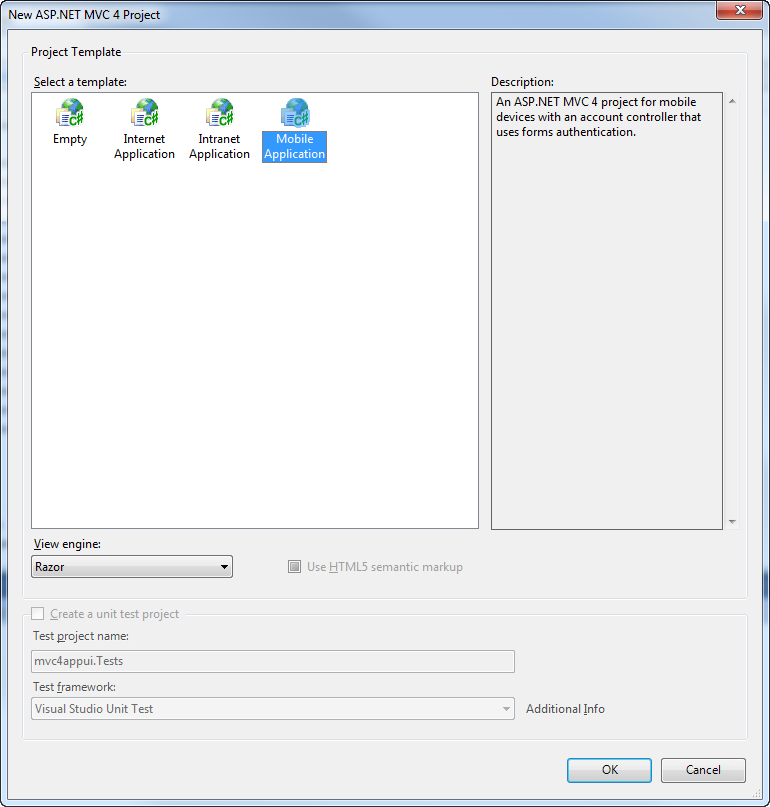
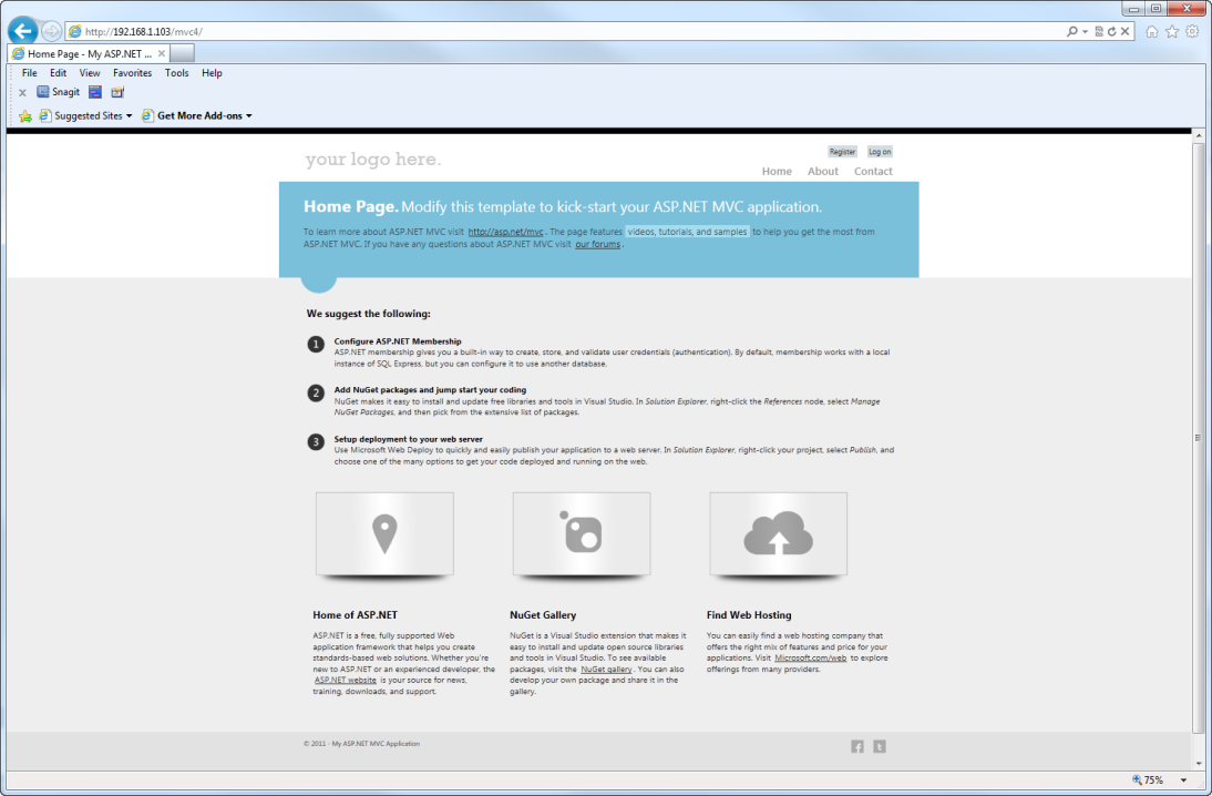
I will discuss the new mobile project application template in the next section. To illustrate the new default Internet/intranet project templates, let’s keep the defaults in Figure 1. As you can see in Figure 2, ASP.NET MVC 4 has a significantly revised CSS design.
Even if you do not take advantage of the new mobile application templates, through a technique called adaptive rendering, your application will adjust to different form factors as illustrated in Figure 3.
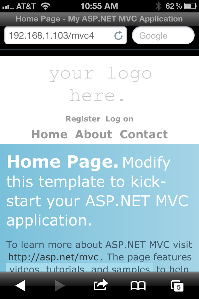
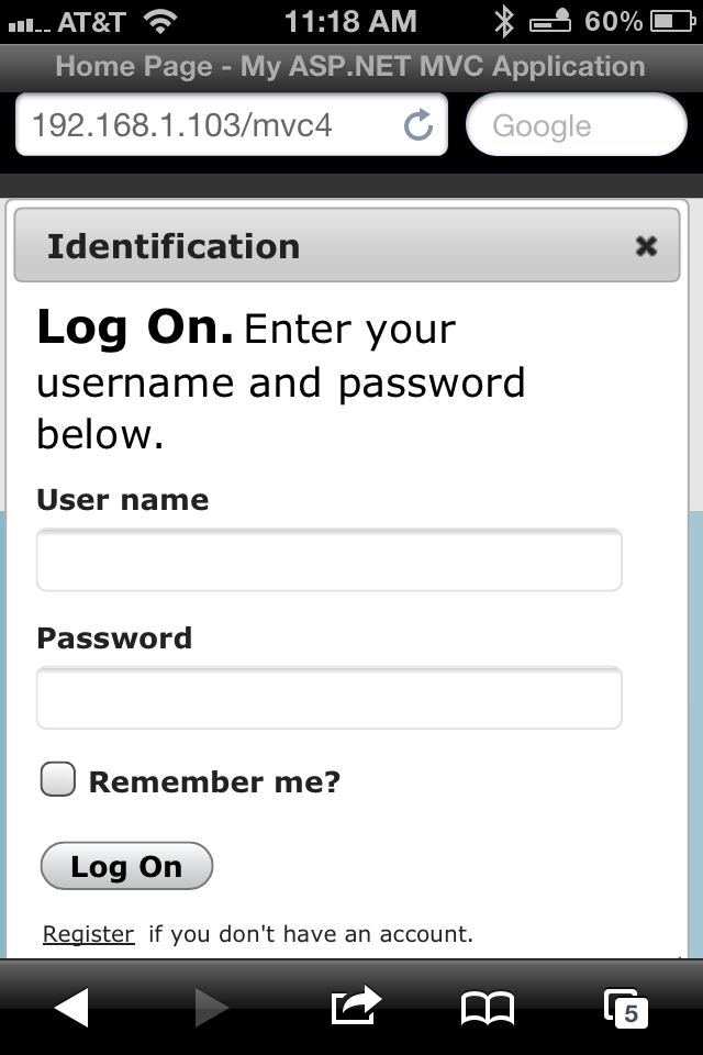
Figure 4 illustrates how adaptive the rendering is with respect to the new Ajax-based login screen.
As you navigate through the project artifacts to see what’s new, be sure to focus on the Views/Shared/_Layout page. Structurally, it is very similar to ASP.NET MVC 3. In ASP.NET MVC 4, you will see a number of new additions in the header:
- jQuery UI CSS
- jQuery UI js library
- Ajax login js library
In addition, you will see a number of new CSS class definitions. For example, the new content-wrapper class encapsulates the body which facilitates centering. Returning to the header section, you will now find this code:
<meta name="viewport" content="width=device-width">
Viewport is an HTML 5 meta tag that controls how your content will appear in mobile browsers. This, in combination with the new CSS classes is how adaptive rendering works in ASP.NET MVC 4. While you could have always added this yourself, it’s nice to have the default project templates handle these tasks.
New Mobile Project Template
While adaptive rendering of a site that is primarily designed for desktop browsers will get you pretty far, there are situations when you will want to create a site that is written specifically for mobile devices. Recognizing that need, the ASP.NET MVC 4 team went ahead and gave us a mobile application template out of the box. In the Jan/Feb 2012 issue of CODE Magazine I introduced you to jQuery Mobile. As you learned, it was relatively simple to incorporate the jQuery Mobile libraries and CSS into your existing applications. Nevertheless, for those that are just getting up and running with jQuery Mobile, it’s nice to have all of that in the box. Figure 5 illustrates how the home page (home/index) appears in a desktop browser.
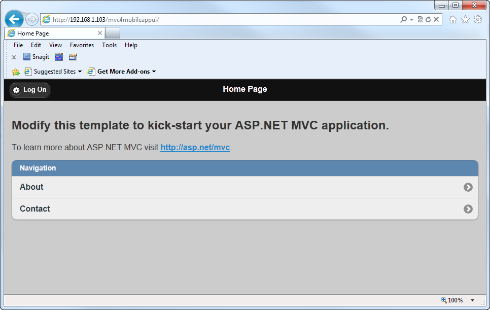
Figure 5 is probably not what you would want rendering to the desktop. Then again, I used jQuery Mobile to optimize this project for mobile devices. Figure 6 illustrates how the home page appears on a mobile device.
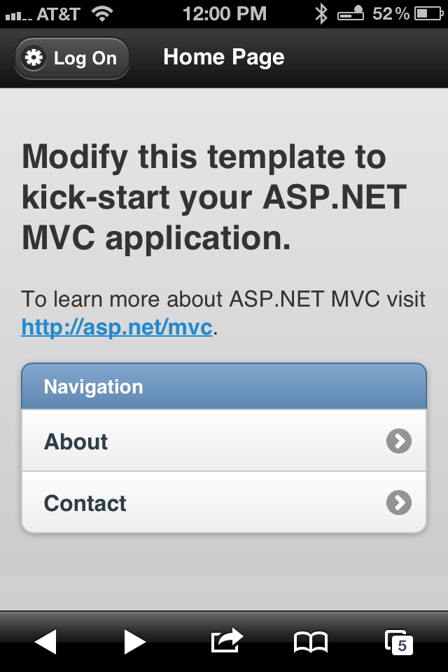
Reviewing the contents in Views/Shared/_Layout.cshtml, we see something that is far less complex than its Internet/intranet application template counterpart. In the header section, you will find references to the jQuery Mobile CSS and js library resources. As with other jQuery Mobile pages, you will find references to the HTML 5 semantic markup data-role item.
The support for mobile applications looks very encouraging. Up to this point, you have seen two separate examples where in each case I demonstrated a distinctive project template. What about cases where you have one project that could serve content to a variety of devices? What about cases where you want a view optimized for a mobile device to be rendered when a mobile device requests content but also render a view optimized for the desktop when a desktop browser requests content? This is where the new jQuery.Mobile.MVC Package comes in handy.
Introducing the New jQuery.Mobile.MVC NuGet Package
In the real world your application will need to be able to service multiple form factors: desktop, tablet, smartphone, etc. Users expect that when they hit your site with a smartphone, the UI will be optimized for that device. As you have already seen, jQuery Mobile is well suited to this task. We have also seen how well the new mobile application template consumes the jQuery Mobile services. On the back end, one approach to servicing various clients is to have separate optimized sites. Another approach is to have one site and have that one application sort out the details of which view to render based on the client that is making the request. In other words, change the display mode based on the client (desktop, iPhone, Windows Phone, tablet, etc.) that is making the request. This second approach will appeal to many developers and it will be the focus of the remaining parts of this article. In order to make this second approach work, we will want to use NuGet to install the jQuery Mobile MVC Package. From the Package Manager Console, type the following command:
PM> Install-Package jQuery.Mobile.MVC
Be sure to have the latest version of NuGet installed. As of this writing, the latest NuGet version is 1.6.21215.9133. For more information on NuGet, visit nuget.org.
Figure 7 illustrates the Package Manager Console output after running the previous command.
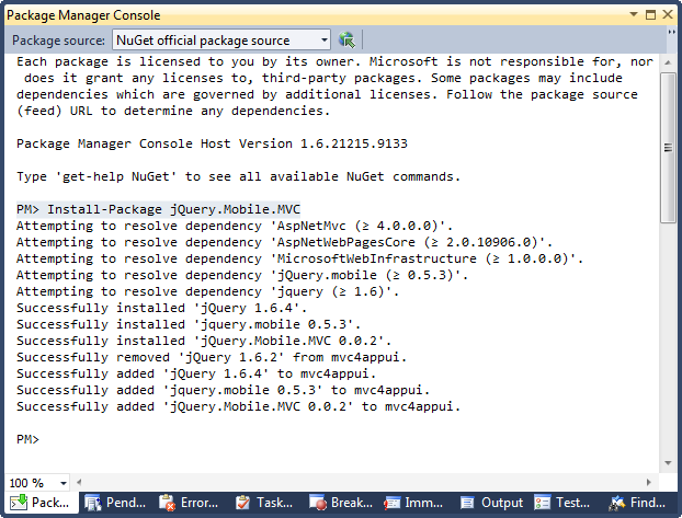
Installing the package adds a number of new items to the project:
- Views/Shared/_Layout.Mobile.cshtml
- Views/Shared/_ViewSwitcher.cshtml
- Controllers/ViewSwitcherController.cs
- jQuery Mobile support files (jQuery js/css, etc.)
If you are seeing JavaScript errors indicating that jQuery is not defined, be sure to review the script references in the Layout and Layout.Mobile views. The jQuery references may be incorrect. Review the jQuery version you have in the /Scripts folder in the solution explorer. Chances are there is a mismatch in the version # (contained in the file name) between what is in the scripts folder and what the layouts are referencing. Simply adjust the names in the layout views to what is in the scripts folder and re-run the app.
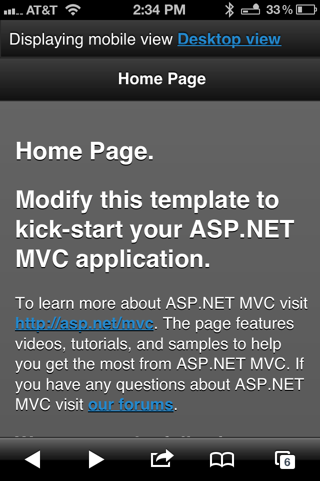
If you navigate to the app from a desktop browser, you will not see any difference in the way the app is rendered. The app will appear just like it did in Figure 2. On the other hand, if you navigate to your app from a mobile device, the rendered view is significantly different as illustrated in Figure 8.
From the desktop you can force the framework to render the mobile view by invoking ViewSwitcher/SwitchView action (replace this server with what is appropriate for your specific environment):
http://192.168.1.103/mvc4/viewswitcher/switchview?
mobile=true&returnurl=/mvc4/
Figure 9 illustrates a breakpoint in the ViewSwitcher Controller SwitchView Action Method.
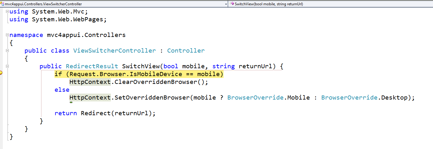
If the browser making the request is actually a mobile device, than any overridden browser settings are cleared. If the browser is not a mobile device than a browser override setting is established. In the case of a desktop browser, the mobile version will be rendered. From that point on, if the user navigates directly to the home page (home/index), the mobile version will be rendered. To reverse these effects, simply navigate to the ViewSwitcher/SwitchView action and set the mobile parameter to false:
http://192.168.1.103/mvc4/viewswitcher/switchview?
mobile=false&returnurl=/mvc4/
Display Modes
Within the mobile device space we can get more specific with display modes. To illustrate, let’s assume that we wish to render a specific view whenever an iPhone hits the site. For every other mobile device, the default mobile view should be rendered. To make this happen, there are a few things we have to put in place. First, in the Application_Start () in the Global.asax file, we need to add this code:
DisplayModes.Modes.Insert(0, new
DefaultDisplayMode("iPhone")
 {
  ContextCondition = (context =>
 context.Request.UserAgent.IndexOf
 ("iPhone", StringComparison.OrdinalIgnoreCase) >= 0)
});
This code adds an iPhone entry to the DisplayModes.Modes hash. By default there are already two entries in that hash: a Default entry and another for Mobile. With this entry, there will be three items in the hash. Next we need to create a new layout. ASP.NET MVC has, at its core, the concept of convention over configuration. To illustrate the point, I added a new view under /Views/Shared and I named it _Layout.iPhone.cshtml. I copied the contents of the existing _Layout.Mobile.cshtml and added one thing to the top of the page:
@{
    ViewBag.Title = "_Layout.iPhone";
}
Figure 10 illustrates the view that is rendered when navigating to the home page with an iPhone.
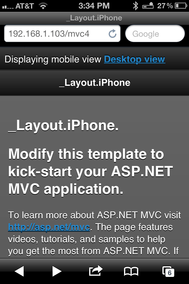
If you navigate to the same page from any other mobile device, the default mobile layout (_Layout.Mobile.cshtml) will be rendered.
Conclusion
As you can see, if I could summarize ASP.NET MVC 4 in one phrase it would be “Mobility Support - Out of the Box!” Granted, we could do these same things with MVC 3. But it would have required us to roll our own templates and in spite of our best efforts, nothing would be baked into the framework. Display Modes is a great example of why we want such things baked into the framework. And like so much in the ASP.NET MVC Framework, we get the best of both worlds: baked in functionality and extensibility. This reminds me of when Microsoft introduced remote validation in ASP.NET MVC 3. Again, we were able to achieve the same things before. With remote validation being baked into framework, a much more elegant solution evolved, one that makes it easier to bring new folks on board. These new baked-in mobility features will make it easier than ever for developers who have wanted to extend their mobile applications to mobile devices. In part 2 of this series, I’ll pick up with two additional major features in ASP.NET MVC 4: recipes and async method support. Recipes are code generation plugins that are supported through NuGet. Perhaps you have wanted to customize what happens when you add an area, controller, view, etc. Recipes will make that task easier than before. As for async method support, this feature ties into the C# 5 and the Async CTP (http://msdn.microsoft.com/en-us/vstudio/async.aspx). Perhaps you have a long running task that you would like to make cancellable. While we have been able to handle these tasks with Ajax and JavaScript, it would be nice if we could achieve the same thing with native C# code.


