Many people will not be able to upgrade to Windows 8 right away for various reasons. However, there is nothing to stop you from designing your WPF applications to have a similar look and feel.
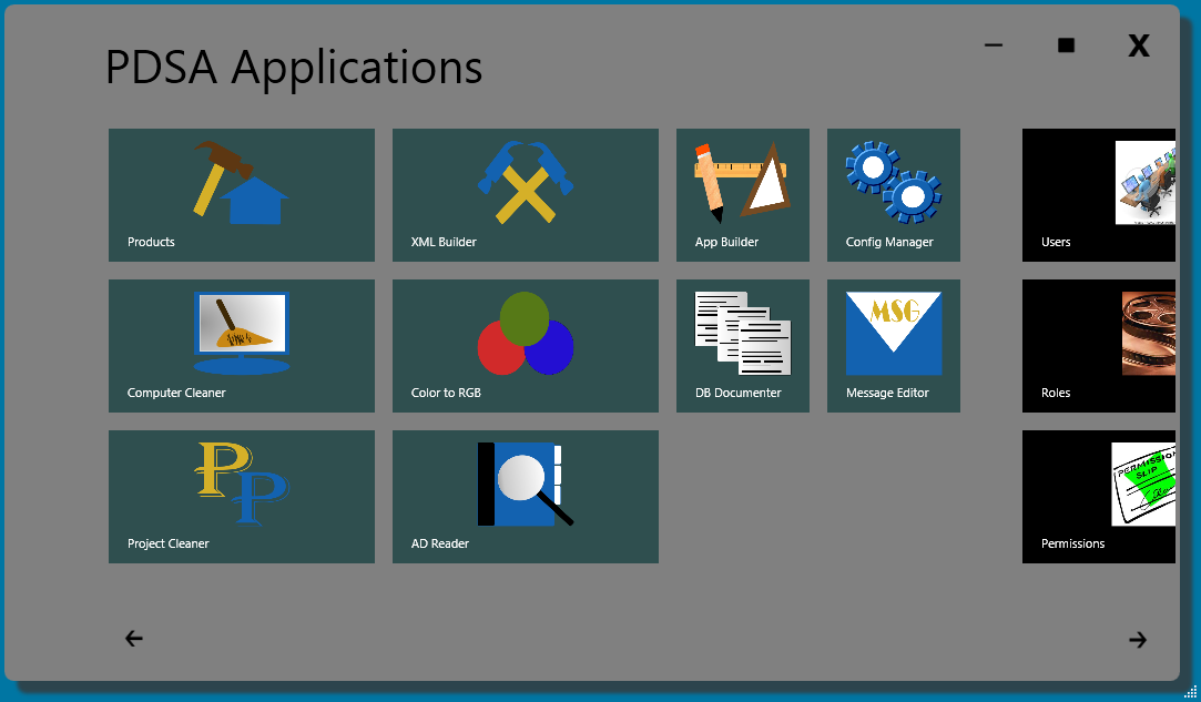
In this article I will show you how to create a Windows 8 style shell (Figure 1) for hosting “Tiles” that you can use to launch features of your application. The first part of this article will discuss how to create the main window, use the tiles to launch applications and how to navigate around the shell. In the second part of this article you will learn about the different user controls used to build this application.

Designing the Home Screen
Figure 1 shows a shell that has a Windows 8 start screen look and feel. I did add a couple of items to make it a little more familiar to Windows 7 users. In the upper right hand corner are the familiar minimize, maximize and close buttons. I also added two arrows at the bottom of the screen to inform users that they can scroll left or right through the tiles. If the user hovers over the tile area for greater than 1.5 seconds, a scroll bar appears. When they hover over a tile, a border is drawn around it to inform the user that they can click on this tile to launch that feature.
Create a Borderless Main Window
The first step to creating your Windows 8 style shell is to create a WPF window that has no border. Set the following attributes on your window to create this borderless window.
- WindowStyle=None
- ShowInTaskBar=True
- AllowsTransparency=True
- Background=Transparent
The WindowStyle attribute allows you to set a single border, 3-D border or a Tool Window border. Setting this attribute to None eliminates the border completely. The ShowInTaskbar attribute is optional, but for a shell window like this you probably want it to show up in the Windows task bar. The next two attributes, AllowsTransparency and Background, work together. You must set AllowsTransparency to True to allow the Background to be set to Transparent. If you do not set these two attributes, then your border is still displayed.
The first step to creating your Windows 8 style shell is to create a WPF window that has no border.
You need to set two additional attributes on the shell window. You’ll set the WindowStartupLocation attribute to “CenterScreen” to ensure that the shell window displays in the middle of the screen when it first appears. The other attribute, ResizeMode, is set to “CanResizeWithGrip,” which displays a grip in the bottom right corner of the screen. This allows the user to resize the shell window.
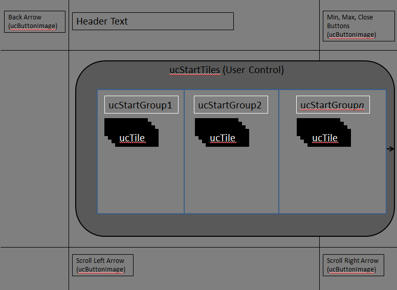
The first control in the Window is a Border with a Gray background color, a CornerRadius of 10, and a drop shadow. This border control sets the shape for this window and offsets this window from the underlying desktop. Inside of the Border is a Grid with the rows and columns needed to layout this screen. There are three rows and three columns that make up this shell window. Figure 2 shows a graphic that describes what is in each row and column. The shell window is made up of many different user controls that will be covered in Part 2 of this article.

Adding Events to the Main Window
Since you removed all of the chrome from the window which usually has buttons for minimizing, maximizing and closing, you need to add your own controls and thus your own code to handle the Click events on these controls. Since you removed the title bar area the user has nothing to click on to drag the window so you need to write this code as well.
Drag Event
Add an event handler to the window for the MouseLeftButtonDown event. In this event you’ll write code to check to see if the mouse is currently pressed and if it is you’ll invoke the DragMove method on the window. This allows the user to drag this window around the screen when the window is not minimized or maximized.
private void Window_MouseLeftButtonDown(object sender,
 MouseButtonEventArgs e)
{
  if (e.ButtonState == MouseButtonState.Pressed)
    this.DragMove();
}
Maximize Event
If the user double-clicks on the window itself, or clicks on the maximize button in the upper right-hand corner, toggle the window between a maximized and normal state. Both the MouseDoubleClick event on the window and the Click event for the maximize button call a method named ToggleWindowState (Listing 1).
Maximizing and making the window a normal size is not just as simple as setting the WindowState property to Maximized or Normal. Since there is a drop shadow around the main window, when you maximize this screen you need to make that shadow go away. In addition, any margin on the border control needs to be set to 0 when maximized. When the user then wants to set the screen back to normal mode, set the drop shadow and the margin back to what they were.
The ToggleWindowState method checks to see if the current window state is normal and if it is, saves the drop shadow effect and the current margin into a couple of private properties. The Effect property of the border is set to null and the border’s Margin property is set to a Thickness of 0. The Maximize button’s ToolTip property is changed to “Restore Down” and the WindowState is set to Maximized. If the WindowState property is Maximized when ToggleWindowState is called this process is reversed.
Minimize Event
When the user presses the minimize button in the upper right-hand corner of the window, the shell window needs to be minimized. Minimize the window by setting the WindowState to Minimized as shown in the following code snippet:
private void btnMinimize_Click(object sender,
  RoutedEventArgs e)
{
  this.WindowState = WindowState.Minimized;
}
Close Event
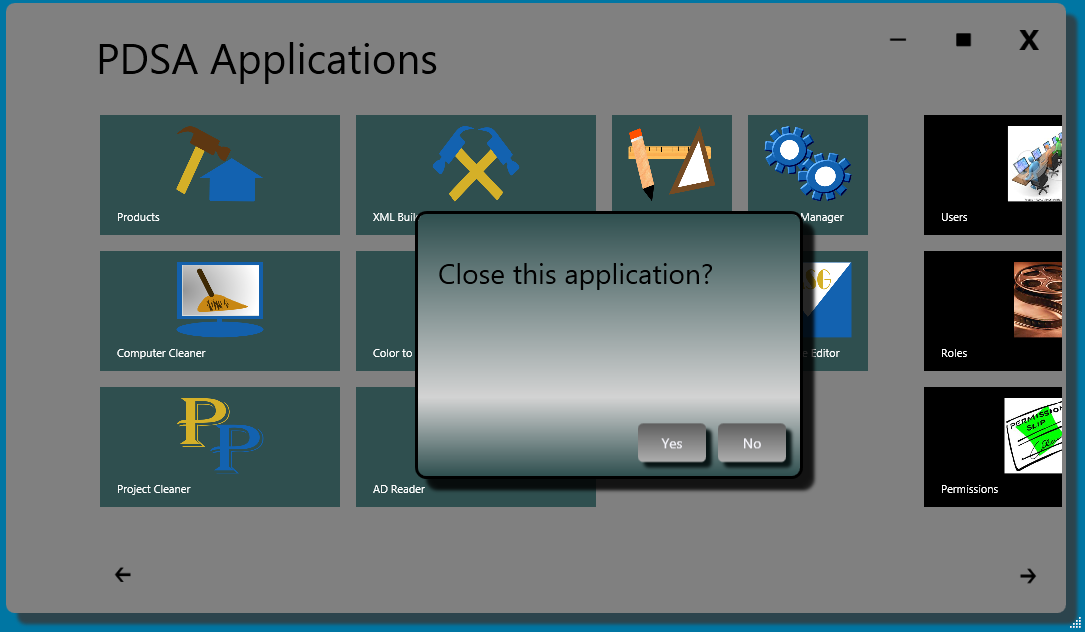
When the user presses the Close button you should ask the user whether or not they wish to close the application. You can popup a regular Windows dialog using the MessageBox.Show method. However, this Windows dialog design does not match our nicely styled WPF window. Instead, I have created a custom message box that can be styled like our main window as shown in Figure 3. My class called PDSAMessageBox has a Show method with many of the same signatures as the .NET MessageBox.Show method. To display the message box shown in Figure 3 you call the PDSAMessageBox Show method as shown below:

private void btnClose_Click(object sender,
 RoutedEventArgs e)
{
  if (PDSAMessageBox.Show("Close this application?",
      "Close", MessageBoxButton.YesNo) ==
         MessageBoxResult.Yes)
    this.Close();
}
Working with Start Tiles
In the middle of the window is an area that has all of the various start tiles that a user can click on in order to navigate from one area of your application to another. In the sample WPF application for this article, only the first tile (Products) actually goes anywhere, the rest are all just placeholders. You will see how to create the different groups of tiles later, but for now, let’s look at how you control scrolling the tiles.
There is a single user control called ucStartTiles for all of the groups of the start tiles. The ucStartTiles contains three additional user controls named ucStartGroup1, ucStartGroup2 and ucStartGroup3. You can add as many groups of tiles as you need for your application. The ucStartTiles control is contained within a ScrollViewer control since you could have more groups of tiles than can fit within the current window size. This scroll viewer has the horizontal scroll bar invisible so you can control this visibility manually. The vertical scroll bar is set to Auto so if the user sizes the window where the height is no longer sufficient to fit the tiles then the vertical scroll bar is shown automatically. The XAML for the scroll viewer and the start tiles user control is shown in the following code snippet:
<ScrollViewer Name="scrollTiles"
  BorderBrush="Transparent"
  Background="Transparent"
  MouseEnter="scrollTiles_MouseEnter"
  MouseLeave="scrollTiles_MouseLeave"
  ScrollViewer.VerticalScrollBarVisibility="Auto"
  ScrollViewer.HorizontalScrollBarVisibility="Hidden">

  <src:ucStartTiles x:Name="startTiles"
                    HorizontalAlignment="Left"
                    VerticalAlignment="Top" />
</ScrollViewer>
The horizontal scroll bar appears if the user hovers over the scroll viewer control for longer than 1.5 seconds. Notice the MouseEnter and MouseLeave events on the scroll viewer control. These are needed to make the scrollbar appear and disappear. In order to get the horizontal scrollbar to appear after 1.5 seconds you create a DispatcherTimer object in the window. You’ll use the DispatcherTimer in order to ensure that the Tick event runs in the same thread as the UI. Normal timers in .NET run on a separate thread and make it more difficult to affect the UI. Define the DispatcherTimer from the System.Windows.Threading namespace like the following within your main window.
private DispatcherTimer _Timer = new DispatcherTimer();
In the Window_Loaded event procedure you set the Interval property for this timer to 1500 which equates to 1.5 seconds. You then hook the Tick event procedure where you can respond to the Tick event and turn on the horizontal scrollbar.
private void Window_Loaded(object sender,
 RoutedEventArgs e)
{
  // Set the Interval to 1.5 seconds
  _Timer.Interval = TimeSpan.FromMilliseconds(1500);

  // Setup Timer for showing scroll bar
  _Timer.Tick += new EventHandler(_Timer_Tick);
}
Turn on the scroll bar in response to the Tick event shown in the code snippet below. Once the scroll bar is visible, turn off the timer so the Tick event is not repeatedly called every 1.5 seconds.
void _Timer_Tick(object sender, EventArgs e)
{
  scrollTiles.HorizontalScrollBarVisibility =
    ScrollBarVisibility.Visible;

  _Timer.Stop();
}
A timer is off by default when it is created so you need to start the timer when the user places their mouse over the scroll viewer control. Start the time in the MouseEnter event for the scroll viewer as shown below:
private void scrollTiles_MouseEnter(object sender,
  MouseEventArgs e)
{
  _Timer.Start();
}
Hide the horizontal scroll bar and stop the timer (in case it did not get stopped) in the MouseLeave event of the scroll viewer control.
private void scrollTiles_MouseLeave(object sender,
  MouseEventArgs e)
{
  _Timer.Stop();

  scrollTiles.HorizontalScrollBarVisibility =
    ScrollBarVisibility.Hidden;
}
Left and Right Buttons
In addition to using the scroll bar to scroll the tiles to the left and right, you should add left and right arrow buttons at the bottom of the screen to give the user an additional indication that they can scroll the tiles. These two buttons each have a Click event procedure that scrolls the scroll viewer programmatically. To scroll programmatically you determine how much you wish to scroll to the left or right when you click on the buttons. In this sample I am going to scroll 15% of the size of the scroll viewer. Use a constant for this percentage amount so you can change this value in just one place.
private const double OFFSET = 1.15;
Clicking on the right button causes the Click event procedure shown in the following code fragment to fire.
private void btnRight_Click(object sender,
 RoutedEventArgs e)
{
  scrollTiles.ScrollToHorizontalOffset(
    scrollTiles.HorizontalOffset +
    (scrollTiles.ActualWidth * OFFSET));
}
In the btnRight_Click event procedure call the scroll viewer control’s ScrollToHorizontalOffset method. Pass to this method a double that specifies where to scroll to. This is just like clicking or dragging the scroll bar directly. To calculate the offset you take the actual width of the scroll viewer control and multiply this by 1.15 in order to get a number that is 15% greater than the width. You add this number to the current HorizontalOffset property of the scroll viewer. After setting this new offset, the scroll viewer control is shifted to the right by 15% (or whatever you put into the OFFSET constant).
Clicking on the left button causes the Click event procedure shown in the following code fragment to fire.
private void btnLeft_Click(object sender,
 RoutedEventArgs e)
{
  scrollTiles.ScrollToHorizontalOffset(
    scrollTiles.HorizontalOffset -
    (scrollTiles.ActualWidth * OFFSET));
}
This method performs the same calculation as you did when scrolling to the right except it subtracts the width times the offset from the number in the HorizontalOffset property.
Clicking a Tile Sends a Message
When you click on one of the tiles a message is sent to the shell window telling the window what to do. Since each tile is an individual user control and not a part of the main window, you need a way to pass a message from one control to another. A global message broker class helps us communicate from one control to another. I will discuss the details of this message broker class later, but the basics are pretty simple. A global message broker property is created in the App class as shown in the code below:
public partial class App : Application
{
  public PDSAMessageBroker MessageBroker { get; set; }

  public App()
  {
    MessageBroker = new PDSAMessageBroker();
  }
}
Each tile is a custom user control called PDSAucTile. This user control has properties such as ViewName, ImageUri and Text. Below is an example of what one of these tiles looks like:
<my:PDSAucTile
     ViewName="ProductView"
     Text="Products"
     Click="Tile_Click"
     ImageUri="/Images-Tiles/PropertyBuilder.png" />
When the PDSAucTile control is clicked upon a PDSAMessageEventArgs object is created and filled with the ViewName, the ImageUri and Text properties from the tile and a Click event is raised. In the Click event for the tile you use the global message broker to send a message with the value in the ViewName property as shown below:
private void Tile_Click(object sender,
  PDSATileEventArgs e)
{
  (Application.Current as App).MessageBroker.
    SendMessage(
      new PDSAMessageBrokerMessage(e.ViewName, null));
}
The ViewName value becomes the MessageName that can be checked for in the MessageReceived event procedure for the message broker. For example, in the main window is the following code:
void _MessageBroker_MessageReceived(object sender,
 PDSAMessageBrokerEventArgs e)
{
  switch (e.MessageName)
  {
    case "ProductView":
      SetMainPageControls(false);
      LoadUserControl(new ucProductView());
      break;

    ...
  }
}
So the “ProductView” string in the “ViewName” property on the tile got sent as a message from the tile all the way to the main window which was setup to listen for the MessageReceived event on the global message broker. Because of this event and the message sent to it, the tiles can communicate to the main window about which tile got pressed. You simply add more “case” statements to load any windows or user controls that you want to display from the main window. Using this message broker class allows your main window to control all the navigation around your application.
In the main window of your WPF application you create an event handler for the MessageReceived event of the message broker using the following code in the Window_Loaded event procedure:
private void Window_Loaded(object sender,
RoutedEventArgs e)
{
  (Application.Current as App).MessageBroker.
    MessageReceived
      += new MessageReceivedEventHandler(
        MessageBroker_MessageReceived);
}
A good practice is to clean up any event handlers you have in your windows or user controls when they are unloaded. So in the Window_Unloaded event procedure on this main window there is the following code to remove the Dispatcher Timer Tick event and the MessageBroker MessageReceived event.
private void Window_Unloaded(object sender,
RoutedEventArgs e)
{
  // Remove Timer 'Tick' Event Handler
  // for Showing Scroll bar
  _Timer.Tick -= _Timer_Tick;

  // Remove Message Broker 'MessageReceived'
  // Event Handler
  (Application.Current as App).MessageBroker.
     MessageReceived
       -=  MessageBroker_MessageReceived;
}
Displaying a User Control
Once the “ProductView” message is received by the main window, a user control is loaded into a Grid control named “contentArea.” This Grid control occupies the same row and columns as the ScrollViewer control used for the start tiles. When a new screen is loaded, the start tiles are hidden and the new screen occupies the same space as where the tiles were. Of course, you could make a new window and pop up that window over this existing shell window if you want.
When the “ProductView” message is received by the MessageReceived event procedure, two methods get called: SetMainPageControls and LoadUserControl.
case "ProductView":
   SetMainPageControls(false);
   LoadUserControl(new ucProductView());
   break;
Prior to loading a new user control you need to set the state of the main window when moving away from the start tiles. The SetMainPageControls method (Listing 2) is what sets the main window’s state. When the start tiles are visible the right and left arrow buttons are displayed. Once you navigate to another section of the application you should hide these buttons as they no longer make sense. There is an invisible back button in the upper left corner that needs to become visible so the user has a way to move back to the home screen. In addition, the scroll viewer for the start tiles is set to invisible and the Grid control for hosting the new user control becomes visible.
After setting the visibility of the various buttons and other controls you can now load a new instance of your user control into the “contentArea.” A new instance of the user control named “ucProductView” is created and passed to the LoadUserControl method shown below:
private void LoadUserControl(UserControl ctl)
{
  contentArea.Children.Clear();
  contentArea.Children.Add(ctl);
}
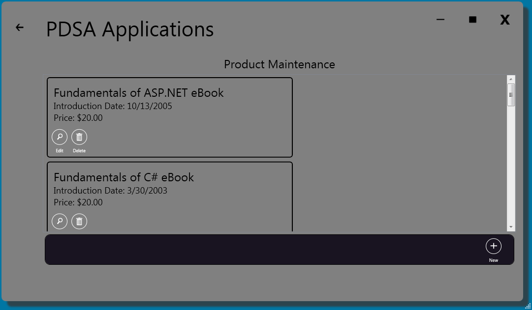
Figure 4 shows you what your screen looks like once the LoadUserControl method runs. Notice the back button displayed in the upper left corner of the screen. Also notice that the two arrows on the bottom of the screen are invisible. As mentioned, you are simply reusing the space where the start tiles were on the main window. Instead of reusing the space, you could create another window and pop up that window over the main window and keep the start tiles visible if you wish. All of this is very easy to do with just a little extra code.

When the user clicks on the Back arrow shown in the upper left corner of the screen, a Click event is fired. This Click event calls SetMainPageControls but passes a true value to tell this method to display the start tiles again.
private void btnBack_Click(object sender,
 RoutedEventArgs e)
{
  SetMainPageControls(true);
}
The SetMainPageControls method (Listing 2) clears all user controls in the “contentArea” grid. In addition, the start page buttons and ScrollViewer are made visible, and the back button is made invisible. This one method is responsible for toggling between the two different views on this window.
Summary
In Part 1 of this article I showed you how to create a Windows 8 style shell. You learned how to navigate around this shell using tiles and how the various buttons on the main window control the window size. At a high level you also saw how the tiles were created and how to scroll left and right through those tiles. A message broker is used to send messages from the various user controls back to the main window. In Part 2 of this article you will see the actual implementation of each of the user controls such as the custom buttons, tiles, message box and the message broker.
Listing 1: To toggle the WindowState you need to reset some of the properties of the border and the maximize button
private Thickness _MainBorderMargin = new Thickness();
private Effect _MainBorderEffect = null;

private void Window_MouseDoubleClick(object sender,
 MouseButtonEventArgs e)
{
  ToggleWindowState();
}

private void ToggleWindowState()
{
  if (this.WindowState == WindowState.Normal)
  {
    _MainBorderEffect = brdMain.Effect;
    _MainBorderMargin = brdMain.Margin;
    brdMain.Effect = null;
    brdMain.Margin = new Thickness(0, 0, 0, 0);
    btnMaximize.ToolTip = "Restore Down";
    this.WindowState = WindowState.Maximized;
  }
  else
  {
    brdMain.Effect = _MainBorderEffect;
    brdMain.Margin = _MainBorderMargin;
    btnMaximize.ToolTip = "Maximize";
    this.WindowState = WindowState.Normal;
  }
}
Listing 2: Certain buttons become visible and others disappear when moving away from the start tiles page
private void SetMainPageControls(bool isStartPage)
{
  if (isStartPage)
  {
    // Unload previous user control
    contentArea.Children.Clear();
    btnBack.Visibility = Visibility.Hidden;
    btnLeft.Visibility = Visibility.Visible;
    btnRight.Visibility = Visibility.Visible;
    scrollTiles.Visibility = Visibility.Visible;
    contentArea.Visibility = Visibility.Hidden;
  }
  else
  {
    btnBack.Visibility = Visibility.Visible;
    btnLeft.Visibility = Visibility.Hidden;
    btnRight.Visibility = Visibility.Hidden;
    scrollTiles.Visibility = Visibility.Hidden;
    contentArea.Visibility = Visibility.Visible;
  }
}


