For several years, database developers have created analytic (OLAP) databases using tools such as Microsoft SQL Server Analysis Services. SSAS includes the MDX programming language for retrieving data and writing custom expressions. These tools remain very powerful for creating analytic applications. However, some view the tools in SSAS/MDX as difficult to learn. In SQL Server Analysis Services 2012, Microsoft has created a second model (known as the tabular model) for creating analytic databases. The new model brings the promise of simplified features and (in some cases) even better performance than traditional OLAP. In this article, I'll provide an overview for this new model and will walk through a basic example of creating an SSAS 2012 tabular model database.
What's on the Menu?
Here are the items I'll cover:
- Getting started: what is a tabular model?
- Setting up the data for a tabular model
- Creating the project in SQL Server Data Tools
- Defining all the table relationships
- Customizing tables in the model
- Defining basic calculations with DAX
- Using DAX to build calculations based on relationships
-
Baker's Dozen Spotlight: Creating KPIs - Deploying and testing
- Creating roles
- Creating partitions
- Building SSRS reports against the tabular model
- Making the tabular model accessible in SharePoint
Before We Begin…
In the March/April 2011 issue of CODE Magazine, I wrote an article on 13 tips for creating SSAS OLAP databases. I definitely recommend that you read the article (http://code-magazine.com/Article.aspx?quickid=1103091). Even if you don't intend to create analytic databases using traditional multidimensional OLAP, the article (especially the introduction and the first half of the article) provide some context that will be helpful in going through this article.
Tip 1: Getting Started: What Is a Tabular Model?
At the end of the day, an analytic database (regardless of database vendor) helps business users to “get at” meaningful business metrics by different business dimensions/entities. Examples include retrieving sales by store within market for both this quarter and last quarter to see trends, getting the top five sales people, comparing budget to actual by time period, etc. I could literally cite different specifics, but all scenarios boil down to users being able to “get at” data, “by” different business entities. And oh yes, without needing to run to a developer.
An application developer working with a transaction database might reply, “But wait, I provide many reports and charts and third-party tools to let users retrieve information...I've written many lines of code to simulate OLAP scenarios...isn't that an analytic database?” The answer is yes and no. It is an analytic application, but not an analytic database. An analytic database natively supports “slice and dice” operations where JOIN statements aren't necessary. For many years, OLAP (and in the Microsoft world, Analysis Services) was the tool for creating databases.
But some viewed SSAS and OLAP as difficult. Also, many found the OLAP programming language (MDX) to be difficult and non-intuitive. Microsoft has responded with a new tabular model, which provides end users with many of the same benefits, but with (potentially) less development effort. This article will spin through an example of creating a tabular model - and will talk about areas where the tabular model is indeed easier than OLAP, and even where it's either “not as easy,” or just “different.”
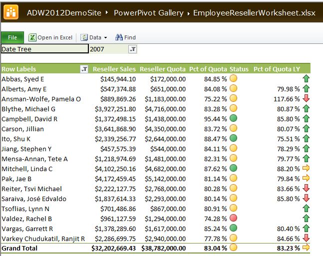
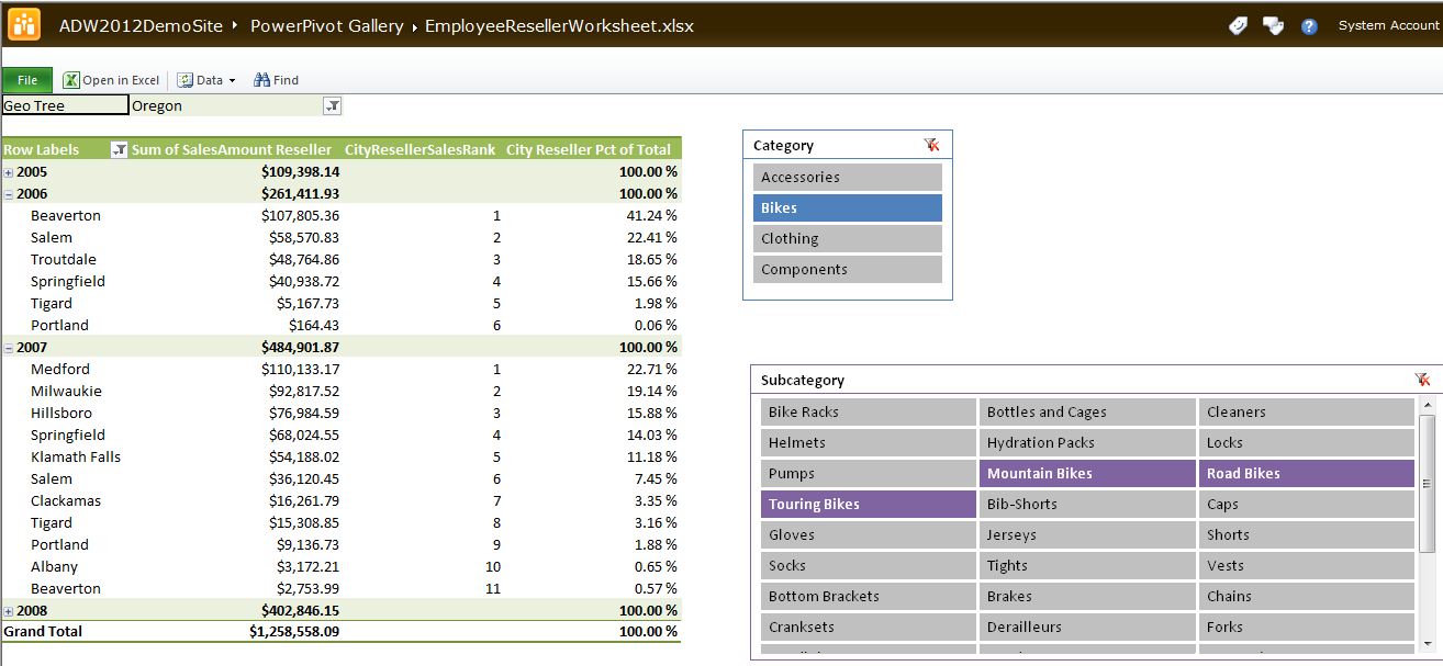
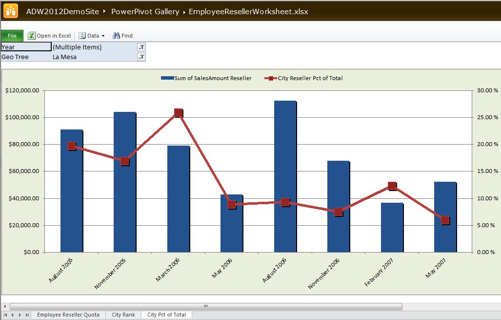
Borrowing from the famous theme of “begin with the end in mind,” I want to draw your attention to Figures 26 through 30. These are Excel spreadsheets with pivot tables and pivot charts that I created against a tabular model database, and then deployed to a SharePoint site. In essence, I used Excel as an end-user report writer and pushed them up to SharePoint so that others could interact with them. One pivot table contains an OLAP-style KPI, one ranks cities by sales, and one shows city sales as a % of their state.
Tip 2: Setting up the Data for a Tabular Model
In this demo, I'm going to take data from the Adventureworks2012DW database (though you can use the AdventureWorksDW2008R2 database as well). Table 1 contains all the views I've created on top of the database, to only retrieve specific columns. (Those who read my prior SSAS/OLAP article will probably recognize the views as similar to these.)
Notice in Table 1 that the views are in a traditional fact/dimension model. Whether you create multidimensional OLAP databases or tabular models (or even if you use an analytic database with another vendor) one universal skill remains: shaping data into fact/dimension relationships. Make Ralph Kimball's book, The Data Warehouse Toolkit: The Complete Guide to Dimensional Modeling your next serious read. It's not a book about technology - it's a book about data and design and patterns. It's the database developer's equivalent of the famous GoF (“Gang of Four”) design patterns book, Design Patterns: Elements of Reusable Object-Oriented Software.
Make Ralph Kimball's book, The Data Warehouse Toolkit: The Complete Guide to Dimensional Modeling your next serious read. It's not a book about technology - it's a book about data and design and patterns. It's the database developer's equivalent of the famous GoF design patterns book.
Tip 3: Creating the Project in SQL Server Data Tools
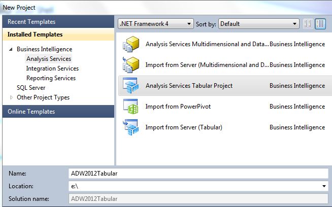
Once we've created a set of views, we can launch SQL Server Data Tools and create a new Business Intelligence Tabular Project. Remember that SQL Server Data Tools (SSDT) is the Visual Studio 2010 shell for create BI applications, and replaces the older Business Intelligence Development Studio (BIDS) application.
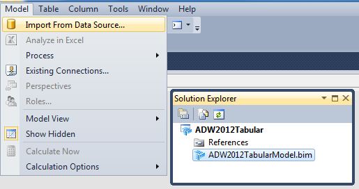
Figures 1 and 2 show the first set of steps - creating a new Tabular project (which creates an empty tabular model) and then taking the option to import data from the relational source.
Tip 4: Defining All the Table Relationships
In order to create an analytic database, it's necessary that “somewhere” along the way, we have to join together the fact and dimension tables by their primary key/foreign key relationships. The tabular model project template in SSDT permits developers to select the necessary tables and join them together in a diagram view (if the tables didn't already have PK/FK constraints built in). Since the source of our project contains database views, we need to build the relationships manually. You'll follow the steps described in the following paragraphs.
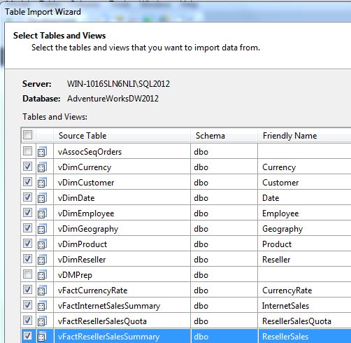
First, (Figure 3) select the views that we previously shaped into fact/dimension relationships.
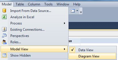
Second, (Figure 4) select the Diagram mode. Then, (Figure 5) create PK/FK relationships by dragging a primary key (usually from a dimension) into the corresponding child/foreign key. Table 1 contains all the actual relationships. Note that while most of this model represents a de-normalized star schema model, the model also relates the Geography dimension to the Customer and Reseller dimensions. That way, any attempt to summarize internet/reseller sales by geography goes “through” the customer/reseller dimensions as referenced (indirect/snowflake) relationships.
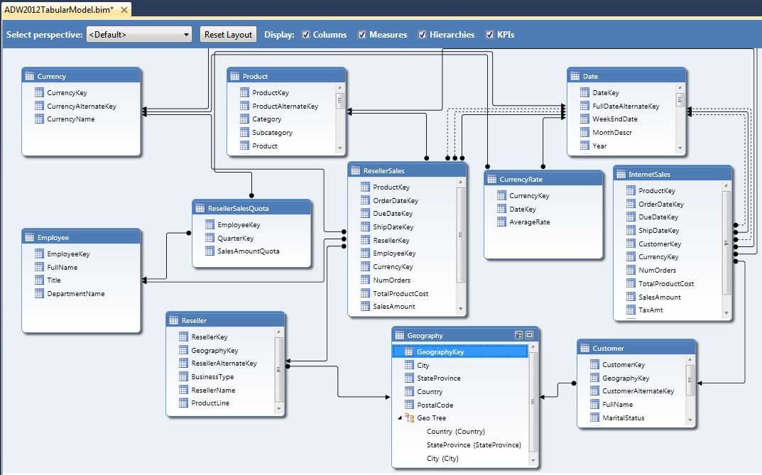
Also note in Figure 5 that we can build hierarchies (to allow users to easily traverse business parent/child relationships).
Note that all relationships must target parent columns that are either primary keys or candidate keys (i.e., the values are unique in the table and therefore “could” represent a primary key). If you attempt to drag a relationship into a non-unique value, you'll see an error message like the one in Figure 6.
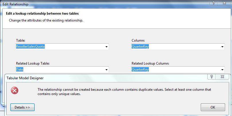
One note: one of the fact tables (Fact Sales Quota) has a granularity based on the quarter. In other words, quotas are set by the quarter and by the employee/salesman. In order to relate this to the date dimension (to roll up quotas to the year), we have two choices: either create a separate “mini-dimension” with a unique list of quarters, or store the first day of the quarter in the fact table, and relate the fact table to the date key in the date dimension. I've chosen the latter of the two.
Tip 5: Customizing Tables in the Model
Once we've defined all the relationships, we can tailor the view of the tables. In particular, date dimension tables usually require some customization. We often need to define the sort order of month and quarter columns, and we might want to hide certain columns.
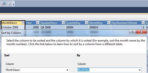
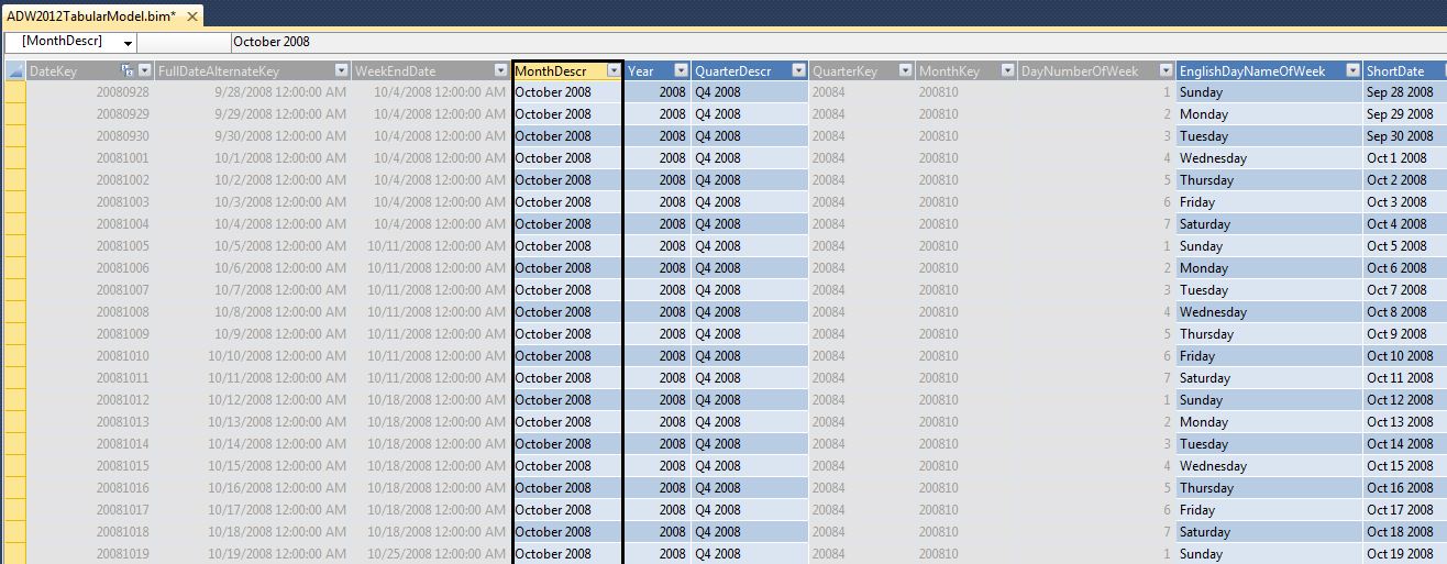
In Figure 7 we can define the sort order for certain columns. This is helpful for month columns where we display “April 2007” but want to sort using a MonthKey column with a value of “2007-04” Also, in Figure 8, we can hide certain columns from the client tools (usually the key columns that we're using to define the sort of description columns).
Tip 6: Defining Basic Calculations with DAX
At this point, we want to create some basic aggregations on sales columns (so that users can “roll up” sales based on related dimension attributes). Figure 9 shows how we can create basic summarizations of numeric columns, and also hide all the control columns/FK columns that we don't want the user to see. Note that the default aggregation method is SUM, though we can also aggregate by methods of COUNT, AVG, etc.
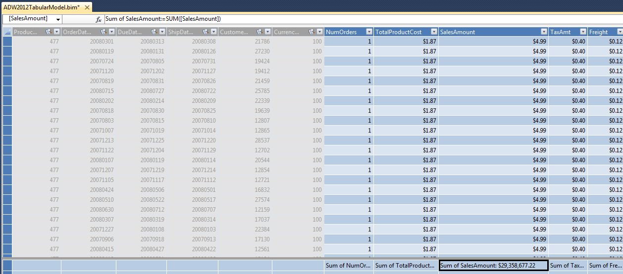
Note that even basic aggregations still generate a DAX expression that the Analysis Services (tabular) engine executes at runtime. DAX is the programming language for the tabular model, in the same way that MDX is the language for OLAP databases. In this instance, the generated DAX code is fairly simple:
Sum of Sales Amount Reseller :=
   SUM([SalesAmount])
However, as we will shortly see, some DAX formulas are more involved.
Tip 7: Using DAX to Build Calculations Based on Relationships
One of the “controversial” comparisons between the full blown version of multidimensional OLAP and the tabular model is that the former permits creating advanced relationships as part of the database structure, whereas the latter requires DAX code to establish the relationship. As an example: a non-trivial dimensional modeling relationship called “role playing relationships” allows us to use a primary key as several “roles” in a fact table. For instance, a date dimension might serve as both an order date and a due date (and a ship date, and a delivery date, etc.) in a fact order table.
Multidimensional OLAP supports this very easily - and generates multiple “views” of the date dimension to allow users to slice any related measure by the different business dates (roles).
The tabular model does not provide native support for this - we need to write custom DAX code to reference any relationship to a date role:
Sum of ShipSalesAmount Reseller:=
  CALCULATE( sum( [SalesAmount]),
    USERELATIONSHIP( 'Date'[DateKey],
       ResellerSales[ShipDateKey]))
While functional, the downside is that a developer will need to establish multiple calculations for each core measure and each date role. Recently I finished a multidimensional OLAP project that had three customer roles (Budget, Parent, and Child customer) with six measures. Had this been a tabular model, I would either have needed to create 18 calculations, or would have needed to redesign the data model to account for this issue. In the future, I hope the next release of the tabular model natively supports role playing relationships.
Additionally, as a “talking point,” the tabular model does not natively support many-to-many (bridge) relationships. This also requires custom DAX code. I considered implementing an example in this article, but decided to keep the overall example more fundamental. In a future article, I'll cover the DAX code for many-to-many bridge table scenarios.
OK, back to our original example. At this point, we're ready to take a peek at what this database will look like to an end user. It should be no surprise that the #1 user tool for business users to browse tabular models is Excel. Fortunately, the tabular model project in SSDT provides an “Analyze in Excel” option (Figure 10) to create a basic pivot table against the tabular model.

Tip 8: Baker's Dozen Spotlight: Creating KPIs and Other DAX Formulas
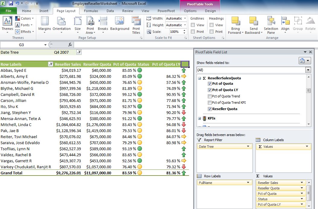
One of our end goals is Figure 14: to view a KPI (Key Performance Indicator) that visualizes employee sales performance against their sales quota for a quarter or year. This will “pit” sales in the Reseller Sales Fact table against quota information in Fact Sales Quota.
Note that the KPI visualizes sales for the current time period, as well as a trend period (in this case, one year ago, to show if the employee % of quota is up or down compared to a year ago).
Every KPI contains a set of business rules. Here is the rule for our KPI:
- For the current period, a person is considered “good” (green light) if their sales as % of quota is at least 85%. They are considered “OK” (yellow light) if their % of quota is between 75 and 85%. They are considered “bad” (red light) if their % of quota is below 75%.
- For the trend (% of quota for the current period with respect to one year ago), if the net change over the last year is within 2 percentage points, we view that as “no change/holding steady.” If the % of quota for the current period is higher than last year (and by more than 2 percentage points), we view that as a positive trend (arrow pointing upward). If not, then we view that as a negative trend (arrow pointing downward).
We will need the following: first, we'll need a new DAX calculation in the Fact Sales Quota table for % of quota:
Pct of Quota:=
    abs(round(
  ResellerSales[Sum of SalesAmount Reseller] /
  ResellerSalesQuota[Sum of SalesAmountQuota],4))
Then we'll need a KPI (Figure 11) with the rules for the % of quota.
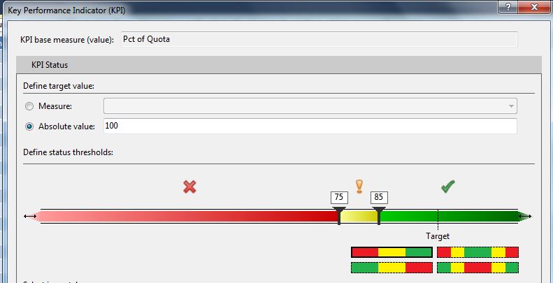
Second, we need to calculate the Pct of Quota for the “same time period last year” with a new DAX formula:
Pct of Quota LY:=
   ([Pct of Quota] )
    (SAMEPERIODLASTYEAR(
       'Date'[FullDateAlternateKey]),
            all(Date))
Third, we need to calculate the difference between the current % of quota and the % of quota Last Year. This is an easy DAX formula:
Pct of Quota Trend:=[Pct of Quota] -
                [Pct of Quota LY]
Fourth, we need a “rule-based” calculation on whether to return a 0 (no change), a 1 (positive trend) or a -1 (negative trend) that the visual trend will use:
Pct of Quota Trend KPI:=
     IF( ABS([Pct of Quota Trend] ) <= .02 , 0,
     IF( [Pct of Quota] > [Pct of Quota LY],1,
     -1))
Fifth, we create the visual KPI for the trend component (Figure 12).
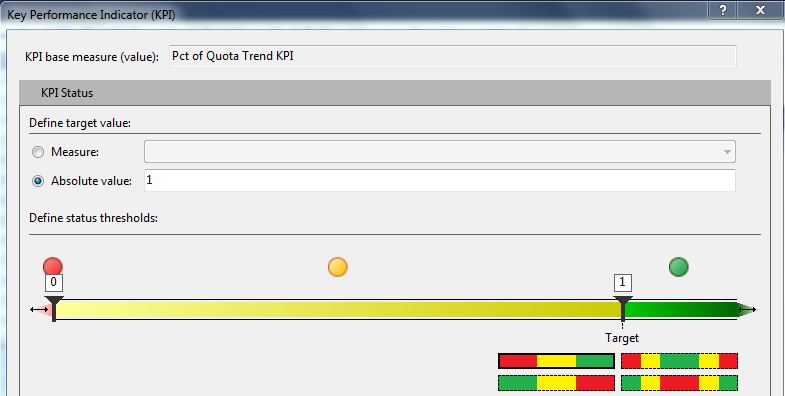
Figure 13 shows a screenshot for the entire Sales Quota table (with the calculations), while Figure 14 shows a test in Excel.
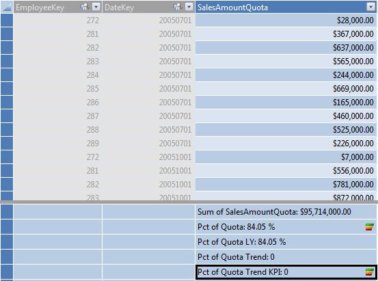
Finally, we're going to add two more DAX calculations to rank cities by reseller sales, and also to calculate sales for a city as a % of sales for the parent state-province, within a given date (Year). Note that the first calculation does not perform a ranking on a total line (where the City is empty) or in instances where there are no cities to rank. You'll see these eventually used in Figure 28.
CityResellerSalesRank:=
 if( countrows( values ( Geography[City]))=1,
   IF(NOT(ISBLANK( VALUES ( Geography[City] ))),
     RANKX( all( Geography[City]),
   ResellerSales[Sum of SalesAmount Reseller]),
     BLANK()),
      BLANK())
City Reseller Pct of Total :=
 [Sum of SalesAmount Reseller] /
   CALCULATE( [Sum of Sales Amount Reseller],
       RELATEDTABLE( (Date),
           ALL(Geography[City])))
Tip 9: Deploying and Testing
You can eventually deploy the tabular model so that other processes can access it as a deployed database. SSDT contains an option in Solution Explorer to deploy the database. Once deployed, the tabular model will show in SQL Server Management Studio, under the Analysis Services instance for Tabular Models (mine is called SQL2012Tabular), as shown in Figure 15.

Tip 10: Creating Roles
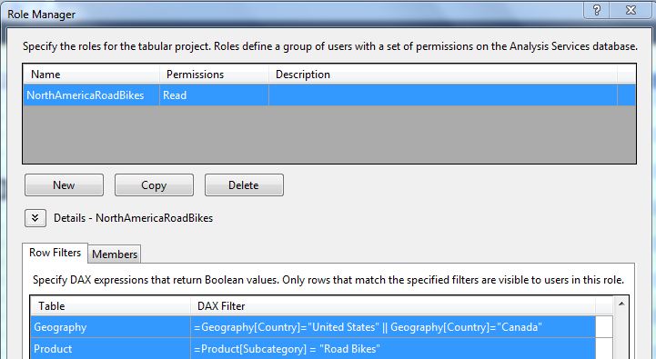
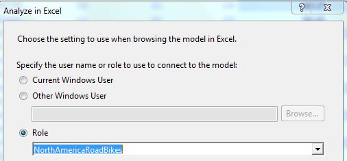
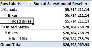
Similar to the full blown version of multidimensional OLAP, we can create roles to restrict user access based on specific dimension member values. Figure 16 shows the interface in SSDT to create a role - in this instance, NorthAmerica (U.S. and Canada) and only for a specific product Bike subcategory (Road Bikes). We can write basic DAX expressions to define the roles, and associate the role with members (users on the domain). Figure 17 shows how we can launch Excel and test the role, and Figure 18 shows a pivot table in Excel that recognizes the role and summarizes data only for North America and road bikes.
Tip 11: Creating Partitions
While the tabular model offers tremendous performance across large tables (it is essentially an in-memory, compressed database), sometimes fact tables might get so large that we might want to partition them.
Figure 19 shows the SSDT Partition Manager, where we can split a Fact table into multiple partitions. Most partitions are built based on a date, on the premise that a high % of user queries are done against data in the last X number of months/quarters/years.
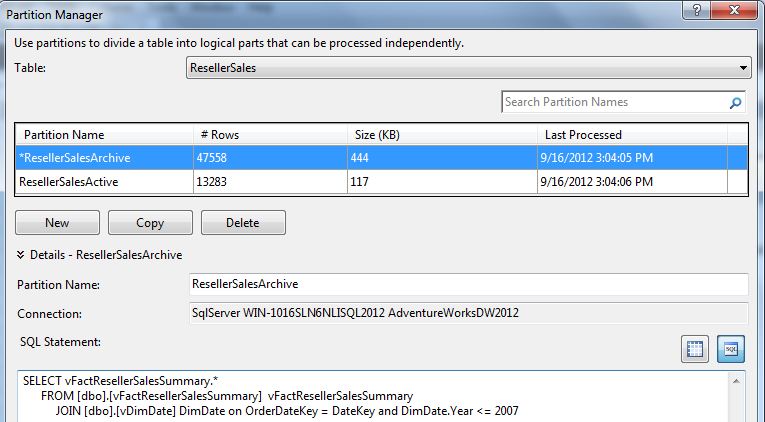
The interface in Figure 19 permits us to write SQL code to split the fact table. You might be wondering, “Shouldn't that be DAX code?” Remember that the Analysis Services Tabular Model Engine will process these rules when it reads data from the source, which is a relational database. So once you think about it, it's understandable that the logic would be implemented using T-SQL.
Tip 12: Building SSRS Reports against the Tabular Model
Back in Figure 15, I showed that the deployed database is accessible under the SSAS Tabular instance on the server. That means developers can create SSRS reports against the model. Note that you would create reports the same general way you'd create reports against OLAP databases - and that means you'd use MDX for any custom retrieval. The Analysis Services tabular engine will automatically process that MDX code into code that can be used to query the tabular model.
Tip 13: Making the Tabular Model Accessible in SharePoint
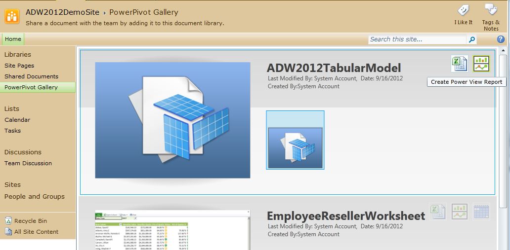
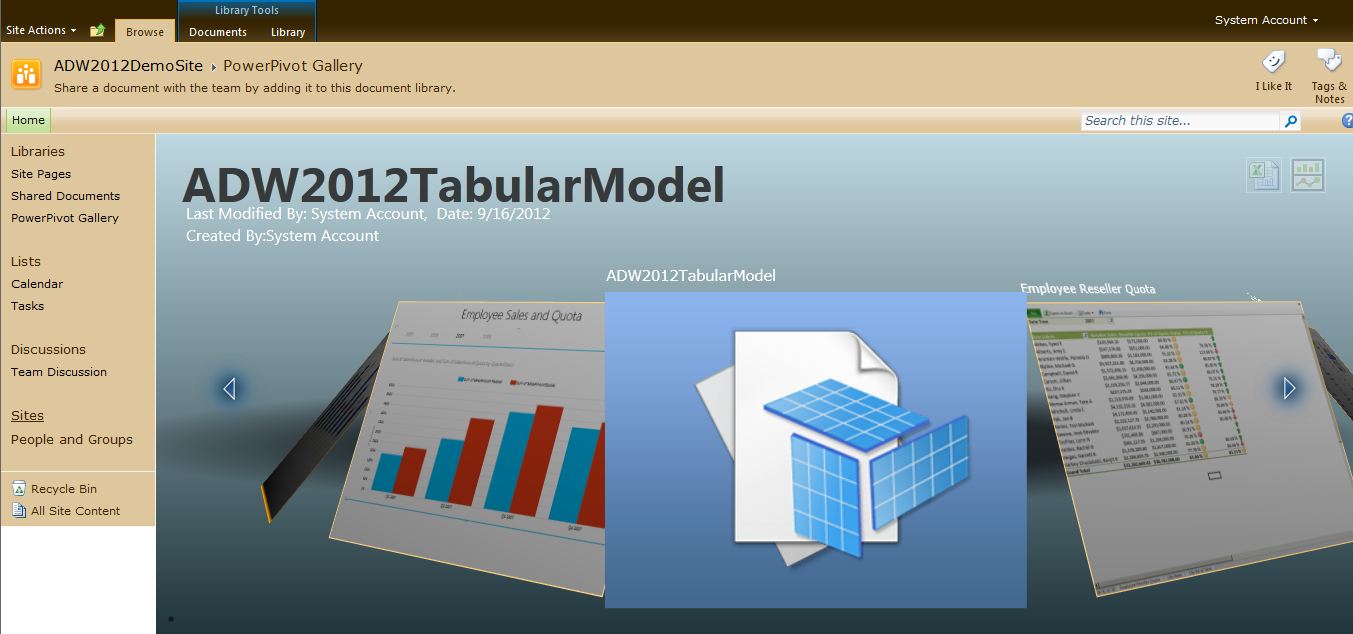
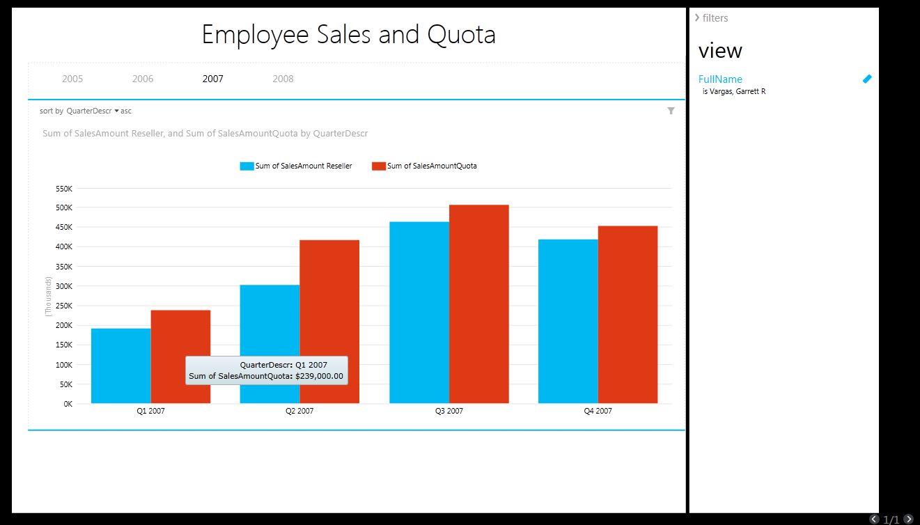
While not a requirement, many businesses will want to access this tabular model inside of SharePoint. SharePoint 2010 (with Service Pack 1) has the ability to serve as a portal for these tabular model databases. SQL Server 2012 also contains a new SharePoint reporting tool called Power View to build reports against deployed tabular models.
There are several steps involved:
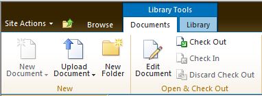


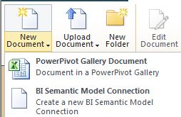
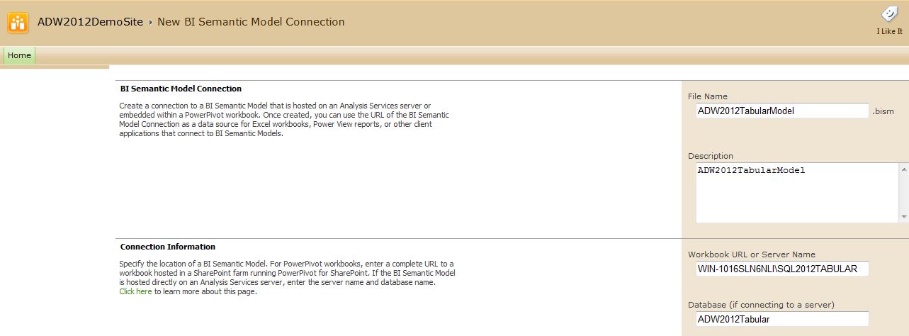
In a Future Issue….
In a future installment of the Baker's Dozen, I'll explore some more advanced concepts in the SSAS tabular model. I already mentioned in Tip 7 that I'd cover bridge table (“many-to-many”) relationships with DAX code in a future article. I'll also show some other DAX formulas, as well as topics like dynamic security, programmatically updating partitions with XMLA code, and a full feature matrix and performance comparison between multidimensional OLAP and the tabular model. Additionally, I'll show some of the ways users can access tabular model data using the newest BI tools in Excel 2013 and SharePoint 2013.
| View | Derived From | Notes/Relationships |
|---|---|---|
| Customer (dimension) | Derived from the Customer dimension table | Related to Geography and to Fact Internet Sales |
| Date (dimension) | Derived from the Date dimension table | Related to all three fact tables |
| Employee (dimension) | Derived from the Employee dimension table | Related to the Fact Reseller Sales and Fact Reseller Quota table |
| Geography (dimension) | Derived from the Geography table | Related to the Customer and Reseller dimensions |
| Product (dimension) | Derived from the `Product,` `ProductSubCategory,` and ProductCategory dimension tables | Related to the Fact Internet Sales and Fact Reseller Sales tables |
| Reseller (dimension) | Derived from the Reseller dimension | Related to the Geography dimension table, and to the Fact Reseller Sales table |
| Internet Sales (fact table) | Fact table, derived from Fact Internet Sales | Fact table for sales through the internet customer channel, with granularity by Date, `Customer,` and Product (and indirectly by Geography through the Customer table) |
| Reseller Sales (fact table) | Fact table, derived from Fact Reseller Sales | Fact table for sales through the reseller sales channel, with granularity by Date, Reseller, Employee, and Product (and indirectly by Geography through the Reseller table) |
| Reseller Sales Quota | Fact table | Fact table for reseller sales goals, with granularity by Quarter and by Employee |


