No one denies the importance of making sure that your iPhone, Android or iPad app is well coded, but far too often, developers overlook the necessity of enjoyable user experiences. Keeping an eye on whether or not your app is intuitive is essential to success.
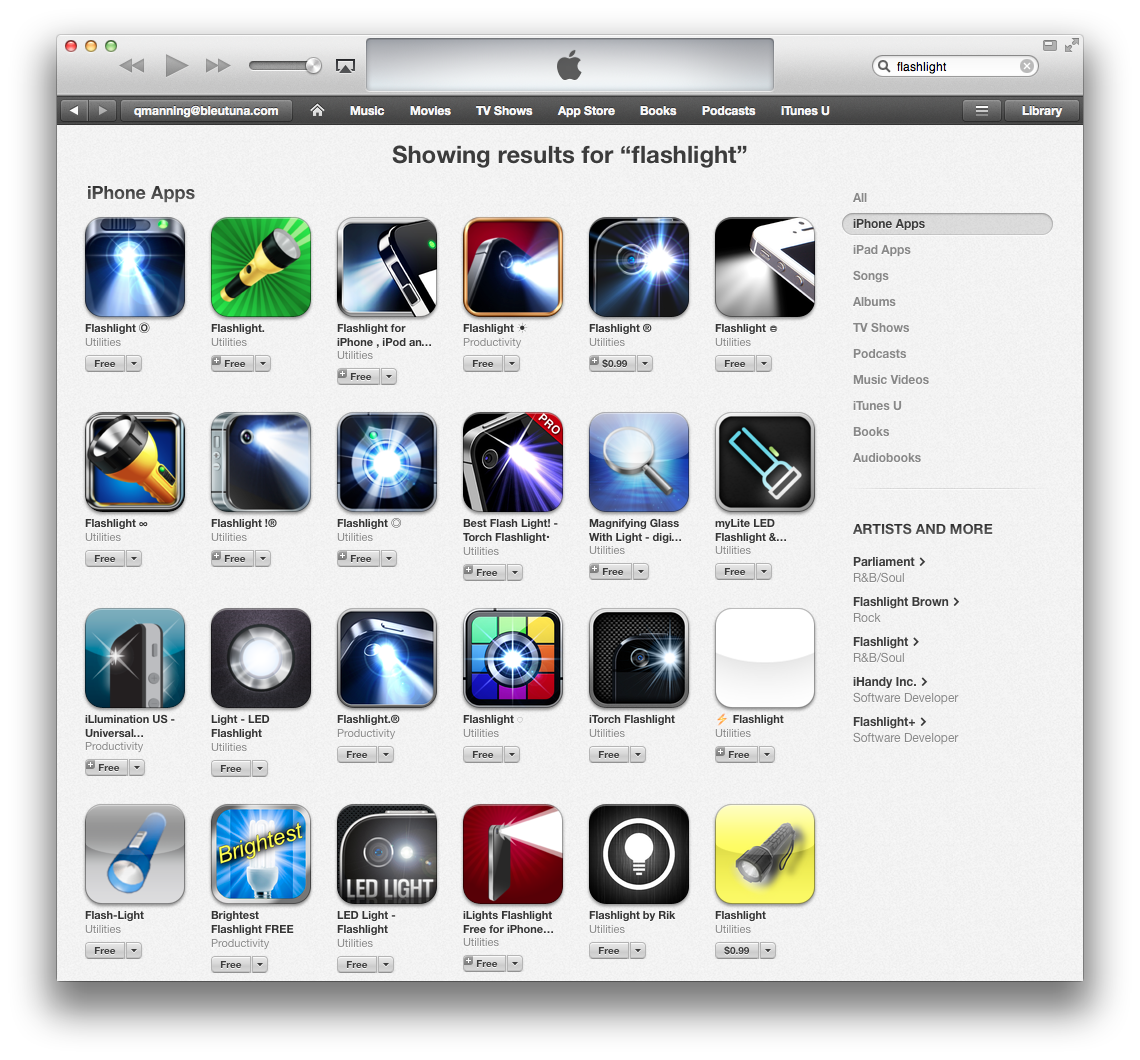
Every app starts with an idea, but the truly great apps begin with a remarkable idea. When you sit down to create a new app, it's unlikely that you'll hit upon an idea that isn't already available from an App Store. Most likely, you'll find hundreds of apps, all executing the same idea (see Figure 1).

Out of all of these similar apps, what makes a few rise to the top of the download charts? What separates the low-ratings from the high-ratings?
Solid development is part of it, but to be blunt, finding a well-developed app isn't that difficult. Many low-rated apps are responsive and bug free. So what do these top apps all have in common?
If you download them all of these apps and test them out, you'll see a strong thread start to appear: The top-selling apps have fantastic user experience (UX). The best apps do more than accomplish their goals; they transport users into a preternatural state of clairvoyance, where each tap is intuitive and never requires second guessing.
What is User Experience Exactly?
Here's how Wikipedia defines user experience:
User experience (UX) involves a person's behaviors, attitudes, and emotions about using a particular product, system, or service
UX is about the layout of every element, taking the time to make sure that every button on a screen is placed exactly where it should be, allowing the user's muscle memory to naturally figure out how to proceed throughout the software's flow. Great UX also includes a serious dosage of strong information architecture, guaranteeing that users won't end up in a dead-end or frustrated because they're forced to interact with the same data in a multitude of different ways.
UX is about your users having fun.
Whether your app showcases all of the Google Analytics data for a website or shows hungry patrons where the nearest sushi restaurant is, the best UX creates a transcendental relationship between the user and the software. It forms an addictive bond so powerful that users keep coming back time and again.
Which raises the question, how do you create this level of user experience?
Know the Rules before You Break Them
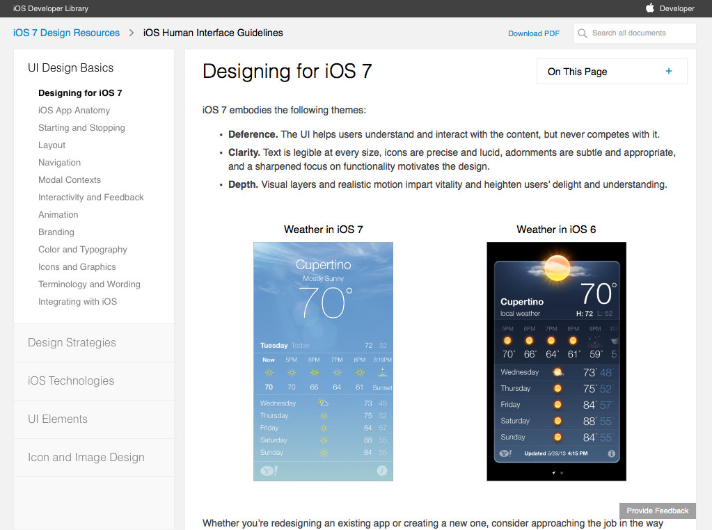
As with everything, you must know rules before you break them. Mobile rules are a series of guidelines known as the Human Interface Guidelines (HIG). The purpose of the HIG is simple: Make sure developers understand how the platform dictates users' navigation patterns through the software and the operating system.
Every app starts with an idea, but the truly great apps begin with a remarkable idea.
How users interact with buttons, move between screens, choose dates, times, and even how large buttons must be are all defined within the HIG. Choosing the wrong tropes from one HIG and applying it to another platform can quickly lead to bad reviews, low ratings, and hurt an app's chances for success.

Don't force Android users into the WindowsPhone HIG. Do you plan to make an iPhone app? Think twice before adopting Android style controls simply because you're more used to them. Users need to be familiar with the way software works on their devices, regardless of the platform.
UX gets more complicated when you decide to make a multi-platform app. You'll have to make a choice:
- Is it more important for users to be familiar with the platform they own?
- Or is it more important to have the same UX for the app, no matter what device?
What's the right answer? That depends on your app's purpose and what the UX dictates is best for the user. If you find that you need to shatter UX conventions to create the best experience, don't throw out those lessons simply because you're making it on both platforms.
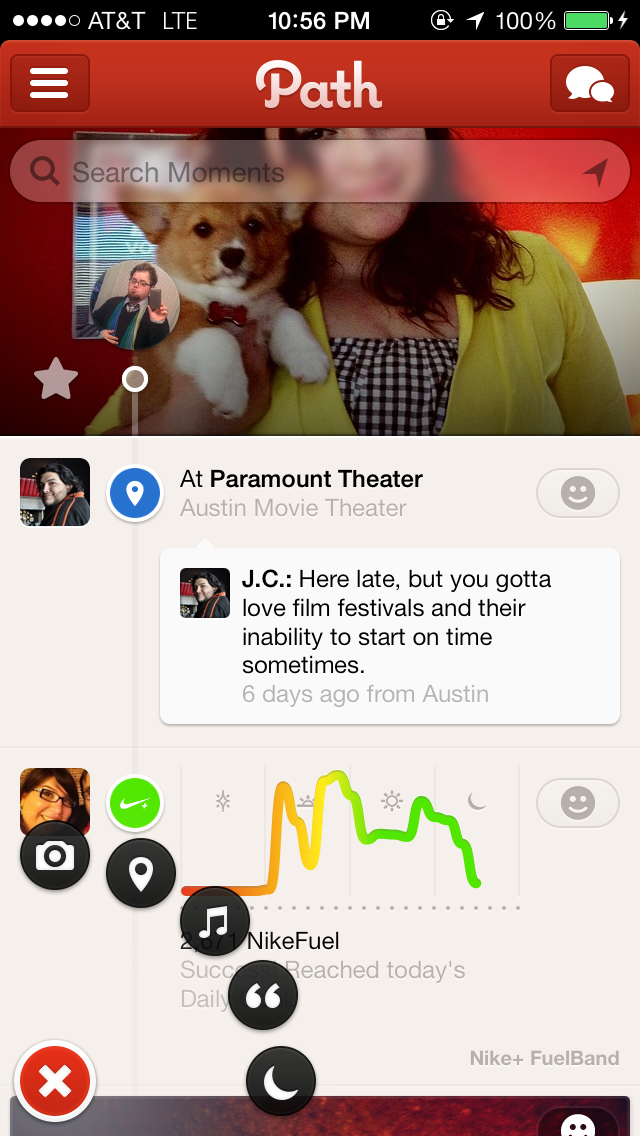
Apps like Path are nearly indistinguishable if you're on iOS or Android. Path created a custom, innovative navigation that works seamlessly with how people use their software. Changing this based on platform would have been a big loss to a whole group of users.
If you design a custom UX paradigm that's not part of any platform HIG, you can feel comfortable carrying it cross platform. But beware: Adapting standard HIG elements, like “time pickers” or “swipe to delete,” can cause serious confusion.
Follow the Trends
When Apple first released their HIG for the original iOS, all navigations were to be at the bottom. For Android, those same navigations were supposed to be at the top. Sometimes, this was the only major difference between the roll-out of an application on both platforms.
Then came the Facebook app, and the whole app world turned upside down. Facebook took the menu, hid it away in a “slide over drawer” and was quickly copied by thousands of apps. Within months, most of the utility apps downloaded featured this very menu, because a “slide over drawer” feels natural.
From the beginning of the Web, developers put menus on the left. Mimicking western reading patterns, developers put important information in the first place a user would look. Because space is limited on mobile, Facebook took this concept, and hid it behind a top-left button that users notice immediately.

Today, all of this may seem like commons sense, but this concept wasn't defined by the creators of any of the mobile operating system. The ingenuity of a company focused on creating a great UX flow created a trend that is now the new norm.
To make beautiful software, you have to play with beautiful software. Pay attention to what trends you see, see how accomplishing tasks changes each year, and make note of what occurs time and again in different apps.
To make beautiful software, you have to play with beautiful software.
New norms drive the Human Computer Interaction (HCI) expectations, and redefine a user's muscle memory. Unless you tap into this muscle memory, your will never transcend the competition.
Also, make sure the trend you adopt fits your app. Forcing the new hotness into your project without dissecting whether or not it works creates a mess. Learn to strike the right balance.
Discover What Works for Your Users
How do you discover the magical combination for your app? That's the hardest part. You could simply copy the control schemes of your competitors, but are you sure they know what users want? Even worse, it takes away your chance to stand out from them by creating a better experience.
You must understand the goals of your software. Filter out the unneeded features that inevitably bloat many projects. Software bloat kills any chance of great UX, throwing too many elements into a mix. You will confuse users, give them no focal point, and end up with your app deleted within minutes.
Discover the most important facet of your project. If you had to sum your app up into one feature, what would that be? Now, what's the second feature? Is there a third? Write these down and refer to them anytime you feel you're stuck. Make sure everything you design augments these limited features.
How do you define what's most important? Contrast of size is a good start. Using size to direct a user into the correct interface flow is your most powerful asset. You don't need to make everything big. In fact, it's the juxtaposition of large element and small elements that helps define the order of importance. Sometimes, a small, solitary button in the middle of an empty interface draws more attention than a big button in that same space. Focus on the placement of objects. Your guide is how a typical user handles a device.
Creating a handheld/phone application? Make sure the most used elements are at the bottom, preferably on the far right or left. Why? Because that's where a user's thumbs rest, and you want to do everything you can to facilitate one-handed usage.
In contrast, place all “killer” buttons as far away from a user's thumbs as possible. Why do you think we usually see “cancel” or “back” buttons at the top left? Simple, because that's the furthest point from where the user's dominant hand typically rests, which means this potentially detrimental button is less likely to be accidentally tapped.
Most messaging apps are excellent at this. “Cancel” is at the top left, and “send” is typically at the bottom right. Although you may be left-handed, always keep in mind the majority of users. Or even better, add an option to your preferences which allows users to change hand dominance.
Finally, focus on your information architecture. Novice app developers fall into the dreaded “forward, forward, forward, back, back, back” style of screen flow. This forces users to go deeper into an app, and then tap “back” multiple times to get back to a higher level. Here is where you see the power of Facebook's “slide over drawer” that gives users the ability to quickly access different areas of the app.
Maybe such a navigation works for you. Perhaps it's more something like what Path uses. There is no right answer, except to learn what's right for your project.

How Do I Know What's Right?
Every UX artist starts off their work in a vacuum, but like any designer, you must field-test your project to know if it's hitting the right target audience. Tap into your friends and co-workers to retrieve vital, first-hand information on what you've built.
Put together a group who is open to trying out new software, and more importantly, who will give you honest feedback when they find problems. Define a simple heuristic testing plan that focuses on accomplishing tasks, not pressing certain buttons in specific order.
A sample script for this plan is as follows:
- Create an account.
- Add a new photo.
- Remove a user.
- Change your password.
Simple commands avoid prejudicing your testers with a task list any monkey could follow. If you give step-by-step directions, you will only test their ability to follow commands.
What does an incorrect plan look like?
- Enter your email address, password, and tap the send button.
- Find the “+” button at the top right of the screen, and tap it.
- Tap a user's profile photo, then once on their profile, look for the button labeled “Remove user.”
- On your profile screen, click the icon of a gear, then scroll to the bottom and find the area marked “Password.” Tap it and enter in a new password.
You would be surprised how often folks fool-proof their testing plans, but don't fool-proof their UX. Make sure your software facilitates a user's goals.
Not that a user will do things as you've directed. A good plan shines a spotlight on your UX problems pretty quickly. Users will ask for help or go down false-roads time and again, trying to accomplish the right goals.
Note, though, that just because one person has an issue with something in your app doesn't mean you have UX problems. Individuals bring individual preferences. A good rule of thumb is to look for a consensus among users. When half of your testers find a problem, then you have an issue. Keep focus on 85% of your audience, and recognize that the other 15% are fringe cases.
In closing, all of this is to make sure your users are having fun. If you can do that, you'll be set for success.


