It's been a while since we published an article about CODE Framework (CODE Magazine's companion business application framework), and a lot has been added and improved. Rather than putting a narrow spotlight on a specific feature (we'll return to that approach in future issues), I am going to paint in broader strokes and highlight some of the more important new things that have been added.
A New WPF Theme: Wildcat
CODE Framework has recently received a major new stand-alone feature, a completely new WPF application theme called “Wildcat.” Wildcat has been inspired by Billy Hollis' popular StaffLynx application that has been used as inspiration for many a recent WPF UI. Saying that we've received many requests to create such as theme is an understatement. I'm happy to announce that Billy Hollis was nice enough to give us permission to create an application theme that's very similar to StaffLynx.
The new Wildcat theme has a number of interesting features. Most striking, of course, is the overall visual appearance of the theme (Figure 1). Wildcat uses a row of available actions across the bottom of the main window (“Shell”). Note that the row of items shown in Figure 1 uses new icons that are provided with the theme using the standard resource names supported by all CODE Framework themes.
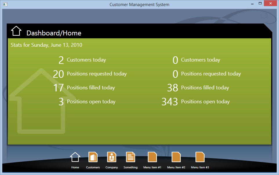
Views are generally loaded in-place inside the main window in a richly styled view host. The host shows the view's title at the top as well as an optional icon that's picked up from the view's icon resource. The view itself is presented on a colored background that‘s based on a background color, and which can be set on each view through the new View.ViewThemeColor property. If not set, the standard theme color will be picked up as the background instead.
Note that the background color isn't merely displayed as a simple color, but it's used as the basis for a very subtle background gradient as well as other things, such as different shades of the color used in different parts of the view. Consider, for instance, Figure 2, which shows a primary/secondary view with list, where the “secondary” part of the UI (the part in which the search textboxes are placed) uses a darker shade of the view's background color. Another example is the slightly different shade of the color used within listboxes.
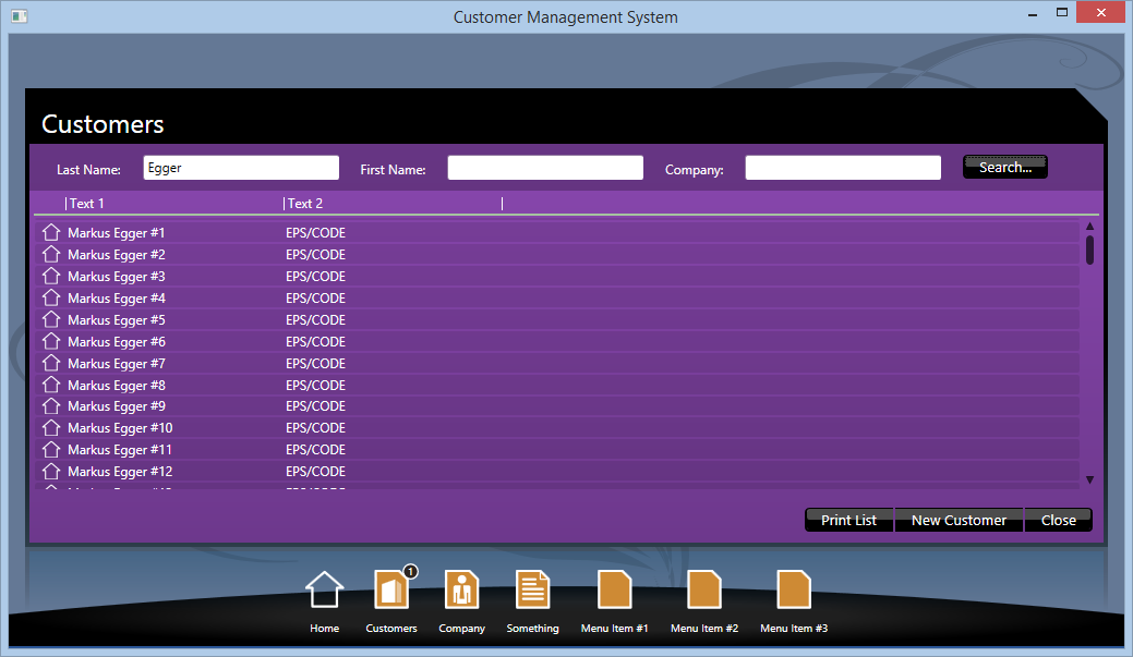
Also apparent in Figure 2 is that the Wildcat theme provides redefined styles for most standard controls. Controls and elements such as textboxes, buttons, listboxes, and more, have all been changed in appearance to create a coherent new theme. Some of these new styles are quite complex. Note, for instance, that the black buttons at the bottom of the view shown in Figure 2 (that are automatically populated based on the view's standard ViewActions) are arranged in groups, with the start and the end of the group featuring rounded corners, but the button in the middle having square corners.
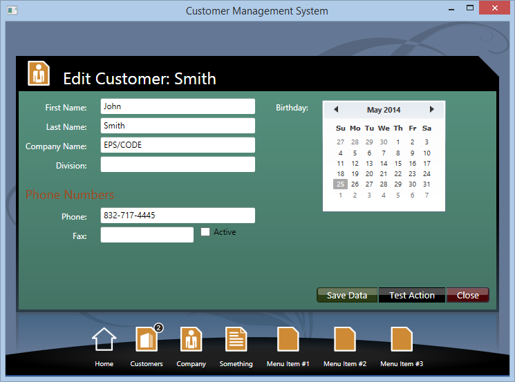
Also, the colors of buttons vary depending on whether they are set to be the default (green) or the cancel button (red). An example of this can be seen in Figure 3. Of course, all of these colors can be altered easily through the theme's color resources.
As can be seen in Figure 2, the Wildcat theme uses a stylized approach to ListBoxes that applies both to standard WPF listboxes as well as CODE Framework's listbox extensions that display listboxes as data grids with multiple columns. The multi-column approach is also the default approach in Wildcat for most standard view templates.
Another interesting detail shown in Figure 2 is the primary/secondary UI's approach to putting the “secondary” part of the UI across the top of the view (unless that part is truly tall and skinny, in which case the secondary part goes on the left). Also, the “standard form layout,” which is used to display the textboxes portion of Figure 2 (the layout of the items within the “secondary” part of the UI), uses a flow-form approach that automatically arranges controls left-to-right using an advanced layout approach that has also been added to the framework relatively recently (discussed below).
The new Wildcat theme requires several new framework features that are now available to all themes.
Figure 3 shows an example for an automatic edit-form layout. Wildcat uses a layout approach for the standard edit-form templates that is similar to the approach used by most other themes. (For developers unfamiliar with CODE Framework: The framework supports various ways of creating screen layouts, or layouts for parts of screens, in a productive and standardized way. The feature is a completely optional component.). It supports all of the CODE Framework features, such as multi-column layout and groups with headers. It also supports layout elasticity (one that automatically grows and shrinks its spacing based on a variety of property settings and styles). The most unusual aspect about the edit-form layout is that labels are right-aligned. As always, all f these defaults can be changed to your heart's content.
One of the aspects about the Wildcat theme that's truly unique is the view action bar across the bottom acts both as a menu that triggers the associated view actions, as well as a list of currently open views that are used to navigate to views that have been launched previously. In that sense, it acts similar to the Windows Task Bar.
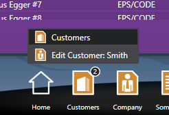
In the example in Figure 3, the “Customers” item initially triggers the customer search shown in Figure 2, which subsequently triggered the edit UI shown in Figure 3. This means that two views are open that relate to the Customers item, which is indicated by the number 2 in the circle adorning the Customers item. When the user clicks on Customers, a menu opens, allowing the user to pick the open view and navigate to it (see Figure 4). This happens in a semi-automatic fashion based on a view's properties. Views now have a new Group property (set to Customers in this example).
ViewActions have a new GroupTitle setting (also set to Customers in the example). The framework matches those two settings. In other words: If a view with a Group setting of Customer is open, it will be added to the menu of the View action with the Customer group title. This makes it easy to roll arbitrary views (regardless of how they were launched) into a certain View action's menu. Note that if no matching View action is found for a view, a new root item is added to the Items bar, so a user can always navigate to the open views. It's recommended to always have actions with a matching group to avoid scenarios with too many open items cluttering the screen.
The Wildcat theme also supports standard features, such as top-level (popup) views, message boxes, status bars, and notifications. They all work as you'd expect. The notifications option, however, deserves special mention, since it presents notification messages in a truly unique look that's generally associated with the StaffLynx demo, and which makes heavy use of a sticky note paradigm. Figure 5 shows Wildcat's implementation of the sticky-note idea.
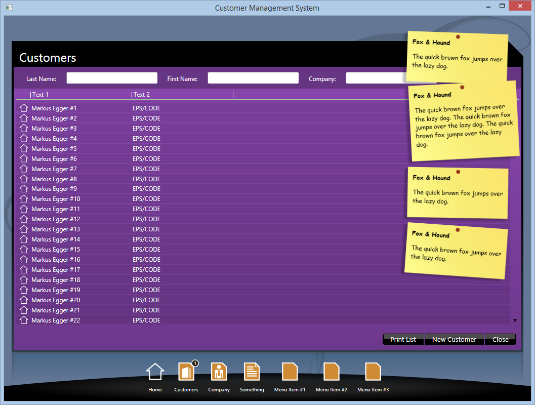
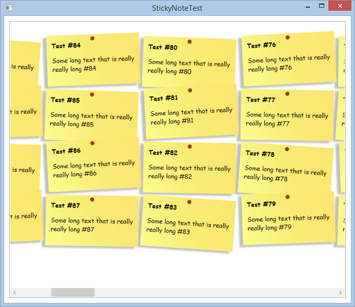
An interesting detail is the fact that the sticky-note notification feature has been implemented by means of a custom layout panel called StickyNotePanel. This layout panel can be applied to any other items control. Figure 6 shows a standard WPF listbox that uses the StickyNotePanel as its items panel template, which can be defined like this:
<ListBox.ItemsPanel>
    <ItemsPanelTemplate>
        <classes:StickyNotePanel/>
    </ItemsPanelTemplate>
</ListBox.ItemsPanel>
Important New Features in ViewActions
ViewActions are one of the iconic features of CODE Framework, and are an area of continued innovation and improvement. Some of the recent improvements have been brought on by the Wildcat theme, and others simply made good sense. Among the most important changes is the replacement of a standard collection in the IHaveActions interface, with a new custom ViewActionsCollection class. This is significant because it could potentially introduce a breaking change if you have chosen to implement the IHaveActions interface manually, although the fix is trivial, as you only have to update the type definition, and all other code remains compatible. Most developers won't have to make any changes to benefit from this change.
The advantage of having a custom collection rather than something like List<IViewAction> or ObservableCollection<IViewAction> is that you are able to add custom features to that collection. One of them is a custom indexer. In the past it was only possible to refer to actions within a ViewActions collection by index (such as Actions[5]), and it's now possible to refer to an action by ID (such as Actions["Customers"]). An action's ID defaults to the caption of an action (if the caption contains spaces, you can refer to an action with or without spaces) but there is now a new ID property that can be set manually. If you make heavy use of this feature, it's advisable that you set it manually to make sure that your code doesn't break in localization scenarios or if the caption changes for some other reason.
Being able to refer to an action within the collection by its ID is a time-saver, and (more importantly), it improves code quality, since a changing action order doesn't break code anymore. Furthermore, it's now possible to bind to actions within the action collection directly from XAML both by index and ID. Let's assume that you have a standard collection of actions that automatically populates UI elements such as menus, toolbars, ribbons, and more. And let's assume that for some reason, you would also like to bind that same action to yet another button on the UI, or a context menu, or perhaps a key-combination. This can now be done easily using XAML code like this:
<Button Command="{Binding Actions[Customer]}"
Content="{Binding Actions[Customer].Caption}" />
We didn't leave it there; we added another very convenient view action feature. We noticed that in very many scenarios, view actions are used to toggle things on and off, or to check and uncheck things. A typical scenario for this is hiding and showing UI elements. For those scenarios, we added an IsChecked property to view actions, as well as a ViewActionType property, which can be set to Toggle. When this is the case, themes can choose to display these actions slightly differently. For instance, toggle view actions may show with a check-mark in menus, or a “selected” or “pressed” background in a ribbon. You can use the Boolean IsChecked property on the view action in binding scenarios (such as the source for a checkbox).
To use such a view action, you can simply instantiate it and set the appropriate properties, like so:
new ViewAction
{
    IsChecked = true,
    ViewActionType = ViewActionTypes.Toggle
};
It's up to you to write an associated execute method that sets the IsChecked property in appropriate ways when the user triggers the action. Often, quite a bit of additional code is required when the action is triggered beyond simply changing the IsChecked property.
You would be correct if you pointed out that there also are quite a few scenarios where all you really need is a toggle mechanism for the IsChecked property. For instance, if you wanted to create a view action that hides and shows a UI element, a simple on/off mechanism is all that's needed. To support this scenario, we've created a special ToggleViewAction subclass. Here's how to use it:
Actions.Add(new ToggleViewAction("Output"));
This hypothetical action could be used to toggle some output UI element on and off. The remaining question is how to exactly bind to this action in a way that translates to visibility settings, which, in XAML, isn't based on Boolean types but Visibility types instead. Since this is a very common scenario, we exposed a second version of the IsChecked property called IsChecked_Visible, which returns Visibility.Visible when IsChecked is true, and Visibility.Collapsed otherwise. Therefore, we can easily bind a UI element to this action and have it show up as needed:
<UIElement Visibility="{Binding Actions[Output].IsChecked_Visible}" />
There are other changes as well. For instance, view actions now have a Visibility property, which can be used to hide and show an action. This acts in addition to the “Availability” concept that was already there, so you can still hide an available action manually. This removes it from UIs such as menus and ribbons, but the action can still be triggered by other means, such as programmatically, or through a key binding.
Improvements to Lists
A popular and heavily used feature in CODE Framework is the concept of stylable listboxes, especially the ability to use standard view templates and multi-column lists, which are often used in scenarios that call for data grids. A complete discussion of all the features of the different variations of lists and grids goes beyond the scope of this news-roundup and will be the topic of a future feature-length article. However, it's worth mentioning that both performance and the feature-set of lists has been improved drastically.
Multi-column lists have added features like richer support for column templates (cell templates). They also support richer command and ViewAction binding to cells and headers to react to various events, such as clicks, in generic ways that work well with the MVVM pattern. Support for various features in headers, such as interactive and templated headers, has been added.
List performance has been improved in various ways. The performance for the individual items used to construct lists (such as row templates) has been greatly optimized. New layout elements have been added, such as a ColumnPanel class, which acts like a highly specialized Grid class that provides only a single row and performs much better in large scenarios than the default WPF Grid layout element. Lists have been fine-tuned for various scenarios to use virtualization in appropriate ways. (For more information on the topic of virtualization, see the “XAML Anti-Patterns: Virtualization” article in this issue).
Many of the features in lists are “behind the scenes” features and most developers will only see that lists work better in large scenarios. However, many of the underlying elements are also useful on their own and I encourage exploration of the templates to see which elements are used in what ways.
Flow Form Layout
A unique feature of CODE Framework is its ability to support developers and designers in creating actual screen layouts. For instance, let's say that you need to create an edit form, which happens often in business applications. Using CODE Framework, you can place all required elements randomly on the view and let a layout element do the arranging for you. This works well for entire screens and for parts of screens.
CODE Framework has always shipped with a variety of standard layout elements, such as edit form layouts (as used by the example shown in Figure 3). We've recently added another element called “Flow Form Layout.” Using this layout approach, UI elements are “flown in” from left-to-right and wrap over to the next line when there isn't enough room horizontally to see all the elements. A flow form behaves like a WrapPanel, in that sense. Where a flow form is different is in the additional smarts the element has that make it more suitable to lay out business application UIs.
Automatic Layout features are one of the most unique parts of CODE Framework.
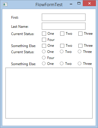
Consider the UI shown in Figure 7. This UI has numerous controls, such as labels, textboxes, radio buttons, and checkboxes. All of these elements are positioned inside a FlowForm container. (This could also have been done by applying a style to an items control). This container automatically positions elements left to right, but adds appropriate spacing, which are definable through properties and styles. There's an extended space between the label “First:” and the following textbox. This happens because the container tries to keep all first labels within each row the same width, creating a more sophisticated appearance. Controls by default flow left-to-right, but attached properties allow for the definition of line breaks or controls that span full lines, as seen by the last control in the example.
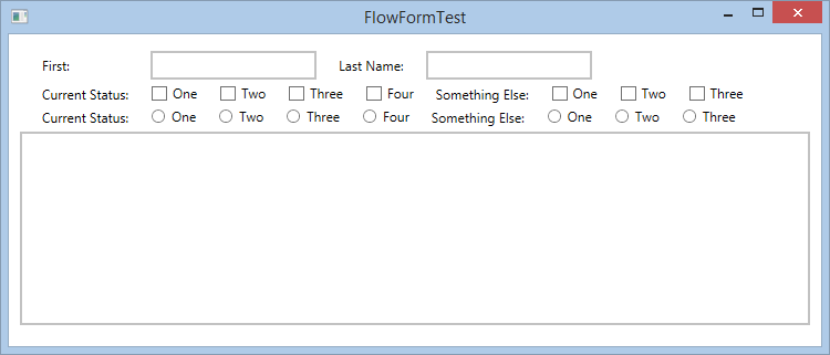
Things get really interesting when the form changes size, as seen in the examples in Figure 8 and Figure 9. In those examples, the same window is resized to be narrower and not all the elements fit on the rows they once occupied in Figure 7. For instance, the second textbox doesn't fit on the first line anymore and needs to be moved to line 2. Note that the label that goes with the second textbox ("Last Name:") theoretically would still fit on the first row, but the layout engine determines that it is more appropriate to move that label to the second row so it doesn't become orphaned. The layout engine also arranged the left edges of both textboxes to line up and create a more professional look.
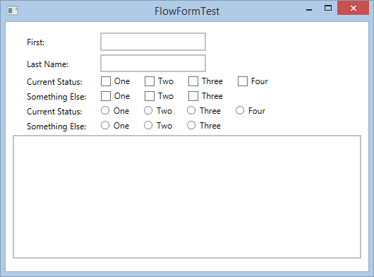
The checkboxes and radio buttons also present an interesting challenge. In the example shown in Figure 8, the start of the second row of radio buttons ("Something Else:") would still fit on the same line as the first row of radio buttons (“Current Status”). This way, “Something Else:” and “One” could have been kept on the first line of radio buttons and only the non-fitting items could have been pushed down. However, that would have led to a rather odd and non-intuitive UI arrangement. Therefore, the layout engine decided to move the whole group of checkboxes to the next line.
It gets even more interesting when the available screen real-estate shrinks to an even narrower size, as shown in Figure 9. There simply isn't enough space to keep radio buttons or checkbox groups together on a single line. Therefore, some of these controls have to be pushed to the next line, but the layout engine still keeps them aligned in ways that make logical sense for business application UIs.
Another new feature that was added to the automatic layout engine is the ability to specify captions for input controls without having to actually place UI elements on a form. This is done by means of the View.Label attached property, as well as companion properties for things like fonts and colors. In the example shown in Figure 7, the first element is a Label and the second element is a TextBox. Using the new View.Label feature however, you could have only created a TextBox and set the View.Label property on the TextBox without ever adding a Label and still achieved the same exact UI output.
Support for New Versions of Visual Studio and the .NET Framework
Older versions of CODE Framework mainly targeted .NET 4.0 and Visual Studio 2010. We specifically tried to stay away from newer .NET Framework classes to make sure that developers still using Visual Studio 2010 were able to use recent versions of CODE Framework. We still like to enable as many developers as possible to use the framework, but we also want to move with the times.
Applying this line of thinking, we decided to update CODE Framework, and especially the CODE Framework Tools (available through the Visual Studio Extensions Manager), to add support for Visual Studio 2012 and Visual Studio 2013. In fact, the CODE Framework Tools are now smart enough to sense the version of Visual Studio and slightly change their behavior accordingly. This also goes for all the project templates. For instance, if you were to create a new CODE Framework WPF application, the project template automatically senses the version of Visual Studio in use and adjusts the .NET Framework version that the template targets accordingly. This results in what we hope will be the best possible combination for all CODE Framework developers. Visual Studio 2010 users may be faced with a few extra notifications during project creation, such as a “do you want to reload the project?” question, but that seems to be a small price to pay to keep supporting developers who still have to use the older version.
CODE Framework now senses Visual Studio versions from 2010 to 2013 and supports them accordingly.
Of course that leads to the question, “what's next?” We're still trying to avoid hardcoding the use of newer .NET Framework concepts whenever it isn't strictly required, but at some point, that model will break down. At that point, backward compatibility isn't going to work anymore, and Visual Studio 2010 developers will have two options: Either stick with the CODE Framework version that supported their older environment (you can find older versions of CODE Framework at https://github.com/codeframework
look under downloads/classic), or, grab a newer version in source code format, pick the new features out, and recompile them for the older target. This will still be possible for most Framework features, although not all.
For the time being, using older versions of Visual Studio is viable, and we'll make sure to alert developers when that changes.
View Visualizer Enhancements
The CODE Framework WPF portions feature a View Visualizer component that is a tremendously useful debug and productivity tool. Think of it as the F12 debug tools available in many Web browsers. Using the View Visualizer, developers can look at all the views that are currently open, the view models they use, which controllers created those views, the styles used in each element of the view, and so on.
The View Visualizer is a very popular and powerful debug tool that works like hitting
F12in a Web browser.
We've received a lot of positive feedback on this feature, so we decided to make it even better. We shipped an updated version in early 2014 that provides even more detail.
Figure 10 shows some of the new capabilities. Using the Visualizer, you can now take a look at the hierarchies of open views and then explore the exact details of each and every element. The example in Figure 10 shows styles, and the properties that go with each style, for a view and, in this example, a selected listbox. The visualization of those styles has been greatly enhanced. Not only can each styled property be displayed, but you get additional information, such as specific values and information on whether the setting is data bound or resource bound. It's easy to see if a certain property is overridden by a superseding style. There's also a Detail panel that shows further information about each property.
Figure 10 shows the defined font family in great detail, and there are many other similar visualizations. Images and colors can be seen visually. Templates, such as data templates, can be seen in their XAML source version. And there's more. This eases the pain on one of the WPF development areas that is most puzzling to most developers: Knowing what is happening at runtime.
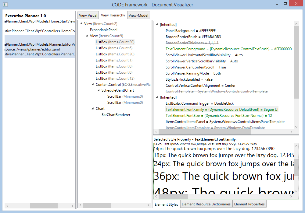
Of course, just like before, it's possible to explore which resource dictionaries apply to each view and element. What's new is that it's possible to explore all properties on an element independent of styling and see not only the current property values, but also whether properties have been set or are still at their default value, whether they have been data bound, and whether or not they get their value from a resource that has been assigned. This is similar to looking at a debugger watch window, with two major differences: For one, this provides access to the view's properties at all times without having to be in debug mode and without having to have a reference to the view's element. It also highlights things in ways the debugger doesn't, such as color coding bindings and resources, or showing serialized XAML for templates.
Another new feature is the new “View-Model” tab, which provides access to the view-model associated with the view. It allows exploring all view-model properties, similar to the view properties. Note that this representation of the view-model is specific to the purpose of showing a view-model. In other words, the aim is to visualize a view-model in the most productive way possible. Concepts such as view actions or standard view models are highlighted in special ways. Parts of the view-model that aren't data elements are displayed less prominently. You can even visualize what the view-model - or parts of the view-model - would look like if visualized using one of the standard templates provided by whatever theme you're currently using.
Odds and Ends
Is that all? Nope! Not by a long shot. There are enough small features that are important enough to have their own whole sections, but I simply don't have the space to do them justice in this issue. Future articles will cover many of those, such as:
- Improvements to the
AsyncWorkerclass - New extensions to
ObservableCollection<T>that improve performance on many scenarios developers face - Watermarks on textboxes
- Detailed changes in various themes
- Message box enhancements and better keyboard support
- ASP.NET-related enhancements
- New standard icon resources and other art assets
- Enhancements to various layout controls, such as the edit form layout or the bi-directional stack panel
- Containers for docking and undocking UIs
- Enhancements to the
ribbonclass and the Workplace (Office) theme
I encourage you to explore many of those details for yourself. The Documentation provides a detailed list of all the enhancements we've made, many of which have links to further details. As always, it is all free and open-source, so don't be shy to explore!


