Way back in the late 1990s, during the first internet boom, one of my first tech-jobs was that of an HTML programmer and CSS coder. As a self-taught developer, my job was to take the designs created by the award-winning design team and translate that into HTML and CSS.
Although the designers often did fantastic jobs on the big ticket items like Home or Services pages, they often glossed over one of the most important aspects of Web development: information design.
Maybe it was my burgeoning design chops starting to teethe, but I relished those moments to take boring, mundane boxes of text and discover interesting ways to engage users. Forms were one of the key places I was able to show off my design abilities.
Eventually, I realized that it wasn't form design that captured my attention, but the importance of information design and that eye-flow hierarchy was the siren calling out to me.
Far too often, the simple layout of information was ignored or seen as unimportant. Since then, I've been involved with many projects and developers who have suffered from the same problems. List views, forms, button states, hover states, and even link treatment are ignored in the design process. And far too often, I see developers simply let the browser execute its default formatting, and then call it a day.
When it comes to communicating with your users, a little bit of great information design can go a long way. CSS is the technology that lets you do it, and more so now than ever before.
Does This Stuff Really Matter?
Perhaps you're thinking, “Why should I care about what forms look like? Or how I display a big list of items?” The reason is glaringly simple: user experience.
Whether your goal is to show-off a bunch of articles in a blog or to capture personal details for a sales lead form, everything you do is about user experience, and ultimately, user conversion. Your goal isn't just to show off a single page, but to have your information hierarchy do its job by enticing users to move through the intended flow of a project.
Whether it's for a museum catalog or an automotive website, how you display content and engage users can never be ignored. Sometimes developers will have a designer guiding them along the way, providing solid red-lines and documentation, but just as often, developers are left to fill in the gaps.
Sass, Less, and Other Technologies
Although I'm a huge proponent of using Sass, a CSS pre-compiler that allows for simple nesting to save time, space, and honestly, a ton of headaches, for the purpose of this article, I'll be dealing with simple HTML and CSS.
I can't stress strongly enough how beneficial using a system like Compass with technologies such as Sass can be for your project. From the ability to create includes that you can simply drop-in later on in your code, to defining commonly used variables to save hours of time, Sass plus Compass is my personal favorite way to work on Web projects. It's a smarter way to work.
If you haven't taken the time to investigate these technologies, you'll be amazed at what they allow you to do, and how much quicker you can build great pages with consistent, re-usable snippets of code.
Sometimes You Need to Reset
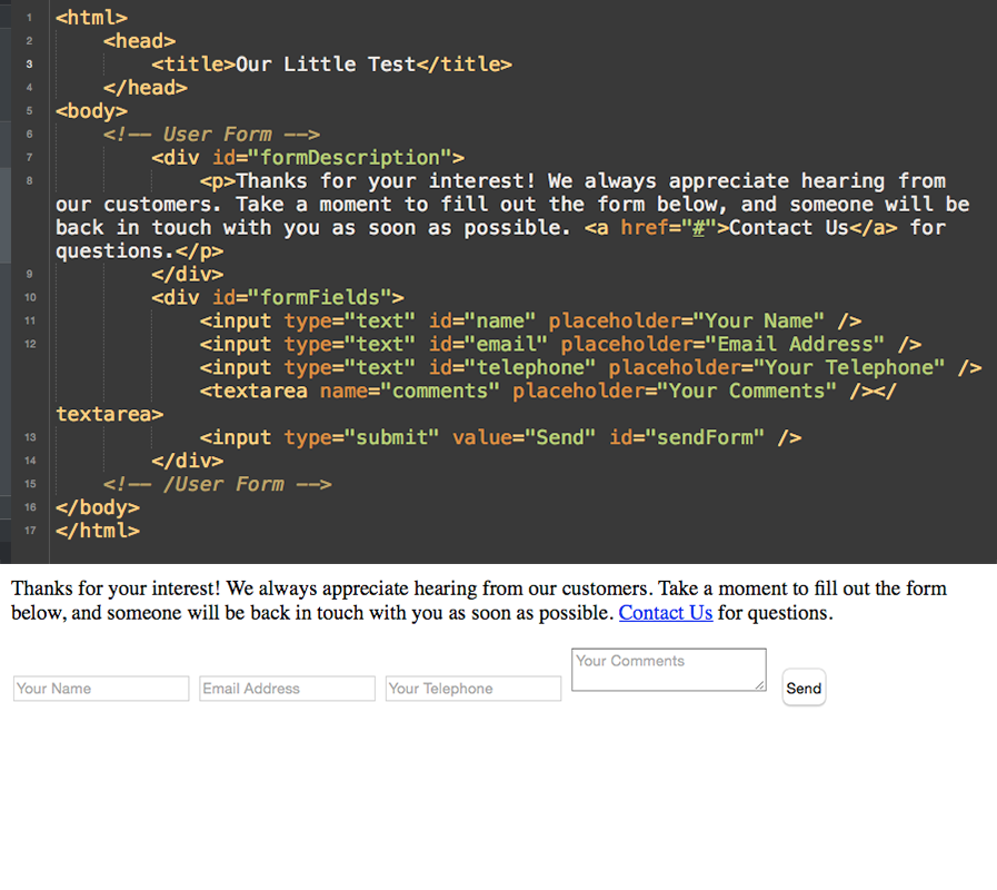
For the example in Figure 1, I was creating a very simple, boring HTML form. This is the type of thing that everyone has encountered, and for many developers who work for large enterprise projects, these are the sort of tasks you're often asked to perform.
Often, there are no design comps to go by or any guidelines to help you along the way. It's your job to make it look great, and ensure that users fill out the content requested.
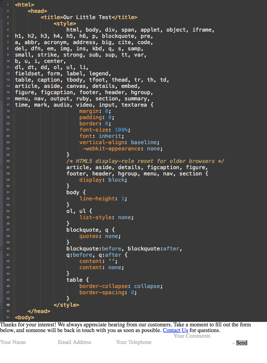
The first thing you'll do is to get rid of all the legacy spacing and attributes that HTML has by default. Your goal is to make things look great, and having additional padding, tracking, line-heights, or margins will only serve to frustrate you later on.
You can use any sort of CSS Reset script you want. Either roll your own, or simply use your favorite search engine to find one that you like. If you're working with Compass, there is a baked-in @include that will handle this for you:
@import "compass/reset"
Whatever you want to use is fine. Just make sure that you use one or you'll be banging your head against your desk, screaming at your monitor with curses and bouts of: "Why are you doing that?!"
Six Key Items for Success
Although there's no secret formula to great design, there are six key items that help differentiate a thought-out project from a thrown-together mess. Once you learn to master these, you'll begin to see a world of difference in your project.
Margins and Padding
We also call this “breathing room,” and its importance is more than aesthetic. Deploying the correct amount of margin around an item is a huge factor in legibility of buttons, rows, tables, and, of course, forms.
Everyone has encountered a button where the text is flush against the top and corners of its bounding box, or the bulk of text in a blog is situated directly against the browser's edge.
To be blunt, there's no excuse for this. All you need to do is add in a bit of margin or padding to improve your design.
What's the difference? Margin is the space around an object. Padding is the space inside of an object. Pretty simple, right? Put padding above or beneath something to make sure it's not bumping against other elements, and place padding inside a cell or <div> to give you that beneficial breathing broom.
Note: It's better to user margin and padding when spacing elements on a page, instead of falling back to the top: or left: attributes. Margin relatively affects the other objects on the page, which means that everything moves according to that object's size, padding, and margin.
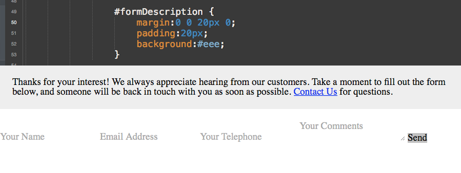
In the example in Figure 3, I've added a simple 20px padding to our #formDescription <DIV>, attached a simple background color to help set it apart, and to increase breathing room, I tacked on a bottom-margin of 20px, so that the content isn't crowding the form fields below.
Fonts
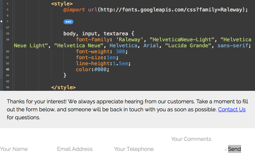
The right font makes all the difference in the world and learning which ones to use and when to use them is far more of an art than a science.
By default, most browsers either use Times New Roman or Helvetica/Sans-serif. Although these typefaces may fit your project, you should always make sure that the font choice serves the project best. Never leave anything to chance, or your project will look haphazard and incomplete.
Luckily for everyone, there are numerous resources that not only provide great free fonts, but host those fonts for you.
Services like Google Fonts, Font Squirrel, and others, provide you with the correct CSS to simply cut/paste text into your document. If your project calls for higher-profile fonts, Typography.com provides access to the award-winning HF&J font library, and TypeKit gives you the ability to use hundreds of fonts from the Adobe Type Library.
A good rule of thumb is to use no more than two distinct fonts in a project. One can be used for headers or navigation elements, and another for body copy. When you start displaying more than two fonts, you'll create a project that feels sloppy, with no cohesion.
Always remember to provide a back-up font choice defined by serif or sans-serif to make sure that the visual balance of your project remains consistent. If you're using a sans-serif font that you've named but for some reason the link isn't working, you'll be giving users a poor experience to have the browser fall back to Times New Roman.
For the example in Figure 4, I'll modify the font-face, as well as the font-size and line-height to assist in legibility.
Colors
I've given some attention to colors already, with the slight gray background I put behind the formDescription ID I used at the beginning of this article, but this is just the start.
Colors are vital in helping to differentiate hierarchy and aid the visual flow of a project so that the user's eyes are directed down a page in the intended order.
CSS gives some pretty fantastic options, particularly when you begin to deploy input items or work with hyperlinks. Not only can you define the look and interior text attributes, but you also have the ability to manipulate what happens when the field is hovered over, or once it's become the focus of attention.
Adding simple hover effects will delight users, but even more importantly, they will allow a user to know, “Hey, this element is something you can interact with!” Never underestimate how important that is to the longevity and success of a project.
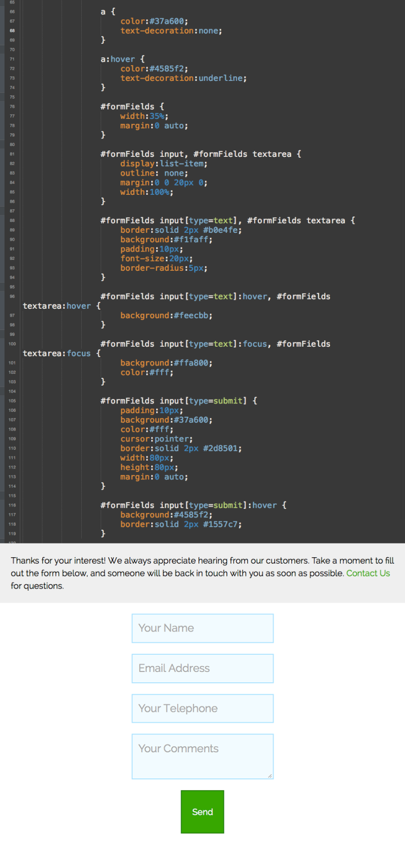
In the example below, I've added simple color changes to the input and textarea elements when a user hovers over the item. You could additionally add another change :active state of the object.
Make sure that you pay attention to the visual cues you're giving users. I've used green for the Send button, with a blue hover state, so I'll also do the same for the hyperlinks.
Note that I've also added in a display:list-item to the input and textareas, to aid in layout.
Corners
One of the great things about the newest CSS3 implementation in modern browsers is the inclusion of the wonderful border-radius attribute.
Border-radius is exactly what you hope it is: the roundness of corners. Now, rather than being forced to create artwork and deal with intricate layouts or tables to showcase boxes with nice, curved edges, you can do this programmatically.
Even better, you can apply these attributes to images, buttons, input boxes, and more. The days of being stuck with rectangular photographs on an About page are gone.
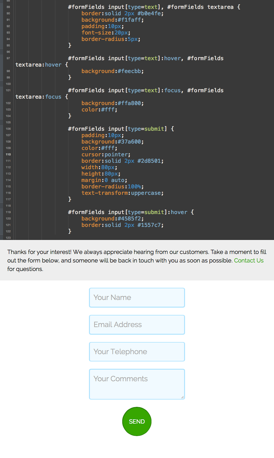
In the example, I'm going to make a few small tweaks to add a little bit of interest to the form. First, I'm going to put in a small bit of border-radius on the input[type=text] and textarea fields. I'll use 5px, although you can use any increment or size you desire.
For the purpose of the Send button, I'll actually create a full-blown circle button, which is always fun. To do this, create a border-radius:100% to ensure that the entire object is rounded.
To additionally set the button apart from the other page elements, I'll add a text-transform:uppercase so that all of the text inside the button is fully capitalized.
Again, helping to create a visual language to differentiate what is not only clickable, but what is also specifically a button, is a good rule of thumb.
Animations
For a final bit of polishing, you want to work the extremely simple, but equally powerful, CSS animation engine. Taking the time to add in subtle, elegant animations to your project create a final sheen of polish.
Using animations doesn't mean always making items zoom across the screen or pop-in one by one.
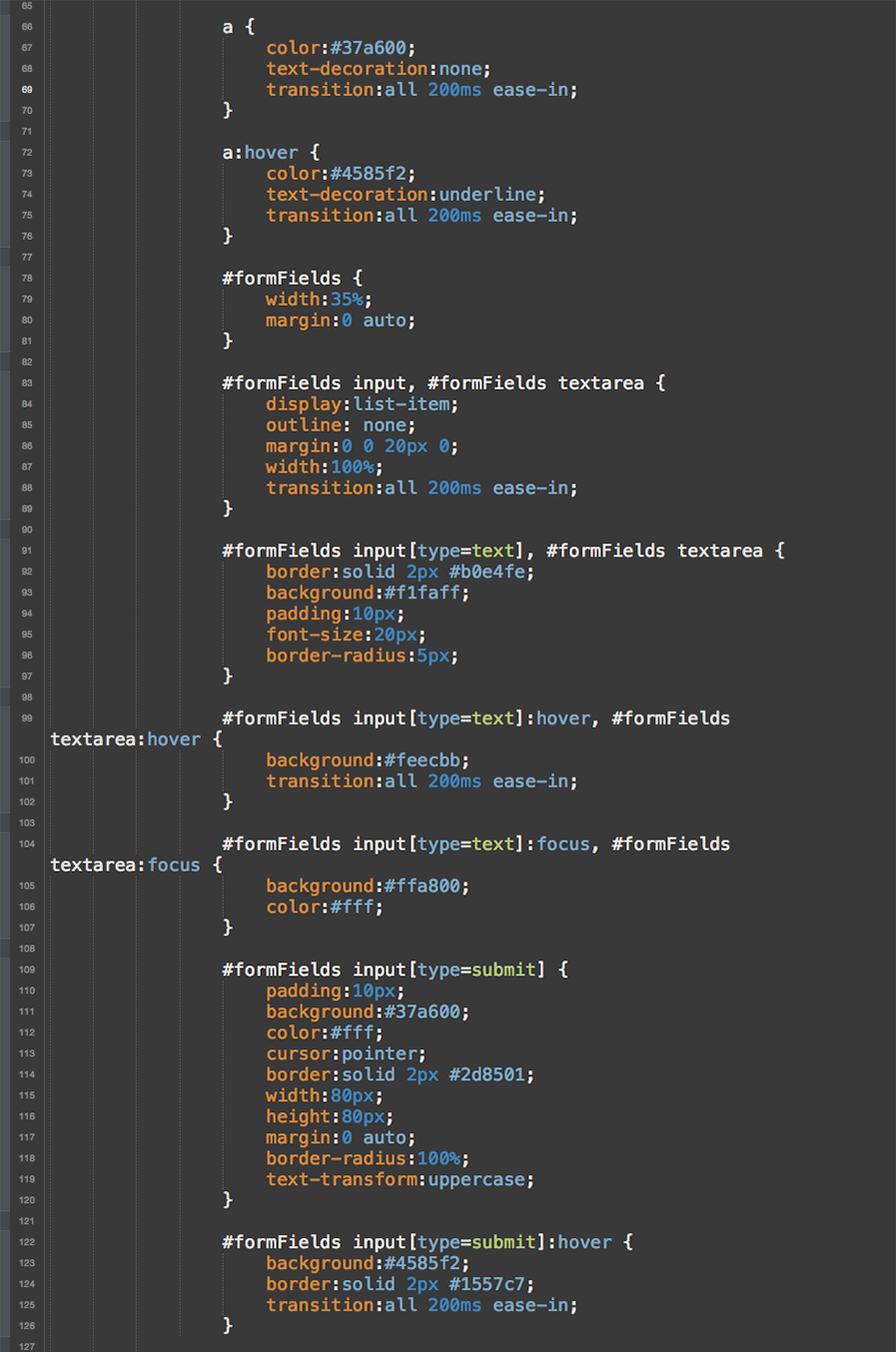
In the example, I'll apply a simple fade that will apply to all of the hover states, which helps break the jarring nature of switching between two distinctive looks of a button or an input area.
For this fade, you'll use the CSS transition property.
You want every aspect of the item to be affected, so you'll apply all. Then you'll set it to execute in 200ms and finally, to make sure it's nice and smooth, you'll tell the browser to ease-in the animation. The final snippet of code is as follows:
transition: all 200ms ease-in;
Note that to be safe, you may consider using specific browser prefixes, such as -webkit- or -moz-. This is a painful little quirk that new CSS definitions need so that they work in various different browsers, though I'll never quite understand why.
Make sure that you apply this to the initial state of objects, as well as to the hover, focus, and active states. Otherwise, the effect will only fade-in but not fade-out.
Keep on Styling
Obviously, there's much more to the world of CSS styling and how it can apply to your projects. With recent browser additions, developers can do everything from change the tint of vector SVG objects, to create complex animations that just a few years ago could only be accomplished with more complex software platforms, such as Adobe Flash.
As a Web developer, knowing HTML is only part of the battle. Although many developers make the effort to increase their ability to manipulate object-oriented code or server-side issues, many forego one of the most important pieces of the puzzle: the user's experience.
Make sure to keep your user's journey through your project in mind, and take the additional time to style your work in interesting, intuitive ways. You'll not only increase the enjoyment, but you'll find that more users actually complete the tasks you want as they work through your projects.


