“Design” is a word that's thrown around, much like the related word “Architecture.” As it turns out, the word design is both a noun and a verb. There are many places to find various definitions. For purposes of this article, I'll rely on guidance from Wikipedia (http://en.wikipedia.org/wiki/Design), as that definition provides a nice framework for this article's design:
Noun: A specification of an object, manifested by an agent, intended to accomplish goals, in a particular environment, using a set of primitive components, satisfying a set of requirements, subject to constraints.
Verb: To create a design, in an environment (where the designer operates).
Of the two alternatives, the noun provides a sound basis of general principles that we can apply to software development. In the world at large, we are constantly interacting with objects that are all designed, whether that design is good or bad. We know instinctively whether something is designed well. Good design, among other things, has clarity and is intuitive with clear intent. This column's title, “The Simplest Thing Possible,” names a hallmark of good design. We expect it in the objects we use and we should expect no less with our software.
Squaring the definition with software, our software is the object that is sponsored by the business (agent). There is intent that the software will accomplish one or more goals. Typically, the software will be constructed pursuant to some stated specification (requirements). Part of that specification mandates one or more environments within which our software is supposed to operate.
Developers often ask themselves, “How do I know whether my software is well designed?” That also begs the question of “How do I create well-designed software?” These are important questions to consider because just the mere exercise of asking is itself part of the design process.
This article borrows from the world of industrial design to establish a framework that you can use to answer the questions posed above.
Hello Mr. Rams
If you have read about or followed the world of industrial design, you may be familiar with the work of Dieter Rams. Mr. Rams, for many years, was the chief designer at the German consumer products company Braun. Part of Mr. Rams' legacy is his ten principles for good design. It:
- Is innovative.
- Makes a product useful.
- Is aesthetic.
- Makes a product understandable.
- Is unobtrusive.
- Is honest.
- Is long-lasting.
- Is thorough down to the last detail.
- Is environmentally friendly.
- Is as little design as possible.
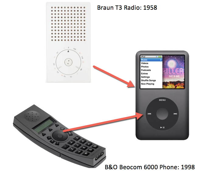
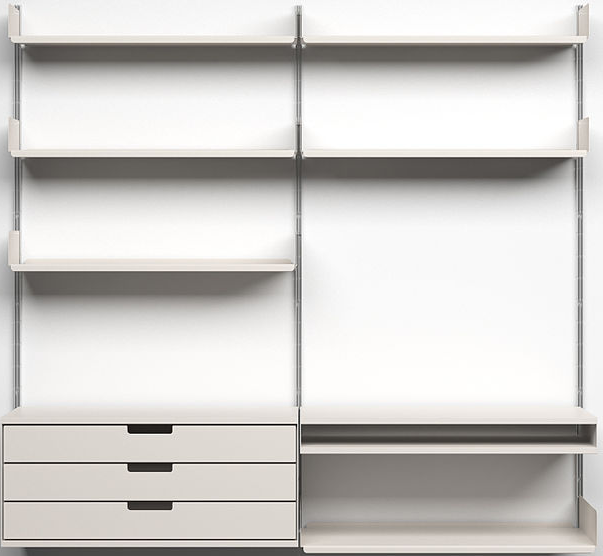
For tangible products such as smart phones and consumer appliances, it's easy to see how these ten principles apply. To illustrate the ten principles in action, take a moment to look at Braun products both past and present. In particular, compare Rams' 1958 Braun T3 Pocket Radio to the Apple iPod. Are there any similarities? To be complete, the T3 accounts for only part of the inspiration of the iPod's design. The wheel reportedly comes from the Bang & Olufsen Beocom 6000 telephone. Rams also designed a revolutionary shelving system in 1960 with a timeless design that could easily be mistaken for something introduced in 2014. Figure 1 and Figure 2 illustrate these designs. These examples emphasize a universal truth: Good design endures.


In software, the applicability of industrial design and these ten principles may not be as clear. Nevertheless, with a bit of thought and time, you can discover that good design is good design, regardless of medium, whether it's tangible consumer products, or software, or something else. Why? Because as it turns out, an object's design is about how people interact with the object rather than how the object looks. It does turn out to be the case that objects that have a pleasing user experience also tend to have a beautiful appearance.
With respect to software, for any contemplated feature, ask how the ten principles apply. For a moment, think about software that you had a good feeling about when you interacted with it. And conversely, think about software that didn't feel good to use. With software, we often equate to these design metrics to the user interface (UI), which makes sense given that it's the UI that we directly interact with. The fact is, the success or failure of a given UI is made up in part by the non-visual code that backs it up. Collectively, this is all about User Experience (UX) and the design of that is critical to its success in the same way that design is critical to the success of the other products we interact with on a daily basis. These principles also extend to non-UI elements like APIs. We've all worked with well-designed and poorly designed APIs. APIs that are pleasing to work with are APIs that also happen to be well designed. The key is when considering design, we need to think beyond the core functionality and also consider how a user or another developer will interact with and use our software.
...with a bit of thought and time, you discover that good design is good design regardless of medium, whether it's tangible consumer products, or software, or something else. Why? Because as it turns out, an object's design is more about how people interact with the object rather than how the object looks.
It's not necessary to contrive things so that all ten principles have to apply all of the time. Like any set of principles, they're meant to be a guide. It's important to emphasize that each of the ten principles doesn't exist in isolation from the others. In the following sections, I will discuss how each principle may apply to the world of software development and how and to what extent they apply in the context of one another. Ultimately, what is deemed to be well-designed or poorly designed is in the eye of the beholder. There's no set formula for that. At the expense of repetition, these ten principles, if followed, will end up with a greater likelihood of design success.
Good Design: Is Innovative
Defined simply, innovation is a new method, idea, product, etc. When you wrote that software, did it employ the same old techniques or did it exploit a new and more effective way at solving a problem? Note that innovation is not always about trying to find new ways to invent the wheel. Innovation doesn't always involve huge paradigm shifts. Sometimes, innovation occurs in small, incremental steps. The takeaway doesn't necessarily rest on the status quo of existing patterns and practices. Good design sometimes involves coloring outside the lines. Being the first principle, innovation is the one that is often viewed in the context of remaining nine principles.
To illustrate that innovation can happen anywhere; consider the Japanese Toothpick in Figure 3.

As it turns out, the decorative aspect of the toothpick isn't decorative at all. Figure 4 illustrates its function.

The design in this case isn't about how the toothpick looks. It's aesthetically pleasing to be sure. As it turns out, the aesthetic is a byproduct of good design, which in this case is quite innovative. The innovation in this case was to take something very simple; a toothpick, and add new functionality without materially altering its interface. In software, we are often faced with the need to add new functionality. How do we do that without impairing the design? The more features, the more difficult it can be to achieve good design. Perhaps you're familiar with the term “Feature bloat.” Software with many features bolted on usually bears the hallmarks of poor design in spite of the fact that the software may have started with a good design. Maintaining balance between features and usefulness (utility) has a profound effect on how we interact with the object whether it be a consumer appliance, furniture, or software. When how we interact with something changes and such change is the result of some net positive value, that's what innovation is all about. Note that what is not embodied in these principles is the notion of quantity. Often with good design, less is more. In the course of this article, you will see an interconnectedness among these principles.
Good Design: Makes a Product Useful
It's common sense that you want your software to be useful. The question to ask is how much is usability considered in your design? It's not enough for you, as a software developer, to think your software is usable. Rather, it's up to the people that use the software to determine whether or not it's useful for the particular purpose it was commissioned. Often, usefulness is captured in the form of user acceptance tests and other quality assurance activities. If these activities are present, you're supporting an environment that helps to ensure good design.
Good Design: Is Aesthetic
Aesthetics are about how pleasing something is to look at. We often equate good aesthetics with beauty. In the software world, this principle clearly applies to user interfaces. What about non-visual elements, like an API specification or the layout of a given code block? Restful URLs tend to look better than URLs with query strings. Does that mean query strings are per se ugly? Clearly, the answer is no. As with most things, there needs to be a balance. In some cases, query strings may in fact fit the bill. Specific context and circumstances should always dictate this consideration.
Good Design: Makes a Product Understandable
If your software is confusing and there is no clearly stated intent on how it's to be used, most likely, your software won't be used or, worse yet, your software will be used incorrectly, which could lead to expensive consequences. Well-designed software is intuitive due to using established standards. Not using established standards can lead to a more expensive investment, such as higher training costs. During development, you may often need to cultivate multiple alternatives and to run those designs past your users to get their feedback.
Good Design: Is Unobtrusive
Good software doesn't get in your way. Your software may perform its core function in a technically proficient way. Nevertheless, there may be some aspects of the software that get in your way. Perhaps there's a section of your application that has annoying and redundant dialog boxes that require user interaction. Is there a necessary function and purpose they fulfill? This principle is closely aligned with the aesthetic and usefulness principles. If there is some behavior that, based on user feedback, gets in the way, unless there is a clear understanding of why that behavior is necessary, that behavior should be eliminated.
Good Design: Is Honest
Is there some aspect of your software that gives the appearance that it's more complex or innovative than it actually is? If that's the case, that's noise that should be removed.
Good Design: Is Long Lasting
This principle directly relates to the notion of design patterns and other software development principles like SOLID. In construction, there's a phrase: Measure twice and cut once. You know that software needs change over time. The question is how? How compartmentalized are the changes? When a new requirement surfaces that your software has to support, do you have to disturb large parts of your code? Or is the disturbance localized? There's a clear cost benefit when this principle is considered.
Good Design: Is Thorough Down to the Last Detail
There is no such thing as a meaningless detail. If your software has a particular appearance or feature, those details matter because those details are part of the equation of how people interact with your software. Why does this particular feature or behavior exist? Why is a particular color scheme being used? Do you know why something works the way it works and whether something works as intended? There should be readily available answers to these questions. Often, these questions can be answered via unit or integration tests. Regardless of how these questions are answered, the importance of being able to answer them cannot be over-stated.
Good Design: Is Environmentally Friendly
How well does your software preserve your environment? Environment in this case considers the cultural norms of your organization. Perhaps there's an effort in your company to reduce email and printing. How well does your software support those initiatives? For reports, does your software provide a good way to view the output in the form of a PDF? Is that option the default? If there is such support, your software can be considered environmentally friendly and in regard to that principle, is well designed.
Good Design: Is as Little Design as Possible
There's a 14th century problem-solving principle known as Occam's razor that states: Among competing hypothesizes, the one with the fewest assumptions should be selected. More assumptions equate to greater complexity. A modern interpretation of this principle is often credited to Albert Einstein (not verified) where he reportedly said that “Everything should be kept as simple as possible, but no simpler.” The same should be true of software. Think of the 1958 Braun T3 Radio that has a very simple interface. There's no waste. What remains is a clear, useful and intuitive interface that is aesthetically pleasing, understandable, and unobtrusive. The T3 doesn't claim or appear to be anything other than being a radio. This last principle summarizes the previous nine principles. If there isn't a clear purpose as to why a given feature or behavior is present, remove it. In that process, your software becomes simpler and less complex. This is a clear case of why the choice of not doing something can end up yielding a superior design.
Conclusion
As software developers, we are confronted with design questions. Is your software well designed? If the feeling is that the software under examination is either poorly or well designed, we must turn to the question of why we came to that conclusion. That becomes the difficult part of the analysis. Although Dieter Rams' ten principles were geared toward industrial design, because good design transcends medium, the principles are applicable to software development. As you plan your features, consider adding these ten principles as part of your definition of design.


