Every UI development system has the concept of screens forming separate units of UI real estate that divide the application into work areas. They go by different names; You may know them as views, forms, dialogs, or pages. Whatever the name, they serve a useful purpose: keeping the UI bits separated into logical sub-areas of the application. Sure, you can build an application with a single screen but think about the mammoth business applications you've seen. Imagine trying to cram hundreds or thousands of bits of application data and user interaction on a single screen. That's a bad idea.
Xamarin.Forms provides their own screen-based solution. They're called pages. I know what you're thinking; given the name of the platform (Xamarin.Forms), shouldn't they be called forms? That was my thought when I first started exploring the platform. I'm not privy to the naming decision; perhaps they wanted the same name as another XAML platform (Windows Phone/Silverlight). Whatever the name, Xamarin pages are the focus of this article.
The Three Parts of Xamarin UI
Pages are the top-level elements in Xamarin UI. Think of pages as the screens in your app. Most of the time, a page takes up the entire screen of the device. However, pages can have sub-pages embedded within their content. In that case, the sub-pages are more like a composite user control. If you're an experienced mobile developer, a Xamarin Page corresponds to iOS View Controller, Android Activity, or Windows Phone Page.
The user can navigate through the app, moving from page to page. Some of the page types are helpful at managing the navigation stack, making it easy for you to add and remove pages from the navigation history.
Once the user gets to the page, they'll see more UI elements (otherwise it'll be a boring application). The page's UI is created with Layouts and View. Layouts are responsible for positioning elements on the screen. In most situations, each page has a Layout element as the top-level child element on the page. Within the Layout, other Layouts and Views live. Views are the main UI elements (known as widgets or controls in other frameworks). For this article, I'll focus on the Pages; I'll discuss Layouts and Views in another issue of CODE Magazine.
The Page Types
There are a number of page types available in the Xamarin library (see Figure 1) covering a broad range of possibilities.
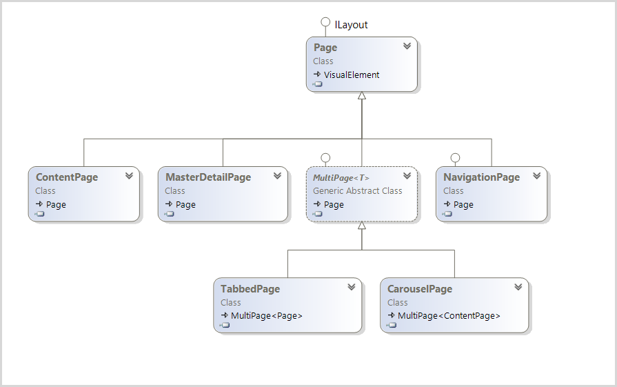
The first two page types in Figure 1 are optimized for showing content.
- ContentPage: A simple page that displays a single view, often used as a child page in other page types
- MasterDetailPage: A divided page that show two panes
The next two pages derive from the MultiPage<T> base class. These pages contain a collection of child pages. The page collection is bindable.
- TabbedPage: Container for child pages. Switch between pages using a tabbed interface
- CarouselPage: Container for child pages. Switch between pages using a swipe gesture
The last page type excels at navigation. Navigation pages provide time-honored UI patterns that let the user move between sections of the app. NavigationPage can serve as a container for a child page. This feature is essential for enabling a page ToolBar in Android and iOS.
- NavigationPage: Provides a service that supplies a back stack and allows navigation to pages within the app
If one of these five page types isn't suitable for your application, you can always build a custom page class of your own.
A Native Look on Each Platform
Xamarin Pages are clever; they change UI metaphors based on the OS of the target device. For example, the TabbedPage ensures that the tabs are on the top of an Android device and on the bottom of an iOS device. On a Windows phone, the TabbedPage implementation uses the Pivot control, allowing the user to employ the familiar Windows Phone side-swipe to change tabs.
Adding a Page to a Shared Library
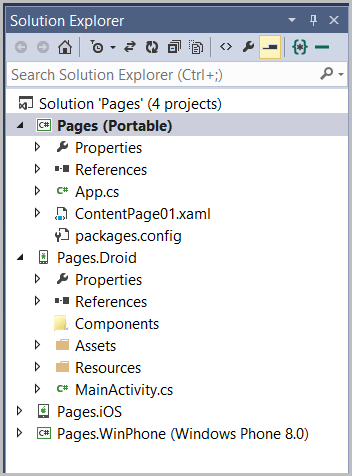
The shared code for a Xamarin solution is usually placed in a shared Portable class library project. In this example (see Figure 2), it's the project named Pages at the top of Solution Explorer.
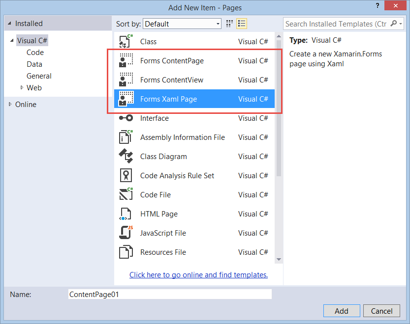
I'll be using XAML files for the Pages in this article. To add the first Page, I'll open the Add New Item dialog and choose the Forms Xaml Page item (see Figure 3). This item template produces a XAML file and adds it to the project. The other two choices shown in Figure 3 (Forms ContentPage and Forms ContentView) are C# template files, which produce a C# file without the attached XAML file.
I've named the first page ContentPage01. Here's the default XAML from the template:
<?xml version="1.0" encoding="utf-8" ?>
<!-- xmlns details removed for brevity -->
<ContentPage xmlns="..."
             xmlns:x="..."
             x:Class="Pages.ContentPage01">
    <Label Text="{Binding MainText}"
         VerticalOptions="Center"
         HorizontalOptions="Center"/>
</ContentPage>
The XAML is very simple; it contains a ContentPage root element and a single Label child element. Remember that the ContentPage can only have a single child element. That's why Xamarin.Forms has the Layout views. They're intended to act as containers for multiple elements. I can replace the Label with a StackLayout and put multiple children in the layout.
<StackLayout>
    <Label Text="One"
        VerticalOptions="Center"
        HorizontalOptions="Center" />
    <Label Text="Two"
        VerticalOptions="Center"
        HorizontalOptions="Center" />
</StackLayout>
Setting the Start Page
I need to tell the Xamarin.Forms which page to show at app startup. This is done in the App.cs file in the Pages project. The code is dead simple; just instantiate the page and assign the reference to the App.MainPage property.
public class App : Application {
    public App() {
        // The root page of your application
        MainPage = new ContentPage01();
    }
}
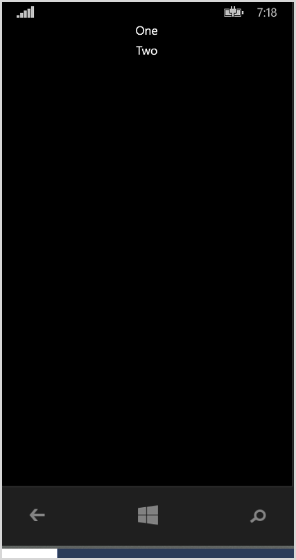
Run the app on the phone and the content page is shown (see Figure 4). It's not the most interesting UI, but it's a start.
Interesting Properties on the Page Class
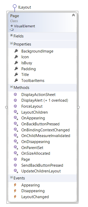
Naturally, the Page base class provides common page properties, methods, and events. Figure 5 shows the object model of the Page class.
Padding
The Padding property controls the amount of space between the page and its inner content. This is set with the Thickness type. If you are familiar with Thickness in other XAML frameworks, you'll be right at home with this implementation.
Thickness th;
th = new Thickness(uniformSize: 30);
th = new Thickness(horizontalSize: 20, verticalSize: 10);
th = new Thickness(left: 5, right: 10, top: 15, bottom: 20);
this.Padding = th;
IsBusy
Each mobile platform provides a mechanism to alert users that the app is busy doing some work. There are two ways in Xamarin.Forms to indicate that your app is busy. The first choice is to use the ActivityIndicator view. Place this element on a content page and set its IsRunning property to true. Unfortunately this won't work in some circumstances, because the ActivityIndicator needs to be on a top-level page. That's great when using a ContentPage, but it doesn't work when using other pages, like TabbedPage.
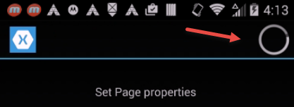
For the other page types, like NavigationPage, there is a page-level property named IsBusy that does the same thing. You set the IsBusy property to true to activate the busy UI on the device. On Windows Phone, Xamarin injects a ProgressBar at the top of the screen (See Figure 6).

On Android devices, you get the moving circle in the app title bar (see Figure 6).
The iPhone has the rotating flower in the app title bar (see Figure 7).

I suggest using a try/finally block when setting the IsBusy property. If the code throws an exception, it'll guarantee that the busy animation on the device stops.
try {
    this.MainPage.IsBusy = true;
    await SomeAsyncMethod();
}

finally {
    this.MainPage.IsBusy = false;
}
Appearing and Disappearing
Do you have a scenario where you want code to run prior to a page appearing or disappearing on the screen? For that, Xamarin.Forms has the Appearing and Disappearing events and their companion OnAppearing and OnDisappearing virtual methods.
There are a few quirks here when moving to another page. On iOS, the OnDisappearing method on the current page is called before the OnAppearing method is called on the destination page. On Android, the opposite is true. Also, iOS only calls the Appearing event once, the first time the page is shown. Subsequent appearances fail to fire the event. This is a known bug at the time of writing this article.
The Content Page
If you're building a single page app, the ContentPage is a good choice. But it really shines as a collaborator with other page types. I'll use it as a building block on the MasterDetailPage. As you've seen, it's the default page type in the Visual Studio item template. Let's see how to work with the other page types.
Adding a New Page: Part Two
Visual Studio is limited as to which page types are available as new item templates. Look at Figure 2 again. You've seen what that XAML template does. It creates a XAML file with a ContentPage root element. Since there isn't a TabbedPage template or any of the other page type templates, what do you do when you want to create one of the other page types? Use the XAML template and change the root element, as shown in this code snippet:
<?xml version="1.0" encoding="utf-8" ?>
<MasterDetailPage xmlns="..."
        xmlns:x="..."
        x:Class="Pages.MasterDetailePage01">
    <BoxView  Color="Blue"  />
</MasterDetailPage>
Change the base class in the .cs file or there will be a compile error.
Public partial class MasterDetailPage01 :
                     MasterDetailPage {
Using the MasterDetailPage
You've probably seen the Master/Detail UI in some of the applications that you use. The master portion of the UI contains a high-level list of items, for example, city names. Selecting a name shows the detail information in another portion of the screen.
The MasterDetailPage contains two child pages. Indicate which ContentPage is the Master by placing it in the Master element, as shown in this snippet.
<MasterDetailPage.Master>
    <ContentPage Title="Master" BackgroundColor="Yellow">
        <Label Text="Master Page" TextColor="Black"
            HorizontalOptions="CenterAndExpand"
            VerticalOptions="CenterAndExpand"/>
    </ContentPage>
</MasterDetailPage.Master>
I'm using a ContentPage within the Master element. This is the most likely child page, but it's not a requirement. I could use a CarouselPage or other page type if it's appropriate for the UI design. Here's how to designate the Detail page:
<MasterDetailPage.Detail>
    <ContentPage Title="Detail" BackgroundColor="Green">
        <Label Text="Detail Page"
            HorizontalOptions="CenterAndExpand"
            VerticalOptions="CenterAndExpand"/>
    </ContentPage>
</MasterDetailPage.Detail>
Run the app on the phone and the Detail page is shown in the UI. To me, this seems backward. I'd rather see the Master page first. There's an easy fix: Add the following property value to the MasterDetailPage element.
<MasterDetailPage xmlns="..."
        xmlns:x="..."
        x:Class="Pages.MasterDetailPage02"
        IsPresented="True">
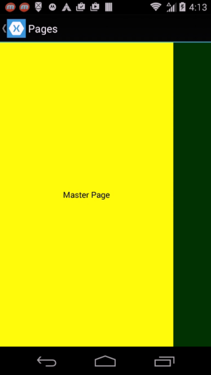
Run the app again and the Master page becomes the initial page (see Figure 8).
Different Faces
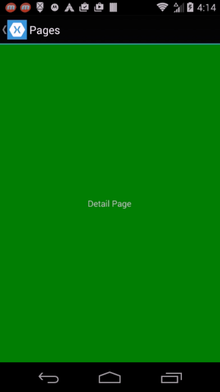
Xamarin tries to make each page type look familiar to the mobile user for each device family. On an Android device, the Master page is shown on the left side of the screen (see Figure 8). It occupies approximately 80% of the screen width. The Detail page occupies a small sliver of real estate on the right side of the screen. Swipe left to reveal the complete detail screen (as shown in Figure 9).
Swipe right from the right edge of the screen to return to the Master page. Another way to navigate on the Android is with the small icon and text button (the Title Bar) on the top left of the screen (see Figure 10). Touch the icon to switch back and forth between the master and detail page.

I'll discuss more device-specific presentations after I add some buttons and labels to the page.
Changing the Swipe Gesture
Let's imagine for a moment that you acquire a strong dislike for the swipe gesture and decide to banish it from your app and replace it with a revolutionary new gesture system. Frankly, I think that would be a silly choice in most apps, but bear with me for a minute. Use the following code snippet to disable the swipe gesture on the MasterDetailPage.
IsGestureEnabled = false;
Of course, this is a cross-platform mobile app, so there are some idiosyncrasies. Even though Xamarin strives to work the same across all platforms, it's not always consistent. Sometimes the reason is because of the platform; expectations are different for users of an iOS app when compared to their Android brethren. Sometimes the reason is less clear; perhaps the Xamarin implementation is not compatible for engineering reasons. The point I'm getting to is this: The MasterDetailPage swipe gesture doesn't work at all in Windows Phone, no matter which value you apply to IsGestureEnabled.
Changing the MasterBehavior Layout
There are several layout choices for the detail page. Use the MasterBehavior enumeration to change the default layout.
- Popover: The Detail page floats over (pops over) the Master page
- Split: The Detail page is displayed in a split screen regardless of device orientation
- SplitOnLandscape: When the device is in landscape mode, show the Detail page on split screen
- SplitOnHorizontal: When the device is in portrait mode, show the Detail page on split screen.
- Default: Use the default implementation for the target platform
Synchronize the Detail Page with the Master Page
The example shown for the MasterDetailPage is instructive but not very useful. It's missing an important part: how to change the Detail page from the Master page. One approach is to swap out the Content page when an item is selected on the Master page. A better approach is to change the bound data for the Detail page when a Master page item is selected.
Swap the Detail Page
The idea behind swapping the Detail page implementation is to have multiple Content pages. For example, I've got three city-specific pages available for my weather app (See Figure 11).
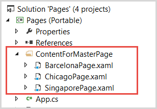
I'll assign the Chicago page to the Detail property in the MasterDetailPage constructor. With this change, I can leave the Detail section blank in the XAML file.
public MasterWeatherPage01() {
    InitializeComponent();

    this.Detail = new ContentForMasterPage.ChicagoPage();
}
In the XAML file, I'll add some buttons to switch to the various detail pages.
<Button Text="Chicago" Clicked="ChicagoButton_Clicked"/>
<Button Text="Singapore" Clicked="SingaporeButton_Clicked"/>
<Button Text="Barcelona" Clicked="BarcelonaButton_Clicked"/>
In the click handlers, I'll swap the page and force the UI to show the Detail page by setting the IsPresented property to false.
public void SingaporeButton_Clicked(object sender, EventArgs e) {

    this.Detail = new SingaporePage();

    // change to the detail page
    this.IsPresented = false;
}
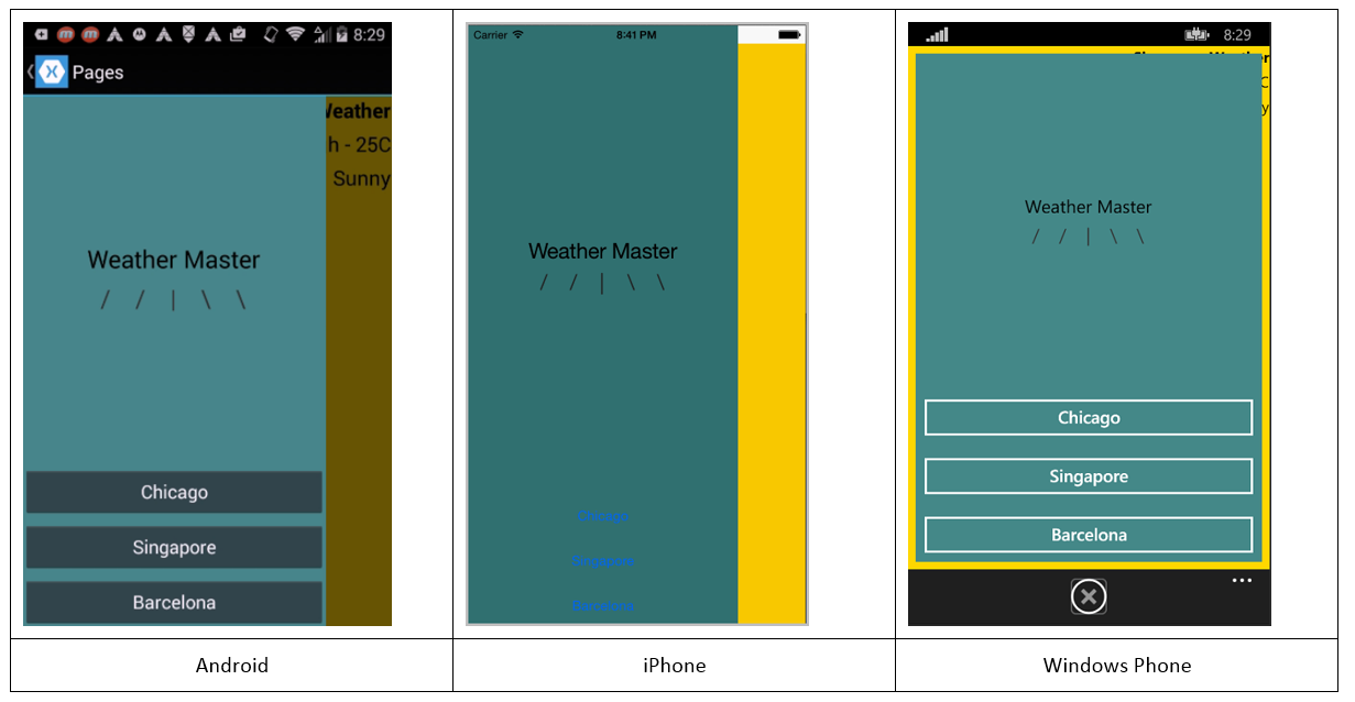
Figure 12 shows the Master page on each device. As you see, each platform has a different presentation. Android has gray buttons across the bottom. You can see a slice of the Detail page on the right side (I've right-aligned the text on the Detail page to make it easier to see in the screen shot).
On the iPhone, the buttons are blue and represented as blue text on the bottom of the page. The default button style is hard to see on the Master page's blue background. That's easy enough to change. There's also a sliver of the Detail page visible on the right. On this platform, the Detail text isn't visible.
On the Windows Phone, the buttons are rendered with white text and a white border. The detail page is visible as the yellow border around the Master page. Look carefully and you can see the black Detail text in the upper-right corner of the screen.
Touch the Singapore button and the Singapore detail page appears (see Figure 13).
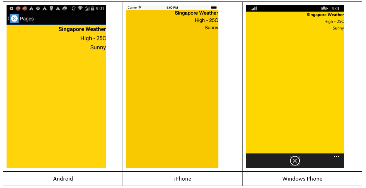
Yes, the UI is slightly different on each device. To return to the Master page, use a swipe gesture on both Android and iPhone. On Windows Phone, touch the X button on the bottom of the screen.
Change the Detail Page Binding
It's more likely that you'll use databinding to show the information on the Master and Detail pages. For this implementation, I'll use a View Model class for the data-source. I'll bind a ListView on the Master page to a list of weather information. On the Details page, I'll bind a few Label views to the selected item and a View Model class for the data-source.
Listing 1 contains the ViewModel class. It's a very simple view model; with just a few members suitable for the databinding in the XAML file.
Listing 1: WeatherViewmodel.cs
internal class WeatherViewModel : INotifyPropertyChanged {

    public WeatherViewModel() {
        CityWeatherList = WeatherDataSource.GetAllCities();
        this.SelectedItem = CityWeatherList.First();
    }

    public event PropertyChangedEventHandler PropertyChanged;

    private CityWeather _selectedCity;

    public CityWeather SelectedItem {
        get { return _selectedCity; }
        set {SetProperty(ref _selectedCity, value); }
    }

    private List<CityWeather> _cityWeatherList;

    public List<CityWeather> CityWeatherList {
        get { return _cityWeatherList; }
        private set { SetProperty(ref _cityWeatherList, value); }
    }

    // A ShowMaster property would be nice in the ViewModel
    // Xamarin binding didn't work with IsPresented property
    // So I removed it from the class

    protected void SetProperty<T>(ref T field, T value,
    [CallerMemberName] string name = "") {
        if (!EqualityComparer<T>.Default.Equals(field, value))
            {
                field = value;
                var handler = PropertyChanged;
                if (handler != null)
                {
                    handler(this, new PropertyChangedEventArgs(name));
                }
            }
    }
}
It contains a property named CityWeatherList that I'll use as the data-source for a ListView. As you can see, the property is typed as a List<CityWeather>.
public List<CityWeather> CityWeatherList {}
I used a List<T> instead of ObservableCollection<T> for the example because the data doesn't change in the list. The View Model also has a property named SelectedCity, of type CityWeather.
public CityWeather SelectedCity {}
This property represents the selected item in the list (I suspect you knew that, by the name).
The CityWeather class is a simple data transfer object.
public class CityWeather {

    public string CityName { get; set; }
    public string HighTemp { get; set; }
    public string Forecast { get; set; }
}
I added three Page classes to the project: WeatherPage02, CityWeatherMasterPage, and CityWeatherDetailPage. In the WeatherPage02 constructor, I set the binding context and set up the Master and Detail pages.
public WeatherPage02() {
    InitializeComponent();
    Master = new CityWeatherMasterPage();
    Detail = new CityWeatherDetailPage();
    this.BindingContext = new WeatherViewModel();
}
Binding in the Master Page
In the CityWeatherMasterPage.xaml file, add a ListView element.
<ListView ItemsSource="{Binding CityWeatherList}"
    x:Name ="CityListView"
    SelectedItem="{Binding SelectedCity }">
    <ListView.ItemTemplate>
        <DataTemplate>
            <ViewCell>
                <ViewCell.View>
                    <Label Text="{Binding CityName}" />
                </ViewCell.View>
            </ViewCell>

        </DataTemplate>
    </ListView.ItemTemplate>
</ListView>
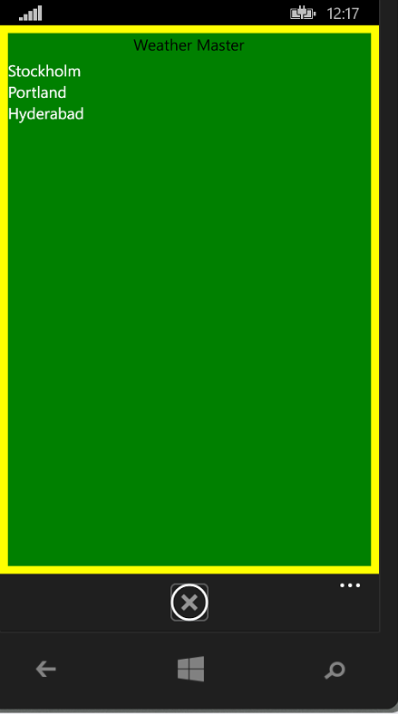
There are three bindings in the ListView. The ItemsSource binds to the List<CityWeather> in the ViewModel. In the DataTemplate, the Label is bound to CityName property in the same ViewModel. With these two bindings set, the city names are shown in the ListView (see Figure 14).
The key to synchronizing the data with the Details page is in the third binding.
SelectedItem="{Binding SelectedCity }"
Whenever the user selects a new item in the ListView, the two-way binding updates the SelectedCity property in the View-Model. Since the Details pages is bound to the SelectedCity property, it's automatically updated (the example code is later in this article).
Before I leave the Master page, let's talk about how to show the Details page when the user selects a City. As it's currently implemented, the user has to swipe to see the Detail page after selecting the City. I don't like that; I'd like the app to switch to the Detail page automatically. Since I'm bound to a View-Model, the best approach is to add a Boolean ShowMaster property and bind the IsPresented property to the View-Model. The XAML for this should be in the MasterWeatherPage02 file.
IsPresented="{Binding ShowMaster}"
Unfortunately this doesn't work on the current Xamarin build. I'm not sure if it's a bug or if I'm setting up the binding the wrong way, but it doesn't work. The workaround is to set the IsPresented property in the SelectedItemChanged event handler in the CityWeatherMasterPage class.
public CityWeatherMasterPage() {
    InitializeComponent();
    CityListView.ItemSelected += CityListView_ItemSelected;
}

private void CityListView_ItemSelected(object sender,
SelectedItemChangedEventArgs e) {
    var parent = (this.Parent as WeatherPage02);
    parent.IsPresented = false;
}
Binding in the Details Page
The final step is adding binding to the Details page.
<StackLayout BackgroundColor="Yellow">
    <Label Text="{Binding SelectedCity.CityName}" />
    <Label Text="{Binding SelectedCity.HighTemp}" />
    <Label Text="{Binding SelectedCity.Forecast}" />
</StackLayout>
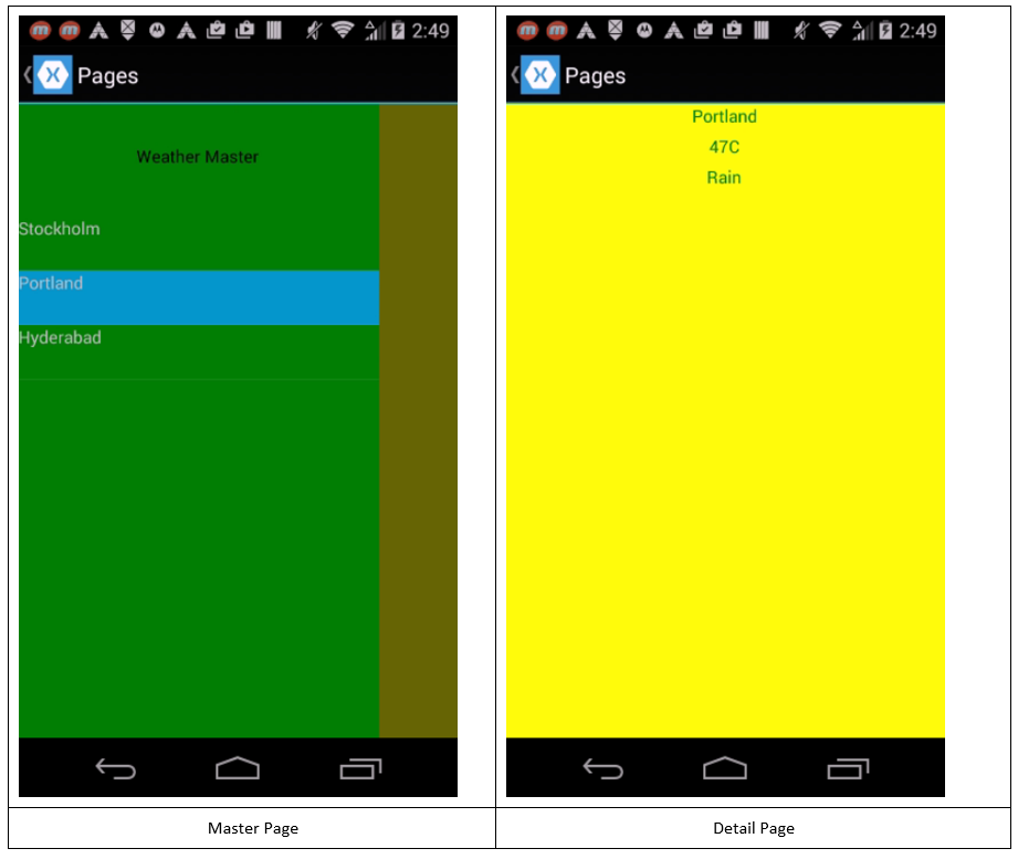
And it's ready to test. This is what the Master and Detail screens look like on an Android device (see Figure 15).
Navigation Pages
Once you have more than a single page in an app, you have to think about navigation. There are as many ways to design the navigation experience, as there are apps in the app store. Okay that's an exaggeration, but the truth is that app designers are constantly trying new navigation schemes, some more successful than others. Xamarin.Forms provide three common navigation patterns (NavigationPage, TabbedPage, and CarouselPage) for your use.
In the next issue of CODE Magazine, I'll show how these pages make navigation a snap.


