I'll freely admit, I'm nearly addicted to SQL Server Reporting Services (SSRS). It's not because SSRS is perfect: The product has flaws and shortcomings, like any other product. I'm addicted because I can use SSRS to address many reporting requirements. Although third-party products and self-service reporting tools offer glamorous features beyond what SSRS contains, SSRS still provides many capabilities for reporting and dashboarding functionality. I'm fortunate to have had many opportunities to build reporting solutions and will share some of those experiences. In this article, I'll show eight examples that will help you with various reporting tasks.
You've Come a Long Way, SSRS
Twelve years ago, I performed a serious evaluation of SSRS versus Crystal Reports, where the latter was the market leader for reporting products. At the time, I liked some of the features of SSRS, but concluded that it wasn't in the same league as Crystal Reports.
Then Microsoft released SSRS 2008 and I started to warm up to SSRS, as did many other database developers. SSRS 2008 didn't cover every bell and whistle that Crystal Reports contained, but Microsoft enhanced the product enough to make it the proverbial “bread and butter” reporting tool for database developers.
Over the years, I've written four CODE magazine articles that covered SSRS features. Although some of these go back many years, the tips and content still apply to reporting scenarios today. You can find these articles by going to my main author page on the CODE Magazine site (http://www.codemag.com/People/Bio/Kevin.Goff) and searching on the page for SSRS.
Once again, I'll going back to “old faithful” to show eight SSRS tips that have helped me with various report needs.
What's on the Menu?
This article covers a little more than half of a Baker's Dozen this time around, with the following SSRS tips:
- Implementing a tab-style interface for navigation to report page/sections
- Cascading parameters
- Some tips on Analytic Charts
- Annotating parameters correctly
- Scatter charts and drill-down features
- Multiline tooltips
- Determining which users have run reports
- Enhancing document maps for group navigation
Tip #1: Implementing Tab-style Navigation to Report Page/Sections
Almost all SSRS developers have built paginated reports that span dozens or even hundreds of pages. SSRS allows runtime browser navigation to specific pages, either through navigation controls in the browser toolbar or through document map links to specific groupings within the report. In these cases, no one knows until runtime whether the report will be 13 pages, or 33 pages, or more.
Sometimes developers create reports where they intend to show a specific number of pages (usually a handful, at most) as report sections. Figure 1 shows an example where you might show one page that contains a matrix and a chart for summary sales, a second page for chart breakouts by product, and a third page for breakouts by market. Note the three textboxes in the report page header that serve as navigation controls for the user to quickly access those pages.
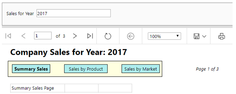
Yes, you could simply tell the user to navigate to page two or page three using the standard toolbar page navigation controls. But simulating horizontal tabs for navigation is one of many small visual effects that make the output look nicer.
Simulating horizontal tabs for navigation is one of many small visual effects that make the output appear nicer.
So how can you programmatically jump to a page in SSRS? Some might think that SSRS bookmarks would do the trick, but bookmarks are more for navigation based on some filter/expression or field value. In this case, you've created specific tables or charts in the report that force a page break at the beginning of the object, and you want the user to be able to quickly navigate to that section. The only effective way is to relaunch the report with URL syntax and programmatically set the Section parameter with the page number. Figure 2 shows the SSRS action, where you relaunch the report and fill in the SSRS report command for the section number (rc:Section=2).
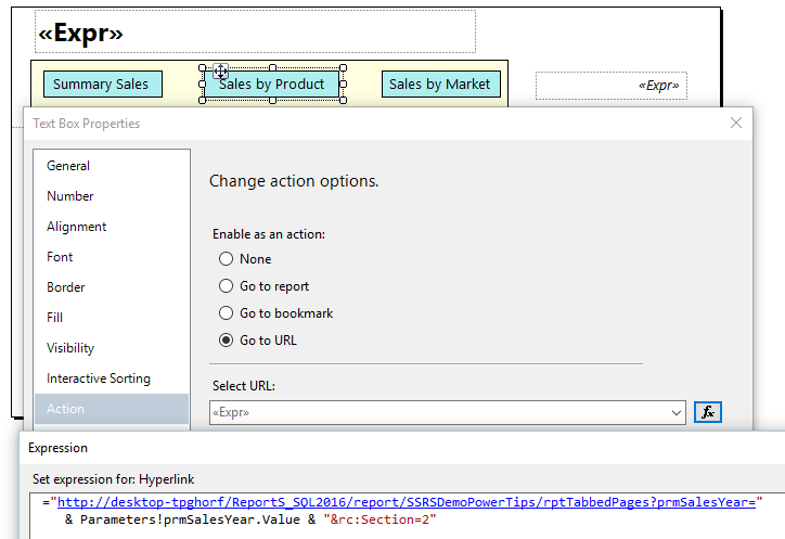
Note that the URL syntax in Figure 2 includes any values for report parameters. In this case, if the user previously selected “2016” for the report year, pass the current value back into the report when you relaunch it.
When the page reloads, you can also bold the textbox “tab” corresponding to the current page number, by placing the following expression in the font bold property of the textbox:
=iif( Globals.PageNumber=2,"Bold","Normal")
Tip #2: Cascading Parameters
Many years ago, my boss used to leave strongly worded notes on my desk if my software showed drop-down entries that were 100% irrelevant for a particular context. He felt, and rightly so, that drop-down lists should only ever contain relevant values. If a user selected a country, the list of products should only include products with sales in that country; otherwise, the list might contain hundreds of products that weren't relevant for the selection. Yes, there are exceptions - sometimes seeing products without sales might be analytically even more important than products with sales. Still, most of the time you can help users by filtering using just those items that are valid.
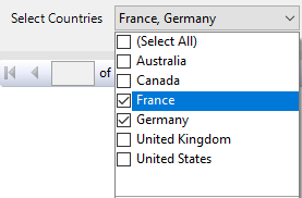
Consider Figure 3 through Figure 5, which represent a parameter flow for a sales report. In Figure 3, the user selects two countries. In Figure 4, the user filters the list of years to only those with sales for France and Germany. (Had I not filtered on years, you'd see several other years in the list). In Figure 5, the user filtered the list of products to only those with sales in France and Germany in 2012 and 2013, AND only those products with the word BLUE in the product description.


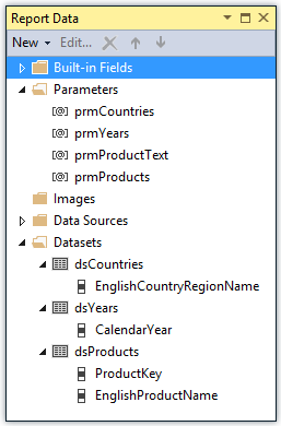
How do you accomplish this? Figure 6 shows the “ingredient list”: it's three datasets and four parameters. Here's the sequence of events to follow:
- Create the DataSet dsCountries, with a query that reads the list of countries.
- Create the Parameter prmCountries, and map the available values of the Parameter to the dsCountries Dataset.
- Create the DataSet dsYears, but only pull the years that have sales for the countries that the user selects in the prmCountries parameter (Listing 1). This provides the “cascading” effect.
- Create the Parameter prmYears, and map the available values of the Parameter to the dsYears Dataset.
- Create the Parameter prmProductText as a free-form text parameter (so that the user can enter a text search to further filter the Product list). Although this isn't required, it greatly assists the user in narrowing the scope of the product list.
- Create the Dataset dsProducts, but only for the products that have sales for the countries/years that the user selects in the two parameters, and also only for products that contain the text in the prmProductText parameter (Listing 2).
Listing 1: Query to retrieve filtered years based on Countries selected
-- For larger tables, consider using flags in the master tables
-- for whether rows are in distribution
SELECT DISTINCT CalendarYear
FROM            DimDate
WHERE           EXISTS
        (SELECT 1 FROM FactResellerSales
           INNER JOIN DimReseller ON DimReseller.ResellerKey =
                      FactResellerSales.ResellerKey
           INNER JOIN DimGeography ON DimGeography.GeographyKey =
                      DimReseller.GeographyKey
        WHERE (DimDate.DateKey = FactResellerSales.OrderDateKey)
          AND (DimGeography.EnglishCountryRegionName IN (@prmCountries)))
ORDER BY CalendarYear
Use cascading parameters with caution. Not all reports need it. Also, if you're not careful with query strategy, the user might have to wait several seconds - or longer - for SSRS to populate the filtered parameter lists. Still, when you implement properly, this can help guide end users through selections.
Listing 2: Query to retrieve filtered products based on Country/Year selected, as well as optional text search
-- For larger tables, consider using flags in the master tables
-- for whether rows are in distribution
SELECT ProductKey, EnglishProductName
FROM DimProduct
WHERE EXISTS
  (SELECT        1
      FROM FactResellerSales
          INNER JOIN DimDate
              ON FactResellerSales.OrderDateKey = DimDate.DateKey
          INNER JOIN DimReseller
              ON DimReseller.ResellerKey = FactResellerSales.ResellerKey
          INNER JOIN DimGeography
             ON DimGeography.GeographyKey = DimReseller.GeographyKey
          WHERE  (DimProduct.ProductKey = FactResellerSales.ProductKey) AND
              (DimGeography.EnglishCountryRegionName IN(@prmCountries)) AND
              (DimDate.CalendarYear IN (@prmYears))) AND
              (EnglishProductName LIKE '%' + @prmProductText + '%')
ORDER BY EnglishProductName
Important note: The two queries in Listings 1 and 2 read from the Microsoft AdventureWorks demo tables, which aren't that large. You wouldn't want to perform these types of queries against very large tables merely to implement cascading parameters. Some environments maintain flags on account and product master tables to mark rows that have been in distribution (i.e., that have sales). That way, any cascading query logic can quickly read these flags instead of large transactional tables to filter parameter lists. The key takeaway is to implement any filtering logic judiciously.
If you're not careful with query strategy, the user might have to wait longer for SSRS to populate filtered parameter lists.
Those using SQL Server 2016 with access to the In-Memory Optimized Table feature might also want to consider using In-Memory Tables as part of the strategy for cascading parameter lookup tables. In-Memory Tables offer potentially huge performance boosts, and we all know that users want drop-down lists to populate as quickly as possible!
Tip #3: Some Tips on Analytic Charts
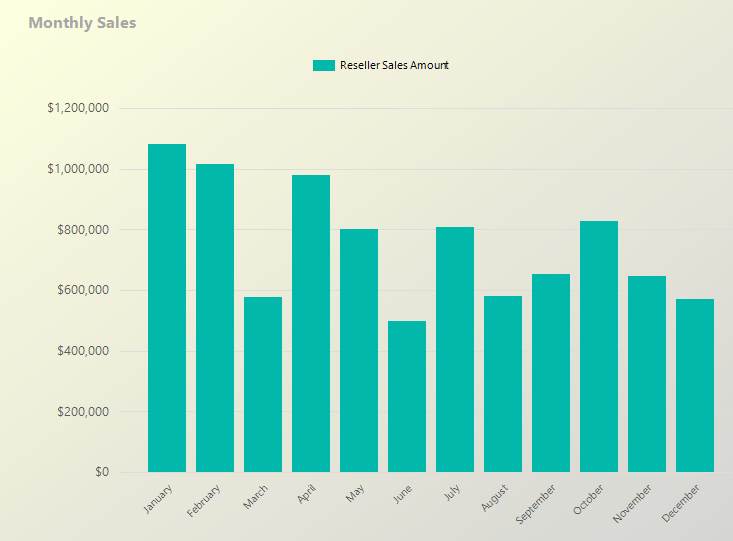
When I was a kid, I'd sometimes ask my father if I could do something that I didn't realize was wrong. My father would respond, “Son, you could do it, but it would be wrong.” My corollary is this: Just because you CAN do something, doesn't mean you necessarily should. That is the way I feel about many business charts. Yes, a picture can be worth the proverbial thousand words, but only if it's the right picture. Take Figure 7 as an example. It's a column chart that shows monthly sales. There's nothing necessarily wrong with this approach, but truthfully, it's rather mundane and a grid of numbers for sales would do just as well.
OK, let's see if we can improve on this. The users are also interested in the average selling price for the current selection. Because the average monthly selling price is on a lower scale than the monthly sales, you need to add a sales price on a secondary Y axis (Figure 8).
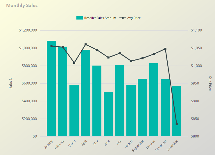
Figure 8 is certainly an improvement, but you can still do better. You also want to know the overall average price for the year and show which months had an average price above (or below) the overall average price for the year. In Figure 9, I add an additional line to show the overall average as a straight red line.
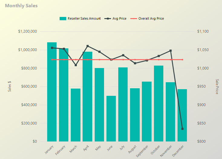
Figure 10 shows the Chart Data section for the actual chart in Figure 9. It plots the reseller sales as a bar chart (note the tiny bar chart image to the left of the reseller sales amount reference). You will also plot the average price and overall average as line charts. SSRS permits you to define a different chart type for each plotted value, which allows you to create the overall chart in Figure 9. You can right-click on each specific value to set chart options and configure whether to plot the value on the primary or secondary Y-axis.
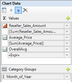
Finally, in the overall average value, you can set an expression that (in this instance) calculates an overall average for SSRS to spread as a straight red line. The expression sums the reseller sales across the entire dataset and divides that value by the sum of the order quantity:
= sum( Fields!Reseller_Sales_Amount.Value, "dsData") /
  sum( Fields!Reseller_Order_Quantity.Value, "dsData")
The moral of the story is this: Don't build SSRS charts just for the sake of building charts. Every chart should have some compelling message or takeaway.
Don't build SSRS charts just for the sake of building charts!
Tip #4: Annotating Parameters Correctly
Some practices are so obvious that they almost don't require repeating, but I'll do it anyway. Always annotate reports with the user selections. Regardless of whether you show user selections such as Market/Product/Timeframe in a report page heading or footer, always make sure you show them. Imagine if your phone bill didn't show the date range of service or specific accounts or other key information associated with the billing. That's how users can feel if you don't annotate reports with the selections they made!
Tip #5: Scatter Charts and Drill-down Features
One of my favorite chart types is a scatter chart. Recently a company executive asked me to produce a visualization that shows the distribution of price points by customer. They had excess/aged inventory and wanted to sell it to customers who had been paying the highest sales price in specific markets for the same or similar products.
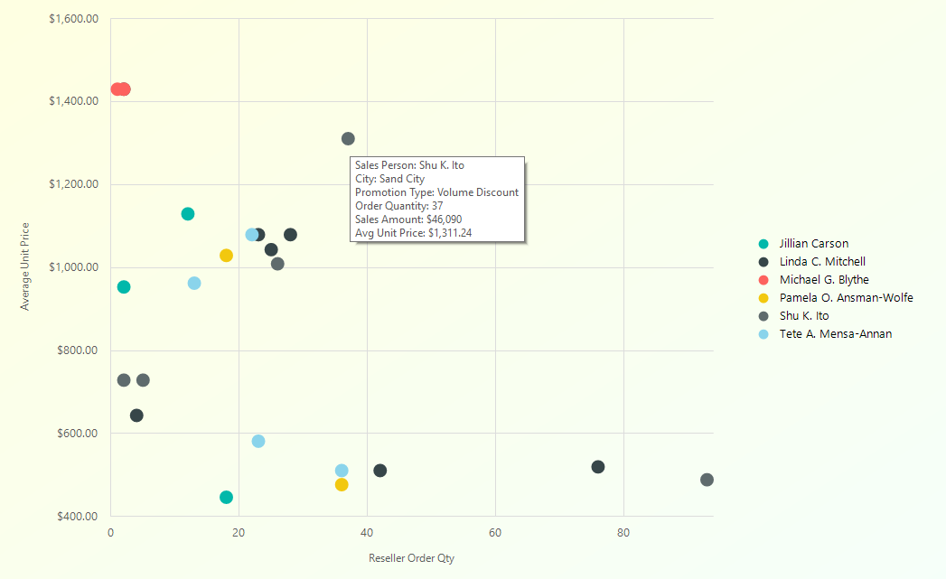
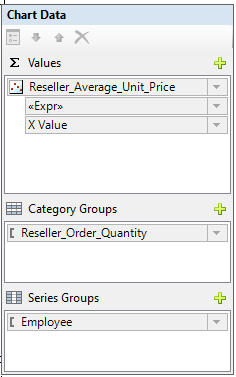
Figure 11 is a bit generic, but still a good example of showing the distribution of data. The example shows the breakout of sales by city for each salesperson, with the average unit price on the Y axis and the sales quantity on the X axis. Figure 12 shows the chart data components. Admittedly, sometimes I get a little confused about which data element to place in which chart component, so it always helps to keep an example nearby.
Note that Figure 11 also shows a multi-line tooltip. I'll cover that in the next tip.
Before I continue to the next tip, I'd like to point out a three additional things you can do with scatter charts.
First, some people want to show a straight linear regression trend line to show the impact of the X-axis variable on the Y-axis variable. Unlike Microsoft Excel, SSRS doesn't provide any built-in capability to plot a regression trend line. However, you can find many example SQL queries on blogs/sites to calculate the necessary line slope and plot that data as a straight line.
Second, advanced analysts might want to see the linear correlation between the X-axis and Y-axis variables. Analysts and statistical experts refer to this as the Pearson correlation coefficient, or PCC. In a perfect world where X has a pure linear correlation with Y, the PCC has a value of 1. If X has no linear correlation with Y, the PCC has a value of zero. So overall, the PCC measures the strength of linear dependence between the two variables. Again, analysts use regression lines and PCC values to study the impact of one event on another. In the same way that you can find slope and regression line calculations on blogs and websites, you can also find the logic for the Pearson correlation coefficient.
Third, some people might want to see details associated with a single plotted point on a scatter graph. SSRS makes this very easy through report actions. You can go to the series properties for the data series and define an action based on the data for the current plotted point (i.e., current date, market, product, etc.).
Tip #6: Multiline Tooltips
Figure 11 in the previous tip shows a multiline tooltip. In my opinion, one of the strongest features in SSRS is how it exposes the current data for the plotted point, making tasks like tooltip expressions and drill-down report actions very easy. In the series data for the chart, you can go to the tooltip property and generate a multi-line tooltip (Figure 13). Note in the tooltip expression that you use the VBCRLF constant to implement a line break.

Use tooltips as much as possible. Users appreciate meaningful information in tooltips! Once, I had a manager who left me screen shots of key on-screen calculations that didn't have an accompanying tooltip, with VERY angry comments. Diplomatic? No. Was he right? Yes.
I had a manager who left me screen shots of key on-screen calculations that didn't have an accompanying tooltip, with a VERY angry note. Diplomatic? No. Was he right? Yes.
Tip #7: Determining Which Users Have Run Reports
Occasionally, I've needed to see which users have run reports. Fortunately, SSRS provides an execution log in the ReportServer database that you can query to see when users have rendered reports.
Here are two SQL queries that you can use against the SSRS Execution Log. The first query lists the reports deployed on the current server along with the most recent execution time and the total number of executions for each report.
SELECT ItemPath AS ReportName,
       MAX(CAST(TimeStart AS DATE))
           AS MostRecentReportDate,
         COUNT(*) as NumExecutions
FROM Executionlog3
WHERE ItemAction = 'Render'
GROUP BY ItemPath
ORDER BY MostRecentReportDate DESC
The second query shows every user who's run a specific report (referenced in the WHERE clause), along with the most recent execution time and the total number of executions for each user.
SELECT  MAX(CAST(TimeStart AS DATE))
          AS MostRecentReportDate,
          COUNT(*) as NumExecutions , UserName
 FROM [ExecutionLog3]
 WHERE itempath = '/SomeReport' and ItemAction = 'Render'
 GROUP BY UserName
 ORDER BY MostRecentReportDate DESC
I've created administrative-level reports using queries like these in order to gather statistics on report usage.
Tip #8: Enhancing Document Maps for Group Navigation
Most SSRS developers are aware of the Document Map navigation capability, so that users can quickly jump to the start of a specific group value. It's common to see document maps with a list of accounts, products, etc.
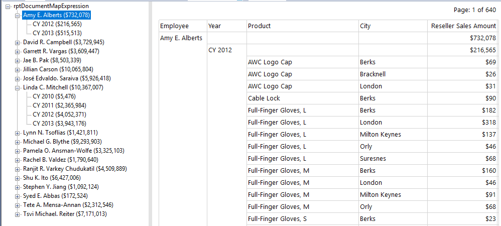
However, you can also annotate the document map with additional information, such as the sales for each employee in the group, as well as the sales for the year for that employee (Figure 14).
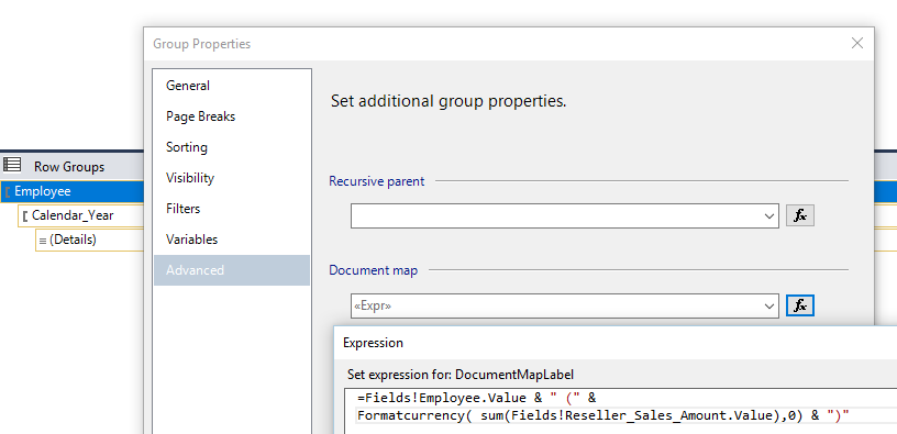
Implementing the document map expression is quite easy. In Figure 15, I've pulled up the group properties and set the expression. In this case, the expression concatenates the employee/salesperson with the sum of the reseller sales amount. You can do the same thing for the secondary group on employee plus year (in Figure 14) with a similar expression for the year.
Final Thoughts
I hope that you picked up at least one good tip in this article that you can use in future reports. Although I've largely retired from public speaking, I did roughly 250 community sessions on different .NET and SQL Server topics over the last twelve years and at the end of each session, I asked attendees to raise their hands if they honestly felt they had learned at least one new feature that would help them in some way in their jobs. That has always been my goal. There are many speakers and writers who are far better than I'll ever be. My niche has always been one of a storyteller. I've built many applications for many people and I love sharing how I handled a task in the proverbial trenches.
I bid everyone a temporary adieu, as I don my Baker's cap and return the kitchen for ETL in Data Warehousing, part deux!


