As companies digitize their products and become more technology-focused, developers and designers absorb increased pressure to accelerate transformation so their companies can expand market share and fend off disruption. This rising demand for developers - despite a widely documented shortage of technical talent - fundamentally changes the roles of developers and designers and the dynamic between them.
Designers were once solely responsible for dreaming up beautiful interfaces, and they're now often expected to define the entire front-end UI/UX experience for users. Because designers are the direct gatekeepers for overloaded developers, they're critical of eliminating anything that could result in extraneous coding or lack of clarity before handing off projects for development.
This designer-to-developer handoff has long been a source of frustration and animosity among design and development teams - and inefficiency and lost productivity for companies. It's also one of the greatest opportunities for transformation.
Four Ways to Accelerate Design to Code.
There are several ways to accelerate the change from design to code. Here are my four favorites.
1. Be Clear in Specs and Functionality
Communicating specs and functionality has become the biggest obstacle plaguing the designer-to-developer handoff. It's nearly impossible, for instance, to know the pixel measurements of, say, a scroll bar, by looking at a static design file. The developer must guesstimate the size of each element and its relative proportion to other elements on the screen.
Developers often apply the same guesswork to determining how features are meant to function. For instance, the designer envisions a certain hover animation, but doesn't properly communicate it to the developer. And don't get developers started on where to find files for features or images that are shown in mockups but weren't delivered to them during handoff!
In the end, the developed design looks - and acts - like a caricature of the intended design. From the designer's perspective, the developer has destroyed their design. From the developer's perspective, the designer has wasted their time. Both are right, of course, but neither is to blame.
A design team can Introduce a design system to overcome these common issues. The design system then serves as the single source of truth that gives designers and developers an agreed-upon language that they can use to build apps. Design systems, backed by user interface components, eliminate the guesswork and accelerate app creation.
According to Gartner, “A design system is one of the most important strategic assets for an organization that produces digital products. A robust design system drastically shortens design and development timelines, ensures the user interface design is consistent, predictable, and usable, and guarantees brand compliance.”
Even better, there are third-party tools that can pull out digital assets like CSS, HTML, and even code from the designs, which ensures a mistake-free coded output and often leads to a significantly accelerated product delivery.
According to Gartner, design systems are strategic, “A robust design system drastically shortens design and development timelines, ensures the user interface design is consistent, predictable, and usable, and guarantees brand compliance.”
2. Make Usability Testing Non-Negotiable
We've all had the bad experience of engaging in major design iterations during development, which is the biggest source of waste plaguing the designer-to-developer handoff in the app development process. With an effective user testing strategy, teams can identify and address issues during the design phase.
Changes to layout, interactions, or other structural design elements during development can result in thousands of lines of unnecessary code. This equates to longer dev cycles (missed deadlines), higher costs, and slower product delivery - not to mention a lot of avoidable back and forth (and tension) between design and development teams.
Fixing problems during development can cost ten times as much as fixing it during design, and potentially 100 times as much if you're fixing a problem once the product has already shipped.
Forrester estimates that for every $1 to fix a problem during design, it would cost $5 to fix the same problem during development, and $30 to fix the same problem after the product's release.
Even so, teams continue making this mistake by not conducting usability tests up front. Instead, they wait until the user interface has already been developed so they can interact with it the way they would the finished product.
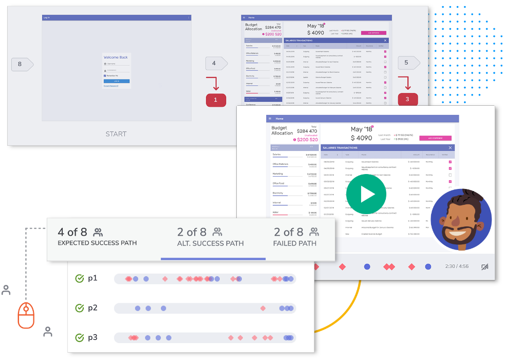
On a positive note, today, there are design systems and tools that give users an entire app experience to test before development writes any code, as seen in Figure 1. Be it high- or low-fidelity prototypes, screenshots with hot-spot links for navigation, or an actual design from a tool like Adobe XD or Sketch, you can user-test an experience and find most of the costly UX bugs with a good user-testing strategy. And all of this can happen virtually, rather than in person, especially with COVID restrictions forcing most of us to work from home indefinitely or even permanently.

This resolves another common obstacle to usability testing: the time and cost involved in recruiting large groups of paid panelists, who have traditionally been required to be physically present to conduct testing. Testing often gets sacrificed because teams view this method of testing as an unnecessary expense and hurdle to meeting condensed timelines.
By letting users test applications in a centralized, digital tool that designers and developers both have access to - from wherever they are in the world - affordable testing can be conducted quickly and at scale. But even smaller testing groups can suffice. According to Nielsen Norman Group, the best results related to detecting UX issues in a design come from iteratively testing with as few as five people.
3. Get Rid of Coding Altogether
Not so fast. An entire market of no-code and low-code apps has emerged in response to the massive amount of time it takes to code applications, whether completely or partially from scratch.
Considering that UI development can account for upward of 60% of total development time and application costs, there's significant cost savings in a code-reuse (low-code) or code-elimination (no-code) approach to UI development.
Although these apps can enable citizen developers to create simpler apps, more complex enterprise apps will continue to require the skills of developers. Organizations need to streamline the app development process - with standardized tooling - so that the volume of manual coding can be reduced.
At the core of design-to-code apps is a design system - or a repository of reusable assets, with clear visuals, user interface designs, and technical standards - that serves as the foundation for quick and consistent design and development of digital products.
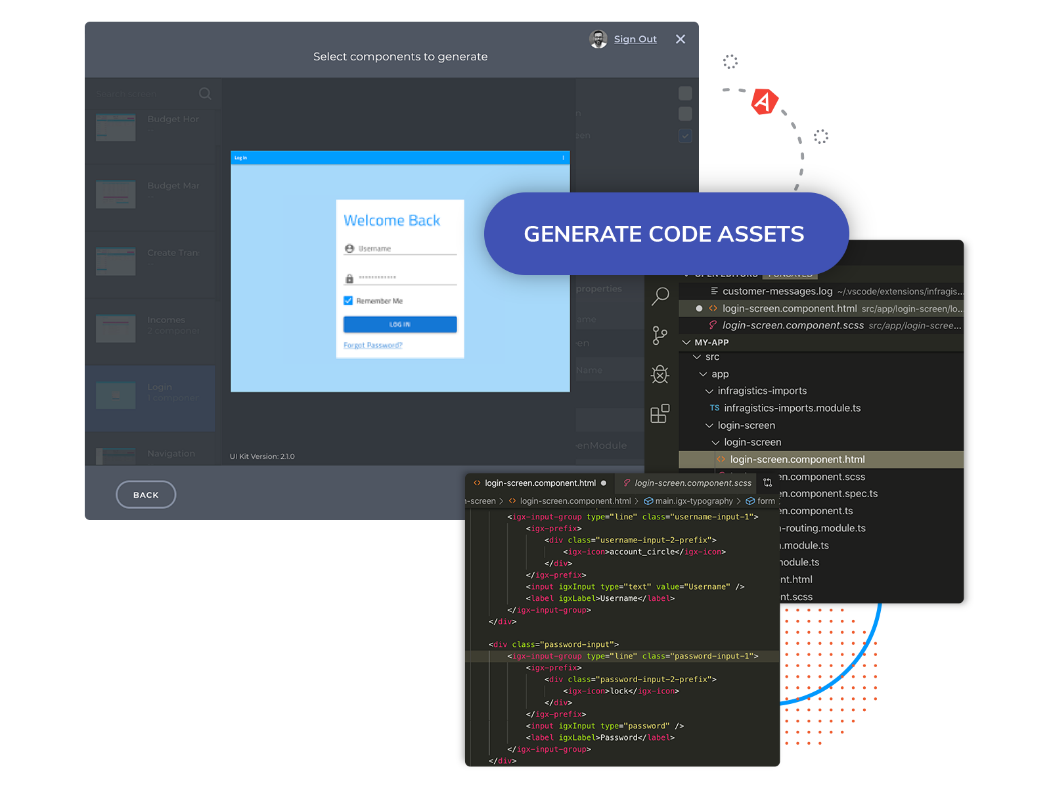
The biggest opportunity for cost and time savings when going from design to code can be found in using a well-thought-out set of UI patterns, or UI controls, that can be turned into code and customized from there. You can see an example of this code generation in Figure 2.

As a start, consider introducing standard UI components that work regardless of which framework(s) developers are working in to reduce the need to recreate components for each framework, like Angular, React, Blazor, etc.
Developers can get all the necessary code, be it Web code for CSS, HTML, or even JavaScript/TypeScript and code for entire pages with a good design-to-code solution.
4. Out with the Contention, in with the Collaboration
Efficiency comes from designers and developers collaborating on a prototype, seeing the data and feedback from testing, and iterating on designs and prototypes before coding. When developers can have workable code generated from those prototypes without having to hand code everything, it adds further efficiency and helps ensure that the finished app delivers with the same experience as the final design and prototype.
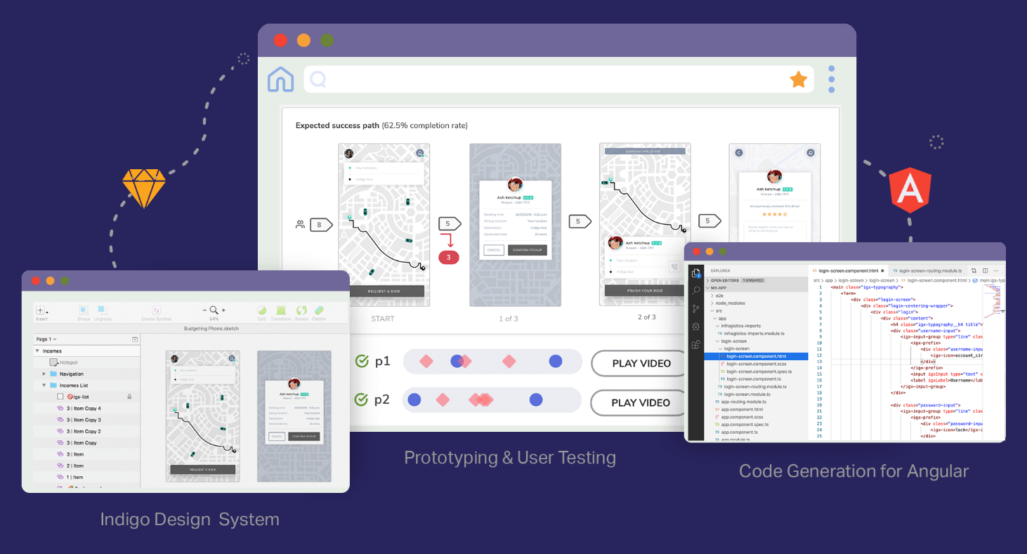
When designers work in one tool or platform and developers work in another, collaboration and communication is harder. Eliminating silos and enabling design and dev collaboration throughout the app creation process by providing a single common platform where they can work together eliminates costly (and messy) handoffs and gets rid of unnecessary siloes between designers and developers, as seen in Figure 3.

Although high output and individual productivity is necessary for product delivery, it can't be at the expense of overall team productivity. Standardizing on tools across an organization drives long-term productivity. For example, ensure that your design team is settled on a design tool; for example, don't let one team use Sketch and another Adobe XD. Make sure that your entire organization has standardized on a development platform; don't let one team use React and another use Angular. The potential short-term gain because of familiarity or experience is miniscule when compared to the long-term cost of rectifying tool and platform compatibility.
The High Cost of Ignoring the UX Process
Considering everything you've read in this article; you might assume that incorporating user experience design activities into the standard software development process would add time and cost to projects. However, these activities save time and money by designing the right solution from the beginning and by finding and correcting problems early in the project, when they're easy and inexpensive to change. User interfaces designed by someone who understands and applies principles of human factors and design best practices helps to avoid many UX problems. Iterative user testing and redesign finds and fixes problems and validates the design direction. Before development begins, design validation occurs by both the business and users, eliminating costly change requests due to unmet requirements and usability problems late in the development process.
It's far less expensive to make changes during the requirements definition and the design phase than during or after development.
Two concrete examples where a UX focus can help (or hurt) your outcomes:
- By correcting usability problems during the design phase of their website, American Airlines reduced the cost of those fixes by 60-90%.
- Avon Products Inc. gave up on a four-year, $125 million software overhaul after a test of the system in Canada revealed that the system was so burdensome and difficult to use that many salespeople quit the company.
To realize gains like American Airlines did, and to avoid the massive time and expense loss shown in the Avon example, eliminating waste in the designer-to-developer handoff while accelerating and perfecting the design to code process is critical. If organizational leaders focus on tools that deliver the best, fastest business outcomes in their digital-first/digital-transformation objective rather than relying on individual, siloed teams to choose “tools of their choice,” they can achieve these goals and they will accelerate delivery and drive down cost.


