In this chapter, you will learn how to add rich vector graphics and images to your application.
You will also learn how to optimize performance and image quality of those graphics elements.
In particular, Chapter 3 will discuss the following:
- The graphics system design principles
- The elements for displaying graphics
- The problems the Silverlight runtime solves “under the hood” and the problems your application must solve
Graphics Principles
The Silverlight graphics API makes it easy to add vector graphics, bitmap images, and text to your applications. This section describes the graphics API design principles.
Vector Graphics and Bitmap Images
Bitmap images are a common method of adding graphics to an application. However, bitmap images become blurry when scaled up, as shown in Figure 3.1, or aliased when scaled down, as shown in Figure 3.2. Unlike a bitmap image, if you scale a vector graphic, it will remain sharp as shown in Figure 3.3. Both vector graphics and bitmap images are useful in most applications. For example, a user interface control looks better at different sizes and resolutions with vector graphics instead of bitmap images. Bitmap images are useful for displaying content that is not easily expressible in vector form such as digital photographs or visual effects not supported by the runtime.

New in Silverlight 3
There are a number of techniques for scaling down an image to produce a result better than that shown in Figure 3.2. Silverlight 3 converts your bitmap to a set of smaller images at various sizes using a better algorithm. This conversion happens once per bitmap and Silverlight caches the result of the conversion for the lifetime of your bitmap. During an animation, Silverlight 3 dynamically selects the right resolution bitmap to display. This process can increase memory usage by 33%, but substantially improves the display quality of scaled down images and 3D transforms to get a result close to that shown in Figure 3.3.
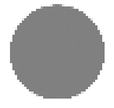
When scaling up bitmaps in Silverlight 3, the image remains blurry as shown in **Figure 3.**1.

Retained Mode
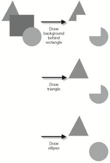
There are two types of graphics API: retained mode and immediate mode. A retained mode API automatically responds to changes to a graph of objects. An immediate mode API requires you to issue all the draw commands to describe a change. For example, to remove the rectangle shown in Figure 3.4 in a retained mode system, simply call a function to remove that element. The retained mode graphics system is responsible for redrawing the background, the triangle beneath, and the ellipse above. To remove the same rectangle shown in Figure 3.4 with an immediate mode API, you need to make three calls to draw the background, the triangle beneath it, and the ellipse above as shown in Figure 3.5.

A retained mode API enables you to do the following:
- Construct a set of graphics elements
- Change properties of the graphics elements
- Build a graph representing the relationship between those elements
- Manipulate the graph structure
A retained mode graphics API is easier to use than an immediate mode API and enables the underlying system to provide automatic performance optimizations such as drawing incrementally and avoiding the drawing of occluded shapes. Silverlight provides a retained mode system to optimize for ease of use, animating vector graphics content, and for building applications composed of UI controls.
In Silverlight, you can construct the retained mode graph declaratively with a XAML file:
<Canvas xmlns="<a href="http://schemas.microsoft.com/client/2007">http://schemas.microsoft.com/client/2007</a>">
<!-- triangle -->
<Path
Fill="Green"
Data="F1 M 128,12L 12,224L 224,224"
/>
<!-- rectangle -->
<Rectangle
Fill="Blue"
Canvas.Left="96"
Canvas.Top="160"
Width="256"
Height="224"
/>
<!-- circle -->
<Ellipse
Fill="Red"
Canvas.Left="230"
Canvas.Top="288"
Width="200"
Height="200"
/>
</Canvas>
Alternatively, you can construct the retained mode graph with code:
Canvas canvas = new Canvas();

//
// Make the triangle
//

Path path = new Path();

path.Fill = new SolidColorBrush(Colors.Green);

PathFigure pathFigure = new PathFigure();

pathFigure.StartPoint = new Point(128, 12);

LineSegment lineSegment1 = new LineSegment();
lineSegment1.Point = new Point(12, 224);
pathFigure.Segments.Add(lineSegment1);

LineSegment lineSegment2 = new LineSegment();
lineSegment2.Point = new Point(224, 224);
pathFigure.Segments.Add(lineSegment2);

PathGeometry pathGeometry = new PathGeometry();
pathGeometry.Figures = new PathFigureCollection();

pathGeometry.Figures.Add(pathFigure);

path.Data = pathGeometry;

canvas.Children.Add(path);

//
// Make the rectangle
//

Rectangle rectangle = new Rectangle();

rectangle.Fill = new SolidColorBrush(Colors.Blue);
Canvas.SetLeft(rectangle, 96);
Canvas.SetTop(rectangle, 160);
rectangle.Width = 256;
rectangle.Height = 224;

canvas.Children.Add(rectangle);

//
// Make the circle
//
Ellipse ellipse = new Ellipse();

ellipse.Fill = new SolidColorBrush(Colors.Red);
Canvas.SetLeft(ellipse, 230);
Canvas.SetTop(ellipse, 288);
ellipse.Width = 200;
ellipse.Height = 200;

canvas.Children.Add(ellipse);
Cross Platform Consistency
An important goal for the Silverlight graphics engine is to enable a developer to write his or her application once and have it run consistently across a variety of operating systems and browsers. Each operating system has a local graphics library. However, these local operating system graphics libraries differ significantly in feature set, performance, and image quality. To ensure cross-platform consistency and performance, Silverlight includes its own rendering engine.
Tools
Silverlight is capable of loading vector and image content from designer tools and integrating with developer written application code. For vector graphics and animation, you can use Expression Design and Expression Blend to generate XAML content for use with the Silverlight runtime. There are also a variety of free XAML exporters available to generate XAML content including an Adobe Illustrator exporter, an XPS print driver, and several others.
Balancing Image Quality and Speed
In addition to displaying static XAML, Silverlight provides real-time animation at 60 frames per second. However, real-time performance is highly dependent on the application content, the specific hardware configuration of the target machine, the resolution of the target display, the operating system, and the hosting Web browser.
When an application does not meet the 60 frame per second goal, the Silverlight team uses the following two options to improve performance:
Reducing image quality for speed is the most controversial optimization technique. The Silverlight application must look good. However, it is possible to trade off image quality in a manner that is generally acceptable to the end user. For example, vector graphics rendering makes some quality sacrifices but still maintains an acceptable visual bar. On the other hand, end users have a much higher standard for text quality and the Silverlight runtime spends more CPU time rendering text clearly.
Graphics Elements
As previously discussed, the Silverlight runtime can load and draw vector graphics XAML on a variety of platforms. The graphics elements can also be specified programmatically when you use C# or JavaScript. This section describes the elements you can use to display vector graphics and images in your applications.
Shapes
This section starts the graphics element discussion with the base class for all graphics primitives: the Shape element. The Shape element provides the following:
- A Fill property to specify how the shape interior is drawn
- A Stretch property to indicate how a Shape element stretches to a specified Width and Height
- Stroke and StrokeThickness properties to specify the pen behavior
The elements that derive from Shape define the shape's geometry. These elements include Rectangle, Ellipse, Line, Polygon, Polyline, and Path.
Rectangle
To draw a rectangle at a specified position, place it in a Canvas element and specify its Canvas.Top, Canvas.Left, Width, Height, and Fill color:
<Canvas xmlns="<a href="http://schemas.microsoft.com/client/2007">http://schemas.microsoft.com/client/2007</a>">
<Rectangle
Fill="LightGray"
Canvas.Left="50"
Canvas.Top="50"
Width="400"
Height="400"
/>
</Canvas>
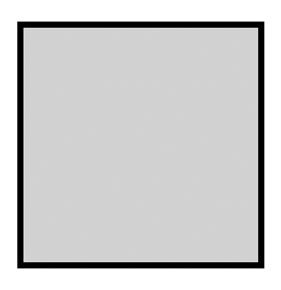
You can add an outline to the rectangle as shown in Figure 3.6 by setting the Stroke property to specify the color and the StrokeThickness property to specify the thickness:
<Canvas xmlns="<a href="http://schemas.microsoft.com/client/2007">http://schemas.microsoft.com/client/2007</a>">
<Rectangle
Fill="LightGray"
Stroke="Black"
StrokeThickness="10"
Canvas.Left="50"
Canvas.Top="50"
Width="400"
Height="400"
/>
</Canvas>
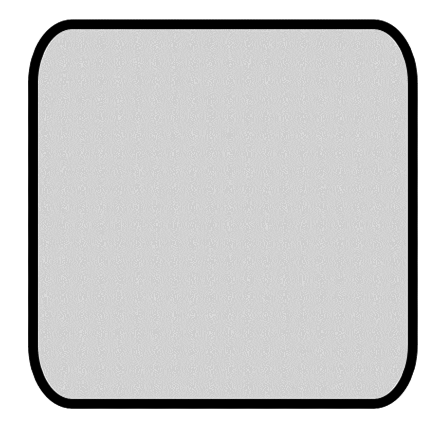
You can use the Rectangle element to draw the rounded rectangles shown in Figure 3.7 by specifying the RadiusX and RadiusY properties:
<Canvas xmlns="<a href="http://schemas.microsoft.com/client/2007">http://schemas.microsoft.com/client/2007</a>">
<Rectangle
Fill="LightGray"
Stroke="Black"
StrokeThickness="10"
RadiusX="40"
RadiusY="60"
Canvas.Left="50"
Canvas.Top="50"
Width="400"
Height="400"
/>
</Canvas>
Ellipse
As with the Rectangle element, you can position an Ellipse element with the same Canvas.Top, Canvas.Left, Width, and Height properties. Silverlight stretches the ellipse to fit the specified bounds as shown in Figure 3.8.
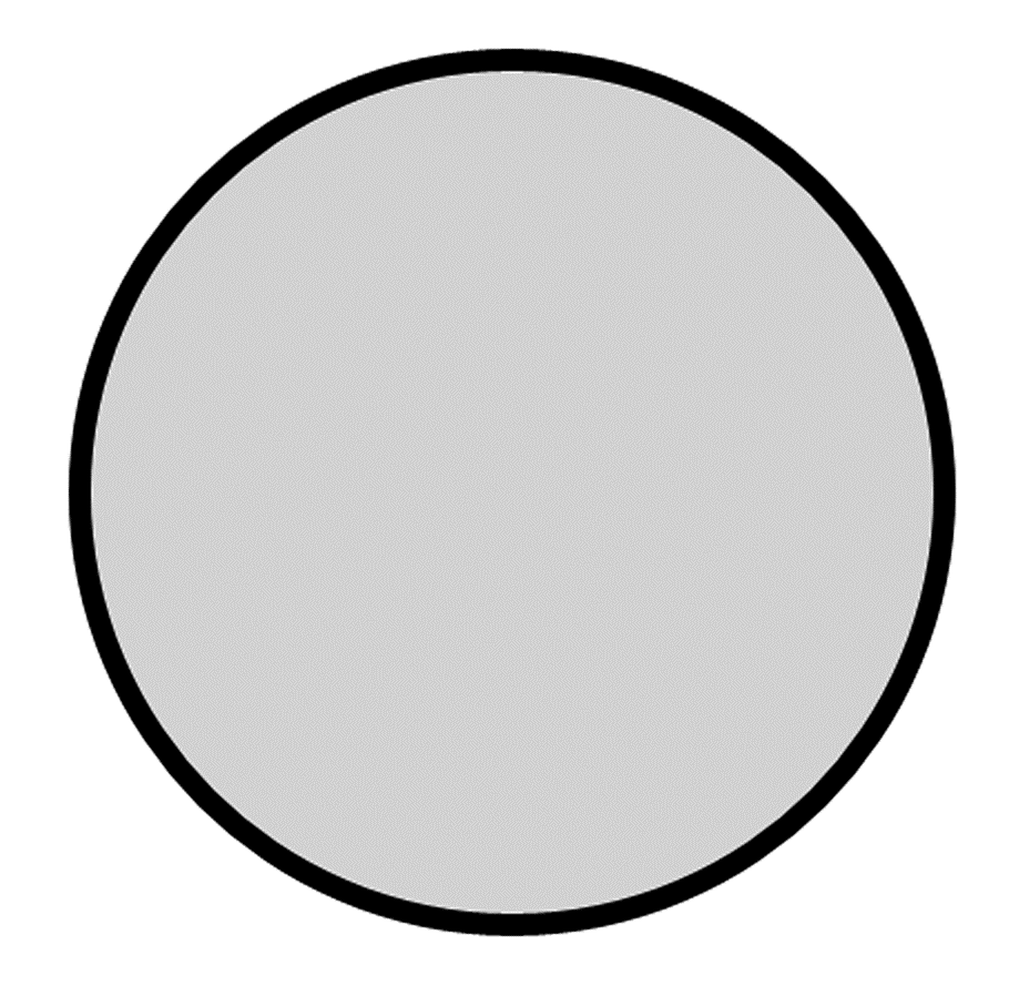
<Canvas xmlns="<a href="http://schemas.microsoft.com/client/2007">http://schemas.microsoft.com/client/2007</a>">
<Ellipse
Fill="LightGray"
Stroke="Black"
StrokeThickness="10"
Canvas.Left="50"
Canvas.Top="50"
Width="400"
Height="400"
/>
</Canvas>
Line
To draw a line, you can use the Line element and set its X1, Y1, X2, Y2 properties. As with all other shapes, you can use the Stroke property to specify the fill color and the StrokeThickness property to specify the thickness as shown in Figure 3.9.
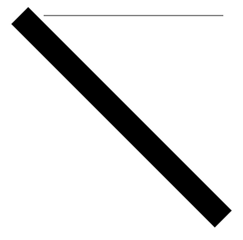
<Canvas xmlns="<a href="http://schemas.microsoft.com/client/2007">http://schemas.microsoft.com/client/2007</a>">
<!-- thick diagonal line -->
<Line
Stroke="Black"
StrokeThickness="40"
X1="60"
Y1="60"
X2="400"
Y2="400"
/>
<!-- one pixel horizontal line -->
<Line
Stroke="Black"
StrokeThickness="1"
X1="100"
Y1="60"
X2="400"
Y2="60"
/>
</Canvas>
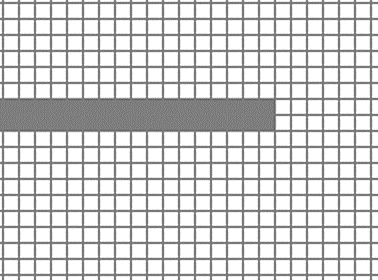
If you look closely at the pixels for the horizontal line shown in Figure 3.10, you will see it has a height of two pixels despite the one pixel StrokeThickness specified in the XAML. Furthermore, the line is gray instead of the specified black color. To understand this rendered result, consider the following equivalent Rectangle element:
<Canvas xmlns="<a href="http://schemas.microsoft.com/client/2007">http://schemas.microsoft.com/client/2007</a>">
<!-- one pixel horizontal line drawn as a rectangle -->
<Rectangle
Fill="Black"
Canvas.Left="99.5"
Canvas.Top="59.5"
Width="301"
Height="1"
/>
</Canvas>
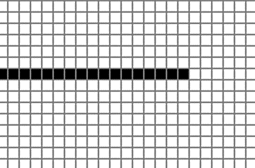
The previous Rectangle element has half integer values for its position. The reason for the half pixel coordinates is that the line expands by half StrokeThickness in either direction. Because StrokeThickness is equal to one, the line adjusts the top and left coordinates by -0.5. Because the rectangle is between two pixels, it gets anti-aliased and occupies two pixels with a lighter color. If you want sharp horizontal and vertical lines, you should draw a rectangle positioned at integer coordinates to get the result shown in Figure 3.11.
<Canvas xmlns="<a href="http://schemas.microsoft.com/client/2007">http://schemas.microsoft.com/client/2007</a>">
<!-- one pixel horizontal line drawn as a rectangle -->
<Rectangle
Fill="Black"
Canvas.Left="99"
Canvas.Top="59"
Width="301"
Height="1"
/>
</Canvas>
Path
The Path element extends the Shape element by providing a Data property that specifies the geometry object. The Rectangle, Ellipse, and Line elements previously discussed are all expressible with the more general Path element. For example, instead of specifying a Rectangle element, we can specify a Path element with a RectangleGeometry:
<Canvas xmlns="<a href="http://schemas.microsoft.com/client/2007">http://schemas.microsoft.com/client/2007</a>">
<Path
Fill="Blue"
Stroke="Black"
StrokeThickness="10"
>
<Path.Data>
<RectangleGeometry Rect="96,160,256,224"/>
</Path.Data>
</Path>
</Canvas>
The Path element syntax is more verbose than the specialized shapes syntax. However, because Silverlight converts all shapes internally to Path elements, if you understand how the Path element draws you will understand how all shapes draw.
In addition to expressing specialized shapes, the Path element can express a geometry consisting of a collection of Figure elements. A Figure element is a connected set of line segments and Bezier segments. The most common method to specify these figures, line segments, and curves is the path mini-language. For example, to draw the shape in Figure 3.12 you would do the following:
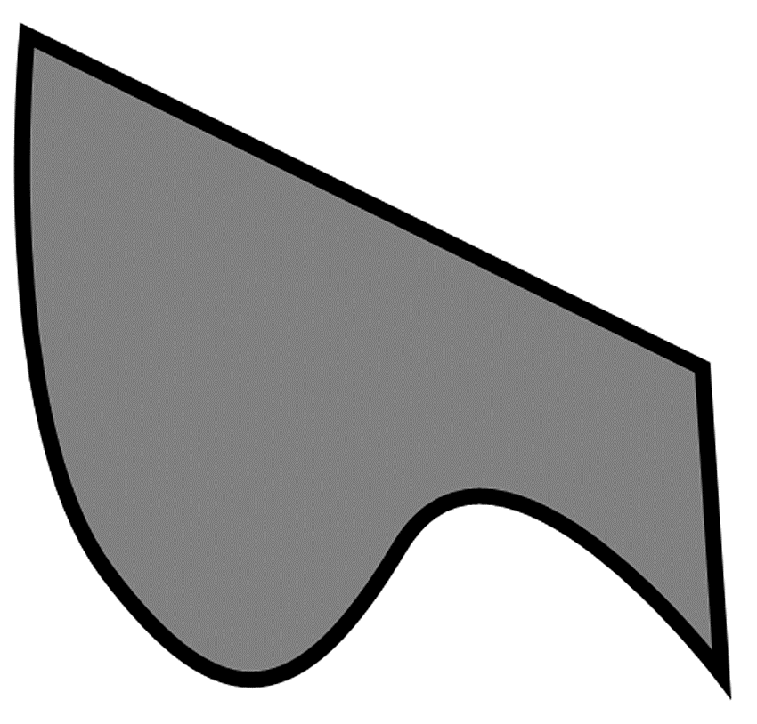
<Canvas xmlns="<a href="http://schemas.microsoft.com/client/2007">http://schemas.microsoft.com/client/2007</a>">
<Path
StrokeThickness="10"
Stroke="Black"
Fill="Red"
Data="M 14,16
C 14,16 -8,256 64,352
C 136,448 185,440 247,336
C 309,233 448,416 448,416
L 436,224
Z"
/>
</Canvas>
The commands supported by the mini-language include those shown in Table 3.1. Each command is followed by the action it takes.
An alternative form of specifying the geometry is to use the expanded XAML syntax:
<Canvas xmlns="<a href="http://schemas.microsoft.com/client/2007">http://schemas.microsoft.com/client/2007</a>">
<Path
StrokeThickness="10"
Stroke="Black"
Fill="Red"
>
<Path.Data>
<PathGeometry>
<PathGeometry.Figures>
<PathFigure StartPoint="14, 16" IsClosed="true">
<PathFigure.Segments>
<BezierSegment
Point1="14,16"
Point2="-8,256"
Point3="64,352"
/>
<BezierSegment
Point1="136,448"
Point2="185,440"
Point3="247,336"
/>
<BezierSegment
Point1="309,233"
Point2="448,416"
Point3="448,416"
/>
<LineSegment
Point="436,224"
/>
</PathFigure.Segments>
</PathFigure>
</PathGeometry.Figures>
</PathGeometry>
</Path.Data>
</Path>
</Canvas>
One additional concept previously discussed is that of a Figure element. Because the Path element can have more than one figure, it can create an empty space in the middle of a filled space as shown in Figure 3.13.
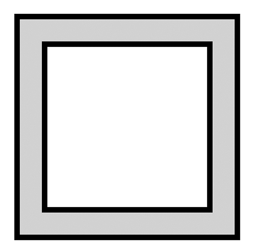
<Canvas xmlns="<a href="http://schemas.microsoft.com/client/2007">http://schemas.microsoft.com/client/2007</a>">
<Path
StrokeThickness="10"
Stroke="Black"
Fill="LightGray"
Data="M 50,50 L 50,450 450,450 450,50 50,50 z
M 100,100 L 100,400 400,400 400,100 100,100 z"
/>
</Canvas>
Performance Tip
These two forms of specifying a path may render identically, but they differ in performance and flexibility. The mini-language form parses faster, consumes less memory, and draws fastest at runtime. The mini-language is the recommended form for static content. However, it is not possible to bind an animation or change a segment property of a path generated with the mini-language because Silverlight does not create the path, figure, or segment API objects.
Fill Rules
The previous section explained how to use geometry to specify an outline of an area to fill. However, an outline does not uniquely specify the inside and outside of the shape. For example, the outline in Figure 3.13 could generate any of the rendering results shown in Figure 3.14. A fill rule is a method to distinguish the inside of a shape from the outside of the shape.
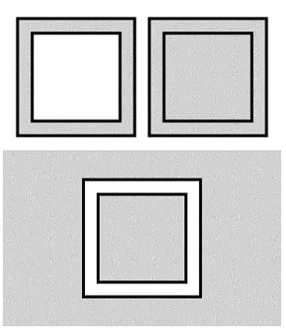
One approach to specifying what is inside a shape is to cast a horizontal line through the shape and count the number of edges crossed from left to right. If the number of edges crossed is even, classify the horizontal line segment as outside the shape. If the number of edges is odd, classify that segment as inside the shape. This fill rule is the EvenOdd rule and is the default fill mode for Path elements. To specify the fill mode explicitly, you can specify the FillRule property on geometry or use F0 for EvenOdd from the path mini-language:
<Canvas xmlns="<a href="http://schemas.microsoft.com/client/2007">http://schemas.microsoft.com/client/2007</a>">
<!-- Path with fill rule F0 = EvenOdd -->
<Path
StrokeThickness="10"
Stroke="Black"
Fill="LightGray"
Data="F0
M 50,50 L 50,450 450,450 450,50 50,50 z
M 100,100 L 100,400 400,400 400,100 100,100 z"
/>
</Canvas>
An alternative rule is the NonZero rule, which considers the order points are specified in the input. If an edge goes up in the y direction, assign that edge a + 1 winding number. If an edge goes down in the y direction, assign that edge a - 1 winding number. The NonZero rule defines the interior of the shape to be all those segments where the sum of winding numbers from the left to the current segment is not zero. For example, if you specify the geometry shown in Figure 3.14 with the point order in the following markup, it would result in the winding numbers and filled segments shown in Figure 3.15.
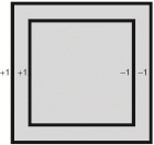
<Canvas xmlns="<a href="http://schemas.microsoft.com/client/2007">http://schemas.microsoft.com/client/2007</a>">
<!-- Path with fill rule F1 = NonZero -->
<Path
StrokeThickness="10"
Stroke="Black"
Fill="LightGray"
Data="F1
M 50,50 L 50,450 450,450 450,50 50,50 z
M 100,100 L 100,400 400,400 400,100 100,100 z"
/>
</Canvas>
If you specify the points in the following order, the shape would render differently as shown in Figure 3.16.
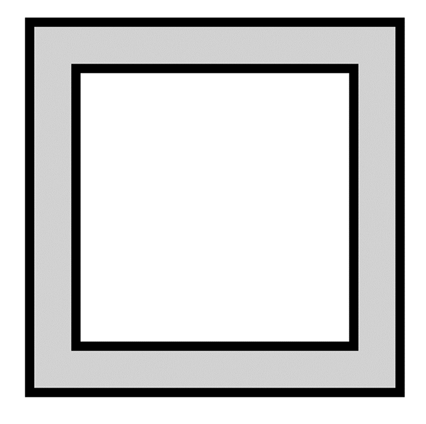
<Canvas xmlns="<a href="http://schemas.microsoft.com/client/2007">http://schemas.microsoft.com/client/2007</a>">
<!-- Path with fill rule F1 = NonZero -->
<Path
StrokeThickness="10"
Stroke="Black"
Fill="LightGray"
Data="F1
M 50,50 L 50,450 450,450 450,50 50,50 z
M 100,100 L 400,100 400,400 100,400 100,100 z"
/>
</Canvas>
Performance Tip
The NonZero rule is more complicated than the EvenOdd rule and does render slower. For most vector graphics fills, the EvenOdd rule gives the desired result.
Images
In addition to the vector graphics elements previously discussed, the other fundamental graphics primitive is the Image element. To display an image, you can use the Image element with a reference to a URI to produce the result shown in Figure 3.17.

<Canvas xmlns="<a href="http://schemas.microsoft.com/client/2007">http://schemas.microsoft.com/client/2007</a>">
<Image Source="silverlight.png"/>
</Canvas>
The Source property can reference any image in JPG or PNG format. However, if the JPG or PNG contains DPI (dots per inch) information, Silverlight ignores this information because it is usually not accurate for display purposes. All references to URIs in XAML are relative to the location of the XAML file. For example, if the XAML file is in a XAP, Silverlight searches for silverlight.png in the XAP. If the XAML file is a resourced in a managed assembly, Silverlight searches for silverlight.png in that same assembly.
If you do not specify the Width and Height properties of an image, Silverlight draws the image at its natural size, which results in a pixel perfect rendering of the original image data.
Brushes
All of the previous examples filled the Path element pixels with a single color. Silverlight also supports filling arbitrary shapes with image brushes, linear gradient brushes, and radial gradient brushes. A brush is a mathematical function that maps an (x,y) position to a color. For example, SolidColorBrush is a simple function that ignores its position and always outputs the same color. This section describes the brushes available in Silverlight and includes the function used to map from screen position to color.
Technical Insight
As shown in the previous example, the Source property of an Image element can be set to a URI. Many references to the same Source URI cause Silverlight to download the image once and use it multiple times. If you remove all references to Image elements for a specific URI, Silverlight removes the image from the memory cache and a future reference causes Silverlight to initiate another download. Future downloads may be serviced from the browser cache or go over the network if the image is no longer in the browser cache.
Solid Color Brush
SolidColorBrush returns a single color for all screen positions. When you specify a Fill or Stroke property value, Silverlight creates a solid color brush for the corresponding shape fill or pen stroke respectively:
<Canvas xmlns="<a href="http://schemas.microsoft.com/client/2007">http://schemas.microsoft.com/client/2007</a>">
<Rectangle
Fill="Blue"
Stroke="Black"
StrokeThickness="10"
Canvas.Left="96"
Canvas.Top="160"
Width="256"
Height="224"
/>
</Canvas>
Alternatively, you can specify a brush with the expanded XAML syntax:
<Canvas xmlns="<a href="http://schemas.microsoft.com/client/2007">http://schemas.microsoft.com/client/2007</a>">
<Rectangle
StrokeThickness="10"
Canvas.Left="96"
Canvas.Top="160"
Width="256"
Height="224"
>
<Rectangle.Fill>
<SolidColorBrush Color="Blue"/>
</Rectangle.Fill>
<Rectangle.Stroke>
<SolidColorBrush Color="Black"/>
</Rectangle.Stroke>
</Rectangle>
</Canvas>
The previous examples specified a named color. You can also specify a color explicitly by providing a hex string of the form #aarrggbb, which represents a hex alpha channel value, red channel value, green channel value, and blue channel value. For example, opaque green would be #ff00ff00.
From C#, you can specify a color by creating an instance of the Color class:
Color green = Color.FromArgb(0xff, 0x0, 0xff, 0x0);
The alpha channel specifies the degree of transparency where 0x0 indicates completely transparent, 0xff indicates an opaque color, and intermediate values indicate partial transparency. A brush with a transparent color will blend its color to the background color using the following formula:
Color_destination = (alpha * Color_source + (0xff - alpha) * Color_destination)/256
Silverlight will pass colors specified in hex format to the Web browser without a color space conversion. Typically, the browser will interpret the color as a standard RGB color space color (sRGB) that is, an 8-bit per channel 2.2 implied gamma space color. However, the visible color may vary with operating systems, Web browser, the monitor, and the operating system color profile. An alternative form of specifying colors is the floating point wide gamut linear RGB color space (scRGB):
<Canvas xmlns="<a href="http://schemas.microsoft.com/client/2007">http://schemas.microsoft.com/client/2007</a>">
<Rectangle
Fill="sc#1, 1.0, 0.0, 0.0"
Canvas.Left="96"
Canvas.Top="160"
Width="256"
Height="224"
/>
</Canvas>
Silverlight converts scRGB colors to sRGB internally for blending. Consequently, specifying colors in native sRGB is desirable to avoid extra color conversion steps.
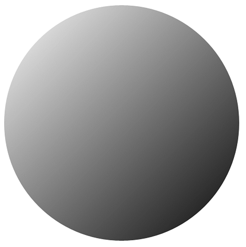
Gradient brushes define a set of colors and positions along a virtual gradient line. The function that maps screen position to color first maps the screen position to a point along the gradient line and then interpolates a color based on the two nearest points.
Consider the following use of a LinearGradientBrush:
<Canvas xmlns="<a href="http://schemas.microsoft.com/client/2007">http://schemas.microsoft.com/client/2007</a>">
<Ellipse
Width="450"
Height="450"
>
<Ellipse.Fill>
<LinearGradientBrush StartPoint="0,0" EndPoint="1,1">
<LinearGradientBrush.GradientStops>
<GradientStop Color="White" Offset="0"/>
<GradientStop Color="Black" Offset="1"/>
</LinearGradientBrush.GradientStops>
</LinearGradientBrush>
</Ellipse.Fill>
</Ellipse>
</Canvas>
The preceding linear gradient brush produces the fill shown in Figure 3.18. A linear gradient brush maps a screen position to the point on the line closest to that position. The brush then interpolates a color based on the two nearest points specified along the line as shown in Figure 3.18.
Alternatively, you can specify a radial gradient fill using RadialGradientBrush that takes the distance from the screen position to the center of the radial gradient and maps that distance to the specified gradient line of colors and positions. For example, the following XAML generates the rendering shown in Figure 3.19.
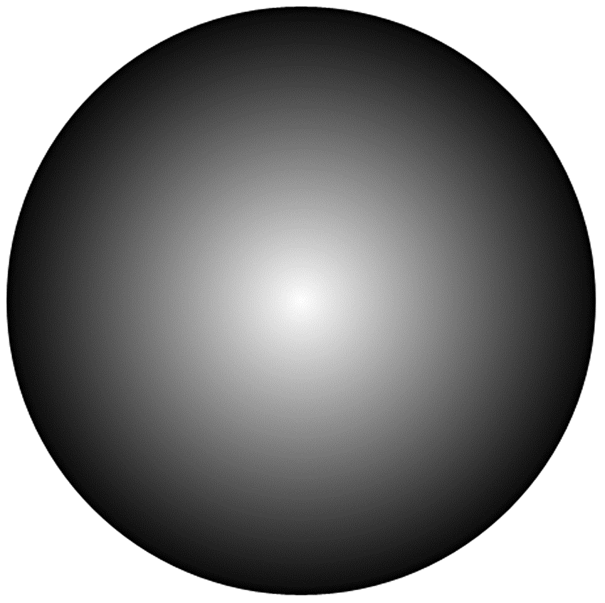
<Canvas xmlns="<a href="http://schemas.microsoft.com/client/2007">http://schemas.microsoft.com/client/2007</a>">
<Ellipse
Width="450"
Height="450"
>
<Ellipse.Fill>
<RadialGradientBrush>
<RadialGradientBrush.GradientStops>
<GradientStop Color="White" Offset="0"/>
<GradientStop Color="Black" Offset="1"/>
</RadialGradientBrush.GradientStops>
</RadialGradientBrush>
</Ellipse.Fill>
</Ellipse>
</Canvas>
Another feature of RadialGradientBrush is the capability to move the point that maps to the start of our gradient line. In particular, in our previous example, the center of the radial gradient circle mapped to the start of our gradient line and the radius of the gradient circle mapped to the end of our gradient line. With this pattern, you always get a uniform ellipse. You can move the center using the GradientOrigin property to get the result shown in Figure 3.20.
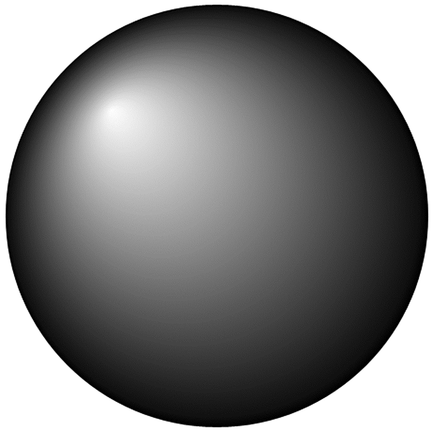
<Canvas xmlns="<a href="http://schemas.microsoft.com/client/2007">http://schemas.microsoft.com/client/2007</a>">
<Ellipse
Width="450"
Height="450"
>
<Ellipse.Fill>
<RadialGradientBrush GradientOrigin="0.25 0.25">
<RadialGradientBrush.GradientStops>
<GradientStop Color="White" Offset="0"/>
<GradientStop Color="Black" Offset="1"/>
</RadialGradientBrush.GradientStops>
</RadialGradientBrush>
</Ellipse.Fill>
</Ellipse>
</Canvas>
One other feature of linear and radial gradients is the capability to specify the behavior when the display position maps to some position outside the range of the gradient line. The SpreadMethod property defines that behavior. The Pad mode repeats the closest point when off the line, the Reflect mode mirrors to a point on the line, and the Repeat mode simply takes the position modulo the length of the line as shown in Figure 3.21.

Image Brushes
The role of the image brush is to map a screen position to a pixel in the specified image. For example, the following XAML would result in the image brush rendering shown in Figure 3.22.

<Canvas xmlns="<a href="http://schemas.microsoft.com/client/2007">http://schemas.microsoft.com/client/2007</a>">
<Ellipse
Width="450"
Height="450"
Stroke="Black"
StrokeThickness="10"
>
<Ellipse.Fill>
<ImageBrush ImageSource="silverlight.png"/>
</Ellipse.Fill>
</Ellipse>
</Canvas>
Strokes
The previous section showed how to use a brush to color the fill of a shape. You can also use a brush to add color to the outline of a shape by setting the stroke properties. For example, the following XAML generates the output shown in Figure 3.23.
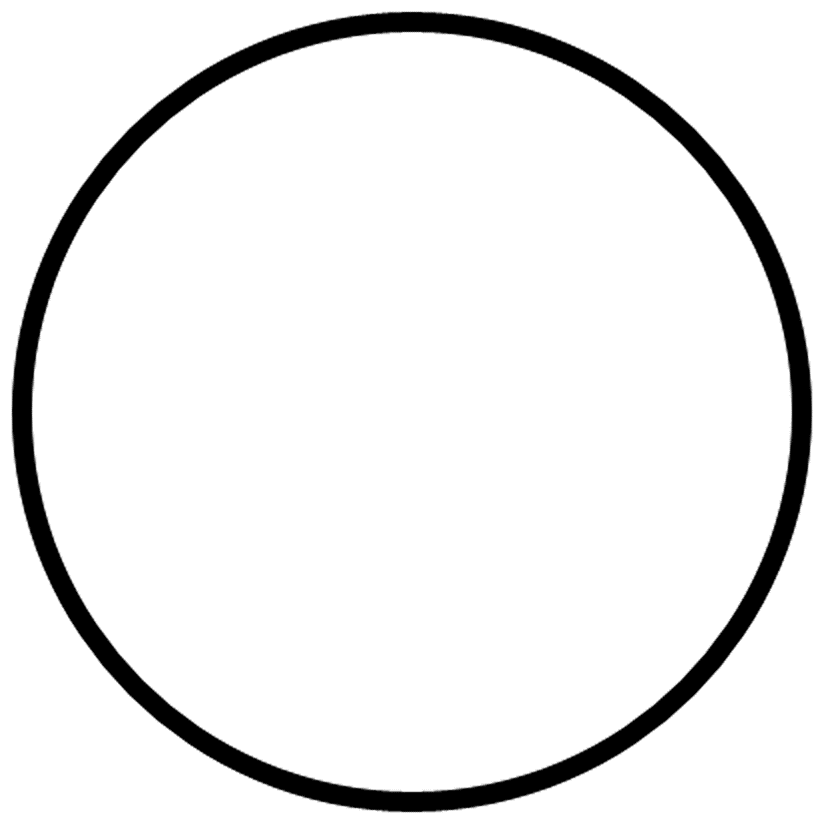
<Canvas xmlns="<a href="http://schemas.microsoft.com/client/2007">http://schemas.microsoft.com/client/2007</a>">
<Ellipse
Stroke="Black"
StrokeThickness="10"
Canvas.Left="50"
Canvas.Top="50"
Width="400"
Height="400"
/>
</Canvas>
Stroke
A stroke transforms geometry to a widened form that describes the shape outline instead of the shape fill. Silverlight fills the widened geometry with exactly the same rendering rules as the main shape fill. For example, Figure 3.24 shows an example of a widened ellipse.
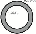
The widening process expands the original geometry by half the stroke thickness to form an outer outline. The widening process also shrinks the original geometry by half the stroke thickness to form an inner outline. The outer and inner outlines combine to form two figures Silverlight fills to produce the resulting stroke.
Technical Insight
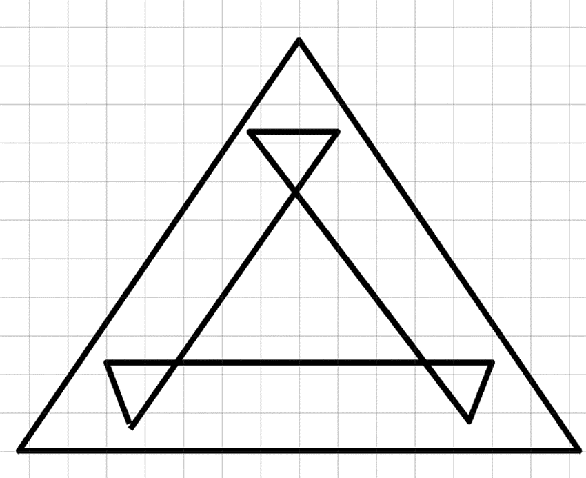
One side effect of the widening process is that local self-intersection can occur. For example, the process of widening a triangle generates several self-intersections as shown in Figure 3.25. One option is to run a loop removal algorithm to remove these intersections before rasterization. However, by simply filling the new geometry with the NonZero fill rule, these self intersections are not visible to the end user.
Dashes
To add dashes to your strokes, specify an array of distances alternating between the dash filled distance and the gap distance. For example, the simple dash array in the following XAML generates the output shown in Figure 3.26.

<Canvas xmlns="<a href="http://schemas.microsoft.com/client/2007">http://schemas.microsoft.com/client/2007</a>">
<Ellipse
Stroke="Black"
StrokeThickness="10"
StrokeDashArray="5, 4, 2, 4"
Canvas.Left="50"
Canvas.Top="50"
Width="400"
Height="400"
/>
</Canvas>
Technical Insight
Dashes are also a geometry modifier built on top of the stroke geometry modifier. When you specify a StrokeDashArray, Silverlight takes the output of the pen and subdivides it into smaller geometries. Large numbers of dashes can result in significant slowdowns in rendering speed and therefore you should use them sparingly.
Canvas
Every example shown so far has had a single root Canvas element with a set of Shape elements contained within it. In addition to providing a convenient container, the Canvas element also enables you to modify the rendering primitives it contains as a group. In particular, the Canvas element enables the following:
- Naming groups of elements
- Grouping shapes so that you can add or remove the group with a single operation
- Applying a transform to the group of elements
- Clipping a group of elements
- Apply an opacity or opacity mask effect to a group of elements
Transforms, clipping, and opacity effects are available on both individual shapes and the Canvas element.
Performance Tip
For individual shapes, it is faster to express clipping or opacity as a different geometry or a different brush color. For example, draw a Path with an ImageBrush to achieve the same result as applying a clip to an Image element. Similarly, you can add opacity to the brush color alpha channel instead of adding Opacity to the shape.
Transforms
A transform enables you to position, rotate, scale, or skew a shape or group of shapes. To transform a group of primitives, you can set the RenderTransform on the Canvas element as exemplified in the following listing to achieve the result shown in Figure 3.27.

<Canvas xmlns="<a href="http://schemas.microsoft.com/client/2007">http://schemas.microsoft.com/client/2007</a>">
<Canvas.RenderTransform>
<TransformGroup>
<ScaleTransform ScaleX="1.5"/>
<RotateTransform Angle="30"/>
<TranslateTransform X="100" Y="-10"/>
</TransformGroup>
</Canvas.RenderTransform>
<Ellipse
Fill="LightGray"
Stroke="Black"
StrokeThickness="20"
Width="200"
Height="200"
/>
<Rectangle
Fill="Gray"
Stroke="Black"
StrokeThickness="20"
Canvas.Left="100"
Canvas.Top="100"
Width="200"
Height="200"
/>
</Canvas>
As shown in the previous example, you can use a list of ScaleTransform, TranslateTransform, and RotateTransform elements in a TransformGroup element. Alternatively, you can specify an explicit matrix with a MatrixTransform:
<Canvas xmlns="<a href="http://schemas.microsoft.com/client/2007">http://schemas.microsoft.com/client/2007</a>">
<Canvas.RenderTransform>
<TransformGroup>
<MatrixTransform Matrix="
1.30, 0.75,
-0.50, 0.87,
100.00, -10.00"
/>
</TransformGroup>
</Canvas.RenderTransform>
<Ellipse
Fill="LightGray"
Stroke="Black"
StrokeThickness="20"
Width="200"
Height="200"
/>
<Rectangle
Fill="Gray"
Stroke="Black"
StrokeThickness="20"
Canvas.Left="100"
Canvas.Top="100"
Width="200"
Height="200"
/>
</Canvas>
3D Transforms (New in Silverlight 3)
In Silverlight 3, you can set the Projection property to a PlaneProjection to rotate a group of elements in 3D as shown in Figure 3.28.
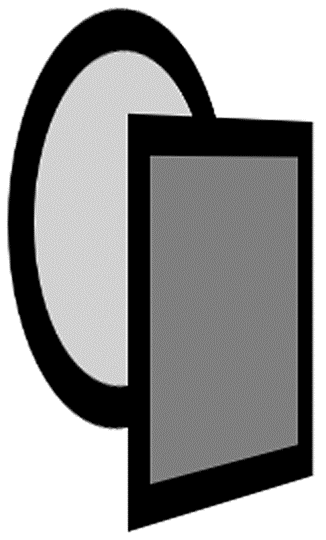
<Canvas xmlns="<a href="http://schemas.microsoft.com/client/2007">http://schemas.microsoft.com/client/2007</a>">
<Canvas.Projection>
<PlaneProjection RotationY="-60" CenterOfRotationY="50" />
</Canvas.Projection>
<Ellipse
Fill="LightGray"
Stroke="Black"
StrokeThickness=" "20"
Width="200"
Height="200"
Canvas.Top="50"
/>
<Rectangle
Fill="Gray"
Stroke="Black"
StrokeThickness="20"
Canvas.Left="100"
Canvas.Top="100"
Width="200"
Height="200"
/>
</Canvas>
Each projection logically has its own camera. To position more than one object relative to the same perspective camera, position them all in the same place and use the GlobalOffsetX, GlobalOffsetY, and GlobalOffsetZ properties to move in the 3D world as shown in Figure 3.29.
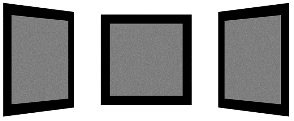
<Canvas xmlns="<a href="http://schemas.microsoft.com/client/2007">http://schemas.microsoft.com/client/2007</a>">
<Rectangle
Fill="Gray"
Stroke="Black"
StrokeThickness="20"
Canvas.Left="200"
Canvas.Top="100"
Width="200"
Height="200"
>
<Rectangle.Projection>
<PlaneProjection
GlobalOffsetX="-200"
RotationY="-60"
CenterOfRotationY="50"
/>
</Rectangle.Projection>
</Rectangle>
<Rectangle
Fill="Gray"
Stroke="Black"
StrokeThickness="20"
Canvas.Left="200"
Canvas.Top="100"
Width="200"
Height="200"
>
<Rectangle.Projection>
<PlaneProjection GlobalOffsetZ="-150"/>
</Rectangle.Projection>
</Rectangle>
<Rectangle
Fill="Gray"
Stroke="Black"
StrokeThickness="20"
Canvas.Left="200"
Canvas.Top="100"
Width="200"
Height="200"
>
<Rectangle.Projection>
<PlaneProjection
GlobalOffsetX="200"
RotationY="60"
CenterOfRotationY="50"
/>
</Rectangle.Projection>
</Rectangle>
</Canvas>
The global offset properties apply after the rotation property. You can also use the LocalOffsetX, LocalOffsetY, and LocalOffsetZ properties on the PlaneProjection object to apply an offset before the rotation.
Clipping
Clipping is the process of restricting the display area to a specified shape. To clip an element, set the Clip property as shown Figure 3.30 and in the following listing:

<Canvas xmlns="<a href="http://schemas.microsoft.com/client/2007">http://schemas.microsoft.com/client/2007</a>">
<Canvas.Clip>
<EllipseGeometry
Center="100,200"
RadiusX="150"
RadiusY="150"
/>
</Canvas.Clip>
<Ellipse
Fill="LightGray"
Stroke="Black"
StrokeThickness="20"
Width="200"
Height="200"
/>
<Rectangle
Fill="Gray"
Stroke="Black"
StrokeThickness="20"
Canvas.Left="100"
Canvas.Top="100"
Width="200"
Height="200"
/>
</Canvas>
Performance Tip
A clipping operation is semantically equivalent to intersecting two geometries. Clipping a group of elements or a single shape does come with a significant performance penalty. You should avoid clipping when possible.
Opacity
Setting opacity on a brush or setting a transparent color on a brush introduces alpha blending. In particular, if a brush contains a transparent color, the brush blends its color with the content underneath using the following formula:
Color_destination = alpha * Color_source + (1 - alpha) * Color_destination
The other form of opacity is setting the Opacity property on a Canvas. This operation is not equivalent to changing the opacity of each of the shapes within the Canvas element as demonstrated by Figure 3.31.

Performance Tip
Setting Opacity on a Canvas element resolves occlusion first and then blends content. This process is significantly slower at runtime than blending individual primitives. If possible, you should set opacity on a brush, brush color, or a Path element for maximum performance.
OpacityMask
The OpacityMask property on a UIElement provides a mechanism to blend brush per pixel alpha information with the content of a UIElement. For example, the following XAML would produce the result shown in Figure 3.32.

<Canvas xmlns="<a href="http://schemas.microsoft.com/client/2007">http://schemas.microsoft.com/client/2007</a>">
<Canvas.OpacityMask>
<LinearGradientBrush StartPoint="0,0" EndPoint="1,1">
<LinearGradientBrush.GradientStops>
<GradientStop Color="Transparent" Offset="0"/>
<GradientStop Color="White" Offset="1"/>
</LinearGradientBrush.GradientStops>
</LinearGradientBrush>
</Canvas.OpacityMask>
<Ellipse
Fill="LightGray"
Stroke="Black"
StrokeThickness="20"
Width="200"
Height="200"
/>
<Rectangle
Fill="Gray"
Stroke="Black"
StrokeThickness="20"
Canvas.Left="100"
Canvas.Top="100"
Width="200"
Height="200"
/>
</Canvas>
OpacityMask is slow at runtime. In some cases, it is faster to draw content on top that blends to the background instead of using the OpacityMask. For example, you can achieve the effect in Figure 3.32 with the following XAML:
<Canvas xmlns="<a href="http://schemas.microsoft.com/client/2007">http://schemas.microsoft.com/client/2007</a>">
<Ellipse
Fill="LightGray"
Stroke="Black"
StrokeThickness="20"
Width="200"
Height="200"
/>
<Rectangle
Fill="Gray"
Stroke="Black"
StrokeThickness="20"
Canvas.Left="100"
Canvas.Top="100"
Width="200"
Height="200"
/>
<!-- simulate opacity mask effect with a rectangle on top -->
<Rectangle Width="300" Height="300">
<Rectangle.Fill>
<LinearGradientBrush StartPoint="0,0" EndPoint="1,1">
<LinearGradientBrush.GradientStops>
<GradientStop Color="White" Offset="0"/>
<GradientStop Color="Transparent" Offset="1"/>
</LinearGradientBrush.GradientStops>
</LinearGradientBrush>
</Rectangle.Fill>
</Rectangle>
</Canvas>
the remaindar of this chapter can be found here: www.informant.com/articles/article.aspx?p=1397670
| Command | Action |
|---|---|
| M x,y | Move to position x,y |
| L x,y | Draw a line from the current position to position x,y |
| C x1,y1, x2,y2, x3,y3 | Draw a cubic Bezier segment with control points consisting of the current position, (x1,y1), (x2,y2), and (x3,y3) |
| Q x1,y1, x2,y2 | Draw a quadratic Bezier segment with control points consisting of the current position, (x1,y1), and (x2,y2) |
| H x | Draw a horizontal line from the current position x0,y0 to position x,y0 |
| V y | Draw a vertical line from the current position x0,y0 to position x0,y |
| Z | Close a figure |
| F0 | Specify EvenOdd fill rule |
| F1 | Specify NonZero fill rule |


