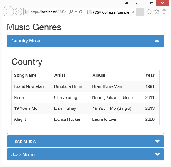
Over the last few years, my company has created many mobile websites for our clients. Like many programmers, we use Twitter Bootstrap to write these mobile websites. Right out of the box, Bootstrap gives you a very nice look and feel, but at times, either your customer wants something different, or you find that you need to add on some functionality to make something easier to use. One thing I added was the ability to add an up- or down-arrow to the title area of the Bootstrap accordion (See Figure 2 for an example of an accordion). In this article, you'll learn how to write just a little bit of CSS and jQuery to extend Bootstrap's accordion.
A Panel Class
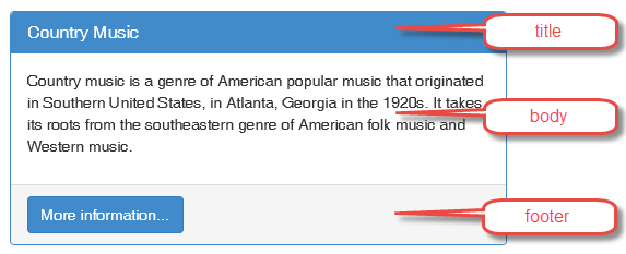
Before you put together an accordion in Bootstrap, you should understand how the panel classes work. In Bootstrap, there's a set of panel classes that define what a panel looks like (see Figure 1). A panel is defined with a set of <div> elements that are assigned to Bootstrap classes. The first class is panel-heading and within the heading there's panel-title. The panel-heading class defines the area at the top with the blue background, and the panel-title class within the <h1> tag contains the words you wish to display. The class panel-title is important, as that's where the user clicks to toggle the accordion functionality. When using a Bootstrap panel that's not an accordion, the panel-title just displays words on the blue background.
<div class="panel panel-primary">
    <div class="panel-heading">
        <h1 class="panel-title">Country Music</h1>
    </div>
    <div class="panel-body">
        <p>Country music is a genre of American popular...</p>
    </div>
    <div class="panel-footer">
        <button class="btn btn-primary">More information...</button>
    </div>
</div>
After the heading, there's a panel-body class. This is where you put the content described by the heading. In this sample, it's information about the Country Music genre. Anything can go into the Body, such as input fields, images, tables, and any other HTML.
The last piece on a panel is the panel-footer class. The footer is typically for buttons, hyperlinks, or other action elements, but it can be for anything you want. The footer is optional, and for an accordion, you won't use the footer area.

Building a Simple Accordion
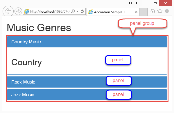
Create an accordion in Bootstrap (Figure 2) by wrapping two or more panels within a <div> element decorated with the class panel-group. To make the panels behave as an accordion, add an anchor element within the <h1> title element (see lines 5-7 in Listing 1).
Listing 1: Create an accordion using the Bootstrap collapse classes
1.  <div class="panel-group" id="accordion">
2.    <div class="panel panel-primary">
3.      <div class="panel-heading">
4.        <h1 class="panel-title">
5.          <a data-toggle="collapse"
6.             data-parent="#accordion"
7.             href="#country">Country Music</a>
8.        </h1>
9.      </div>
10.     <div id="country" class="panel-collapse collapse in">
11.       <div class="panel-body">
12.         <h2>Country</h2>
13.       </div>
14.     </div>
15.   </div>
<div class="panel panel-primary">
    <div class="panel-heading">
        <h1 class="panel-title">
            <a data-toggle="collapse"
            data-parent="#accordion"
            href="#rock">Rock Music</a>
        </h1>
    </div>
    <div id="rock" class="panel-collapse collapse">
        <div class="panel-body">
            <h2>Rock</h2>
        </div>
    </div>
</div>
<div class="panel panel-primary">
    <div class="panel-heading">
        <h1 class="panel-title">
            <a data-toggle="collapse"
               data-parent="#accordion"
               href="#jazz">Jazz Music</a>
        </h1>
    </div>
    <div id="jazz" class="panel-collapse collapse">
        <div class="panel-body">
            <h2>Jazz</h2>
        </div>
    </div>
</div>
</div>
Add the attributes data-toggle and data-parent to this anchor element to inform Bootstrap about where the toggling should be targeted. The href attribute of the anchor element targets the id attribute of another div element (line 10) that's a wrapper around the class panel-body. This <div> element uses the two classes panel-collapse and collapse to identify what's contained within the <div> element is the collapsible area.

Add Up and Down Glyphs
In my projects, I like to try to make the UX as intuitive as possible. On accordions, I feel that having up and down glyphs to the right side of the heading area helps the user understand that they're able to do something with each of the different titles. I added an additional anchor tag just below the other anchor tag within the <h1> element (line 5 in the following code snippet). This new anchor element contains the up and down arrows. They're not added in the HTML as I will be adding them using jQuery.
1. <h1 class="panel-title">
2.   <a data-toggle="collapse"
3.      data-parent="#accordion"
4.      href="#country">Country Music</a>
5.   <a class="pdsa-panel-toggle"></a>
6. </h1>
Notice the class pdsa-panel-toggle added to this anchor element. I use this class name to select all of these using jQuery and add on the chevron-down glyph class to this anchor tag, as shown in the following code snippet:
$(document).ready(function () {
    // Add the down glyph to all elements
    // that have the class 'pdsa-panel-toggle'
    $(".pdsa-panel-toggle").addClass("glyphicon glyphicon-chevron-down");
});
Handling Expanded Panels
Notice in Listing 1 that the first <div> has an additional class named in. This class tells Bootstrap to make this panel's body visible when the accordion is first displayed. However, that means that the down arrow should now become an up arrow. So you need to write a little more jQuery after adding the down arrows. In this new jQuery, you'll need to identify all <div> elements that contain the class in, get the id attribute of that <div>, and find the anchor tag that contains that id within its href attribute. Once you find that anchor tag, you remove the chevron-down glyph and add the chevron-up glyph.
var list = $(".in");
for (var i = 0; i < list.length; i++) {
    $($("a[href='#" + $(list[i]).attr("id") + "']")).next()
        .removeClass("glyphicon glyphicon-chevron-down")
        .addClass("glyphicon glyphicon-chevron-up");
}
Styling the New Anchor Element
The new anchor element you just added needs a little bit of CSS in order to make it look good. You remove any text-decoration from the anchor, float it to the right, and ensure that the cursor becomes a pointer when the user hovers over it. The little bit of CSS presented in the following code snippet accomplishes this.
.panel > .panel-heading > .panel-title > a {
    text-decoration: none;
}
.pdsa-panel-toggle {
    float: right;
    cursor: pointer;
}

Toggle the Up/Down Glyph
Now that you've created the initial look and feel, you need to add the functionality to toggle the up and down glyphs and to toggle collapsing and expanding. First, write a function to detect which class is contained in the specific control and then toggle to the other glyphs. The jQuery code snippet below shows how to accomplish this.
function toggleGlyphs(ctl) {
    if ($(ctl).hasClass("glyphicon glyphicon-chevron-up")) {
        $(ctl).removeClass("glyphicon glyphicon-chevron-up");
        $(ctl).addClass("glyphicon glyphicon-chevron-down");
    }
    else {
        $(ctl).removeClass("glyphicon glyphicon-chevron-down");
        $(ctl).addClass("glyphicon glyphicon-chevron-up");
    }
}
Within the $(document).ready() function presented earlier, you connect to the click events on each of your new anchor elements. When the anchor is clicked, you need to get the id of the <div> element that is the wrapper around the body. You can get this by looking at the previous sibling of the anchor tag you clicked on, and then by grabbing its href attribute. Call the Bootstrap collapse() function and pass in the string “toggle” to get the body to toggle from open to closed or from closed to open. You then toggle the glyph in the anchor tag you just clicked on by calling the toggleGlyphs() function you wrote previously.
$(".pdsa-panel-toggle").click(function () {
    // Retrieve the previous anchor tag's 'href'
    // attribute so you can toggle it.
    $($(this).prev().attr("href")).collapse("toggle");
    // Change the glyphs
    toggleGlyphs($(this));
});
When the user clicks on the panel title, the panel also toggles the collapse because that anchor tag's click event is used by Bootstrap. You also need to tie into this click event so that you can toggle your glyphs as well. You can do that by adding the following code snippet within the $(document).ready() function.
$("a[data-toggle='collapse']").click(function () {
    // Change the glyphs
    toggleGlyphs($(this).next());
});
Summary
Bootstrap makes creating great-looking user interfaces very easy. With just a little CSS added to HTML elements, you can create panels and accordions quickly and easily. Adding your custom elements to Bootstrap is easy to do by just adding your own CSS and jQuery. In this article, I presented a technique to add a glyph to the side of each panel in an accordion. Sometimes, little additional icons aid the user in understanding how a UI works without additional training.


