Xamarin apps run on a variety of device sizes - from small phones to bigger tablets - and the devices can change from portrait to landscape mode in an instant. The app UI needs to adapt to these size and orientation changes, look good, and be functional. Every UI framework has the notion of positioning and sizing elements on the screen. As systems have evolved, these layout tools have advanced too, adding features that simplify commonplace layout problems. It's these layouts that provide the means to building adaptive user interfaces. In this article, I'll look at the Xamarin.Forms layout views and show how to use them to build various UI design structures.
Views and Layouts
The visual elements in Xamarin.Forms fall into two separate categories: controls and arrangers. Both are considered visual elements, share a common base class (View), and are collectively known as Views. But their missions are different. View classes (the controls) are responsible for gathering user input or showing information to the user. They are called controls or widgets in other UI frameworks.
Layouts (the arrangers) serve a different purpose. A layout class is a View class that contains a collection of child views. It's responsible for arranging the child views into position in the UI. It also collaborates with each child to determine the final rendering size. To be clear, layouts are also views, but are rarely called that by the community.
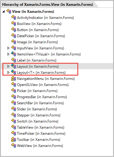
Figure 1 shows a list of classes that derive from the View class. Most of them fall into the input/output control category. The classes outlined with red rectangle in Figure 1 are the base classes for the layout views.
Layout Classes
The layout classes do the work of arranging the elements on the screen. Each layout specializes in a style of arrangement. If you're familiar with other XAML frameworks, many of these layout classes (shown in Figure 2) will seem familiar, albeit with different names.
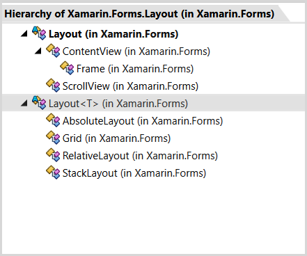
The simplest layout containers are the ContentView, Frame, and ScrollView. They're designed to provide a few simple services to the child items. Although they can contain multiple child items, there's no good reason to have more than one child in these layouts. They simply don't offer layout options that help arrange multiple child items. The other layouts (AbsoluteLayout, Grid, RelativeLayout, and StackLayout) excel at arranging multiple child items. It's common to mix and combine multiple layouts into the page UI. Therefore, understanding the strengths of each layout is essential for crafting your pages.
A Word About Color
The Xamarin.Forms prebuilt color palette is small. There are nineteen color constants available. For this article, I want to use a custom set of colors; here's how to make that happen. Start by creating a static class and add some static properties:
namespace Common {
    static class Hues {
        public static readonly Color Sky = Color.FromHex("#226765");
        public static readonly Color Fire = Color.FromHex("#AA4B40");
    }
}
In this example, I used the Color.FromHex method to define the two custom colors. The Color struct has other methods to describe colors (FromRGB, FromHlsa, and FromUint); use whichever method you prefer to define your color set.
To use these custom colors in a page, add a custom XML namespace to the root element:
<ContentPage
    xmlns="..."
    xmlns:x="..."
    xmlns:c="clr-namespace:Common;assembly=Demo" >
I used the prefix c for my XML namespace. Normally, I'd use a more readable name, like common, but I chose the shorter name so that the example fits into the code snippet size constraint for the magazine. Notice the use of the clr-namespace: syntax in the namespace declaration: That's how you indicate which .NET namespace to use.
This snippet uses the Common namespace in the Demo assembly. Look at the code snippet shown earlier and you can see that the color properties are inside the Common.Hues class. Now that the c namespace is registered, I can access the colors with this snippet:
BackgroundColor="{x:Static c:Hues.Sky}"
The ContentView and Frame
ContentView is not intended to be used directly in your XAML tree. Rather, it's designed to be a base class for building your own composite views. The Frame, which derives from ContentView, is a better choice for a wrapper around a child view. Its biggest asset is that it can render a visible border around the child. This next snippet shows how to set the OutlineColor and add a dropshadow to the Frame:
<Frame OutlineColor="White" HasShadow="True">
    <Label Text="The Label" />
</Frame>
The Frame inherits a useful property, Padding, from the Layout base class. Non-layout views don't have margin or padding properties. The only way to add space around a view is it to put it inside a layout and set the Padding property like this:
<Frame Padding="30">
    <Label Text="The Label" />
</Frame>
Because the Padding property is part of the Layout base class, it's settable on any of the other layout classes.
VerticalOptions and HorizontalOptions
Every view has a size that's set by a collaboration between the child view and its layout container. Use the VerticalOptions, HorizontalOptions, WidthRequest, and HeightRequest properties to influence the final rendered size. Let's look at the default size of an element.
<Frame
    Padding="10,20"
    BackgroundColor="{x:Static c:Hues.Sky}">
    <BoxView
        Color="{x:Static c:Hues.Fire}"/>
</Frame>
The example in the code snippet uses a Frame as the layout and a BoxView as the child. The BoxView is a simple view, useful for drawing solid color rectangles. I'm not specifying a width or height for the BoxView. Nor am I setting any value for the VerticalOptions and HorizontalOptions. Figure 3 shows the UI running on an Android emulator.
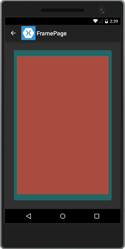
By default, the BoxView is sized to match its container, the Frame. The blue buffer shown around the edge of the BoxView is due to the Padding = "10,20" property on the Frame. In this case, that means 10 pixels of padding on the left and right and 20 pixels of padding on the top and bottom.
The Dynamics of Sizing
Sizing and positioning can get complicated, especially in sophisticated multilayered interfaces. Here are some pointers that will help understand the way the system works.
Each view has a desired size, the size that it wants to be rendered at, if possible. The desired size is calculated internally within the child view. Take a Label as an example. Its desired width depends on many factors. How many characters are in the Text property? What is the font size?
It's the same with the desired height. The desired height will be taller when there are lots of characters, a big font size, and word wrap are enabled. In general, it's better to let the view decide on its own size. You can overrule the desired size if necessary by setting the WidthRequest and HeightRequest property on the child view.
There will be times when the requested size (or desired size) is smaller than the layout container. For example, a 180-pixel width Label within a 300-pixel width StackLayout. In this scenario, the panel defers to the VerticalOptions and HorizontalOptions properties to determine where to place the child element within the extra space. There are several settings available for the LayoutOptions enumeration. The discussion here is around the HorizontalOptions and it's similar for the VerticalOptions property.
- Start
- Center
- End
- Fill (Default)
- StartAndExpand
- CenterAndExpand
- EndAndExpand
- FillAndExpand
I'll look at the top four items in this list. LayoutOptions.Start sets the child width to the requested size and then positions the element to the side of the container. In left-to-right languages, the start position is the left side of the container, in right-to-left languages, the start position is on the right side. LayoutOptions.End does the opposite, positioning the element on the right side in left-to-right languages and on the left side in right-to-left languages. LayoutOptions.Center centers the element and keeps the requested size. LayoutOptions.Fill stretches the width of the child element to match the parent container. LayoutOptions.Fill is the default LayoutOption setting.
Take a look at this next snippet. The BoxView doesn't specify a size, so it'll get the default size. It also doesn't indicate the VerticalOptions or HorizontalOptions either, so it defaults to the LayoutOptions.Fill value. As a result of these settings, the parent Frame stretches the BoxView to fit horizontally and vertically.
<Frame Padding="30" BackgroundColor="#226765">
    <BoxView BackgroundColor="#AA4B40"  />
</Frame>
To override LayoutOptions, use this this XAML:
<Frame Padding="30" BackgroundColor="#226765">
    <BoxView BackgroundColor="#AA4B40"
             HorizontalOptions="End"
             VerticalOptions="Start"  />
</Frame>
Now the BoxView is positioned to the upper-left position on my phone (because English is a left-to-right language). The BoxView isn't stretched inside the Frame, so it will fall back to its default size of 40x40-pixels.
ScrollView
ScrollView is useful when the child content is bigger than can fit in the UI. For example, when the text content on a page is too tall to fit on the screen, wrap the Label in a ScrollView. This can make your UI readable on smaller screen sizes. Content that fits on a big-screen phone like the Nexus 6 will still be readable on the smaller Moto G phone. This code snippet shows a tall BoxView within the ScrollView:
<ScrollView
    Padding="30"
    BackgroundColor="{x:Static c:Hues.Sky}"  >
    <BoxView
        Color="{x:Static c:Hues.Fire}"
        HeightRequest="1400" />
</ScrollView>
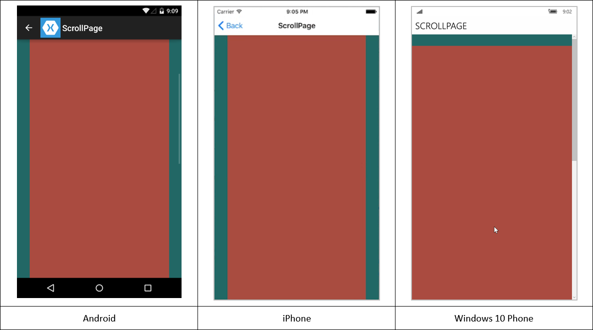
Figure 4 shows the result. If you look closely at the Android and Windows Phone screenshots, you can see the scrollbar on the right side of the screen. It's not visible on the iPhone screenshot, but that's due to the limitations of my screen capture software.
StackLayout
This layout is one of my favorites, and I use it everywhere in my UI. It has a simple mission: position the child elements in a stack, either horizontally or vertically. The order that the child elements are added to the layout is the order in which they are stacked. This snippet adds two BoxViews with default HorizontalOptions, and three more with specific HorizontalOptions set:
<StackLayout >
    <!-- defaults to HorizontalOptions="Fill"-->
    <BoxView Color="{x:Static c:Hues.Fire}"  />
    <BoxView Color="{x:Static c:Hues.Sky}" />

    <BoxView Color="{x:Static c:Hues.Sky}"
             HorizontalOptions="Start"/>
    <BoxView Color="{x:Static c:Hues.Fire}"
             HorizontalOptions="Center"/>
    <BoxView Color="{x:Static c:Hues.Sky}"
             HorizontalOptions="End"/>
</StackLayout>
Figure 5 shows the results.
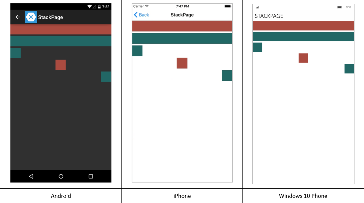
Each item is positioned immediately below the previous one, with six pixels spacing between the items. The spacing is adjustable with the Spacing property.
<StackLayout Spacing="18">
Figure 6 is an example of a StackLayout with a horizontal orientation:
<StackLayout Orientation="Horizontal">
    <Image Source="twitter.png"/>
    <Image Source="facebook.png"/>
    <Image Source="pinterest.png"/>
</StackLayout>

Two-Dimensional Layout with the Grid
The grid is a time-tested way to lay out information in a two-dimensional space. Designers determine placement of important elements with gridlines. As UI design has formalized, the grid has triumphed as a prime tool in the layout workflow.
The Xamarin Grid is similar to other XAML-based grids, although it has one feature that you haven't seen before. It sports the ColumnSpacing and RowSpacing attributes, which define how much room to put between the rows and columns in the grid.
<Grid ColumnSpacing="6"
      RowSpacing="4">
Other than this small change, the other Grid attributes are familiar territory for XAML devs. For those new to XAML, here's the overview. You define columns within a column definition section and rows in a row definition section:
<Grid ColumnSpacing="6"
      RowSpacing="4"
      BackgroundColor="{x:Static c:Hues.Sky}">
    <Grid.ColumnDefinitions>
        <ColumnDefinition Width="100"/>
        <ColumnDefinition Width="Auto"/>
    </Grid.ColumnDefinitions>
    <Grid.RowDefinitions>
        <RowDefinition Height="3*"/>
        <RowDefinition Height="3*"/>
    </Grid.RowDefinitions>
    <!-- child elements go here. -->
</Grid>
This snippet creates a two-row, two-column grid. To control the size of the row or column, use the sizing option specified with the GridUnitType enumeration. There are three choices for GridUnitType sizes: Absolute, Auto, and Star.
An Absolute-size column's width is hard-coded to the specified value. This example shows two columns with fixed widths:
<Grid.ColumnDefinitions>
    <!-- Absolute size-->
    <ColumnDefinition Width="113"/>
    <ColumnDefinition Width="37"/>
</Grid.ColumnDefinitions>
An Auto-sized column's width is determined by its content. An Auto-sized column with a 120-pixel-wide label and an 80-pixel-wide button will be set to 120 pixels. This example shows two columns with automatically sized widths:
<Grid.ColumnDefinitions>
    <!-- Auto size-->
    <ColumnDefinition Width="Auto"/>
    <ColumnDefinition Width="Auto"/>
</Grid.ColumnDefinitions>
A Star sized column (also known as a proportional size) width is determined by its relation to the other columns in the grid. Take a look at this example:
<Grid WidthRequest="450">
    <Grid.ColumnDefinitions>
        <ColumnDefinition Width="113"/>
        <ColumnDefinition Width="37"/>
        <ColumnDefinition Width="2*"/>
        <ColumnDefinition Width="3*"/>
        <ColumnDefinition Width="5*"/>
    </Grid.ColumnDefinitions>
</Grid>
To determine the sizes of each column, the Grid starts by resolving the Absolute-size and Auto-size columns. In this case, the two Absolute-sized columns total 150 pixels. The Grid has requested 450-pixels width. Assuming that the Grid is rendered at 450-pixels, that leaves 300-pixels for the remaining three columns. Next, the grid tallies a sum of all the star-sized items (2* + 3* + 5*=10*) and divides each column by the column star value. The results for the third, fourth, and fifth columns are (2/10 (20%), 3/10 (30%), and 5/10 (50%)). Using these percentages, the final rendered sizes for the columns are: 113, 37, 60, 90, and 150.
Even though I'm not showing examples of RowDefinitions, they work the same way for adjusting row heights.
Once the grid is defined, it's time to add the child elements. Unless otherwise indicated, a child is positioned in column 0, row 0. To modify the default placement, use the Grid.Column and Grid.Row attributes.
<BoxView Grid.Row="1" Grid.Column="2"/>
You can also use the Grid.ColumnSpan and Grid.RowSpan attributes to specify how many columns and rows the child view should span.
<BoxView Grid.RowSpan="2"
         Grid.ColumnSpan="4" />
AbsoluteLayout
Use the AbsoluteLayout when you need precise control over the x and y positions, and the width and height of the child elements. It has its place in the layout world. In most situations, it's better to use one of the other layouts; they make for a more responsive design. Absolute layout harkens back to the old days when we brute-forced screen elements into position. Although that's less common now, it does have its place for certain layout challenges.
Each child element describes its location and size with the AbsoluteLayout.LayoutBounds attribute. Use a comma-separated list to indicate the bounding rectangle (x, y, width, and height) values:
<AbsoluteLayout>
    <BoxView
        AbsoluteLayout.LayoutBounds="90, 50, 75, 25"
        BackgroundColor="{x:Static c:Hues.Sky}" />
</AbsoluteLayout>
The parameters for the AbsoluteLayout.LayoutBounds attribute are as follows:
- X: The horizontal position of the element
- Y: The vertical position of the element
- Width: The width of the element
- Height: The height of the element
This snippet results in a 75-pixel wide, 25-pixel tall BoxView that is positioned 90-pixels left and 50-pixels down from upper-left corner of its parent.
As I said, hard-coded size and position is a throwback to older times. It's better to use a proportional size in the AbsoluteLayout. To switch to proportional layout, use the LayoutFlag attribute:
<AbsoluteLayout>
    <BoxView
        AbsoluteLayout.LayoutFlags="All"
        AbsoluteLayout.LayoutBounds="90, 50, 75, 25"
        BackgroundColor="{x:Static c:Hues.Sky}" />
</AbsoluteLayout>
This sets all four values in the LayoutBounds attribute to proportional size. Now the BoxView is 75% of the width of the parent, instead of 75-pixels. It's the same for the other three values; for example, the top of the BoxView is located at the halfway mark in the parent instead of 50-pixels from the top.
The All flag sets each value in the bounding box to proportional. There are other flags that switch on proportional values for the other bounding box values:
<AbsoluteLayout>
    <BoxView
        AbsoluteLayout.LayoutFlags="WidthProportional"
        AbsoluteLayout.LayoutBounds="90, 50, 75, 25"
        BackgroundColor="{x:Static c:Hues.Sky}" />
</AbsoluteLayout>
The WidthProportional flag sets the Width to a proportional value and the other three values remain absolute. Check out the Xamarin documentation to see all the combinations.
Proportional sizes are an improvement over the absolute sizes; an even better option is to use the RelativeLayout.
RelativeLayout
A RelativeLayout is useful for creating adaptive layouts where the UI adjusts to screen rotation and screen sizes. Use it to lay out UI elements based on their parent's position and dimensions as well as other views' positions and dimensions. Another key benefit of the RelativeLayout (and the AbsoluteLayout) is the ability to overlap or layer child elements.
Each element in the RelativeLayout can define a constraint, which is a rule that defines how the element relates to other items (parent, siblings).
There are several constraint types available:
- RelativeLayout.YConstraint
- RelativeLayout.XConstraint
- RelativeLayout.WidthConstraint
- RelativeLayout.HeightConstraint
The names are self-explanatory. It's not hard to understand what each constraint type does. Next, I'll look at several of the constraints to show you how they work.
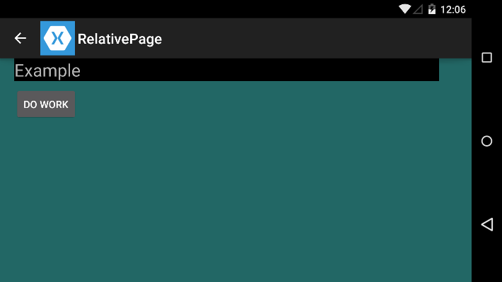
Imagine a scenario where you have two views, a Label and a Button. The Label is positioned at the top of the RelativeLayout and set to 90% of the parent's width. The Button goes below the Label and matches the Label's width and is positioned at the left edge of the button. The width of the RelativeLayout changes when the user rotates the phone to landscape mode. The Label's width needs to adjust accordingly and the left position of the Button needs to change too.
A constraint can have the following values:
- ElementName: The name of the element that the constraint is relative to
- Type: Whether the constraint is relative to the parent or another view
- Property: Which property on the relative element to use for the constraint
- Factor: The multiplier for the constraint
- Constant: An offset for the constraint
Here's the XAML for the Label:
<RelativeLayout BackgroundColor="{x:Static c:Hues.Sky}" >
    <Label x:Name="MainLabel"
             Text="Example"
             BackgroundColor="Black"
             FontSize="24"
    RelativeLayout.WidthConstraint="{ConstraintExpression
                                     Type=RelativeToParent,
                                     Property=Width,
                                     Factor=0.9,
                                     Constant=0}"
    RelativeLayout.XConstraint="{ConstraintExpression
                                     Type=RelativeToParent,
                                     Property=X,
                                     Constant=20}"  />
The Label has two constraints, WidthConstraint and XConstraint. The Type=RelativeToParent parameter sets the constraint to the parent RelativeLayout. The width of the Label is tied to the parent width with the Property=Width value and the Factor=0.9 sets the Label width to 90% of the parent. The Property=X and Constant=20 values set the X position of the Label.
Here is the XAML for the Button:
<Button Text="Do Work"
    RelativeLayout.YConstraint="{ConstraintExpression
                                 Type=RelativeToView,
                                 ElementName=MainLabel,
                                 Property=Y,
                                 Constant=40}"
    RelativeLayout.XConstraint="{ConstraintExpression
                                 Type=RelativeToView,
                                 ElementName=MainLabel,
                                Property=X,
                                Constant=0}"   />
Note the use of Type=RelativeToView and ElementName=MainLabel to set the YConstraint and XConstraint to the MainLabel view. Next, set the Property=Y and Constant=40 values to position the Button 40 pixels below the Label. Also use the Property=X and Constant=0 values to keep the left edge of the Button aligned with the left edge of the Label.
Figure 7 shows the RelativeLayout in action on the Android emulator.
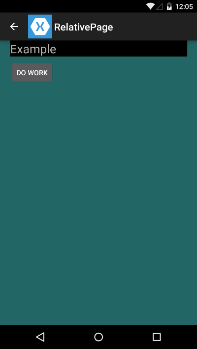
Figure 8 shows the same UI in landscape mode.
Conclusion
Generally speaking, the Xamarin layout views follow a similar structure to other XAML frameworks. They're designed to work in a cross-platform situation, which results in some unfamiliar territory for XAML veterans. Each layout solves a specific problem. Once you understand how each one works, you'll find yourself layering them together to build the UI of your dreams.


